No redesign this year, sorta!

Since I joined Bronco (over 9 years ago) I’ve spent some time each year delivering a new company website. The reason we’ve done this each year range from being bored with the previous iteration, having the design copied for a WordPress theme or needing to showcase our ever developing skillset.
Normally we’d go through the process of redesigning the site near the start of the year but this time I was a little too busy to justify making changes due only to boredom and Bronco, while always changing and adapting, hasn’t altered enough to make a new website the priority.
But as the months rolled past the list of things we wanted to change grew, but the time available didn’t. So rather than head down the route of a big redesign we opted for smaller incremental changes focusing on refreshing problem areas while maintaining sections that didn’t require any updates.
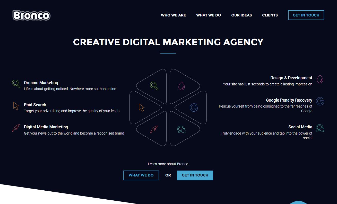
Our new Homepage
Over the past couple of months we’ve made small changes that would go unnoticed by many and there will be further changes over the coming month or so. But the reason for this post today is that the largest of these changes, a new homepage, launched today.
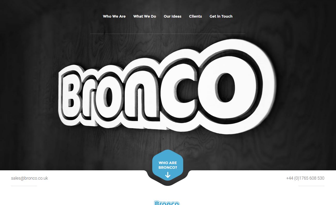
As mentioned we wanted to focus on a few problem areas and while some in the company still liked the impact of large banner image containing our logo, I wanted to try something different. Partly this desire was driven by the growing conversations happening around how similar the web had become in adopting large image banners with overlaid text and ghost buttons. This trend is very widely used by web agencies and so I felt it important to deliver something different that gives us something more unique.
The result is a complete scrapping of image banners through a number of pages and instead, on the homepage, we’re highlighting our main services. The issue with our large banner image was that it didn’t have any content to explain to new users who we are… at all. Sure users can scroll and we’d designed the page to promote this, but we were concerned we weren’t being as clear as we could be. So rather than continue with the large banner image that communicated little we’d scrap it and make it much clearer who we are and the services we can deliver.
We didn’t just stop at the header/banner section either. Over 75% of the homepage has been updated to provide a more visually dynamic design. The use of diagonal dividers between some of the sections does much of the heavy lifting in this regard as well as promoting scrolling from the top banner into the rest of the homepage.
Next Steps?
Now the homepage is complete and live the bulk of the changes we’ve wanted to make are complete. Yet there are a few remaining changes to work through that will be quietly pushed live over the coming weeks that will focus on the navigation sub menu and the top sections of the internal content pages.
Fingers crossed we can have this all be completed by Christmas.
Share this article
Like what you’ve read, then why not tell others about it... they might enjoy it too
We'd love to hear from you!
If you think Bronco has the skills to take your business forward then what are you waiting for?
Get in Touch Today!
Discussion