The basics of Typography and layout

Typography and layout are fundamental in successful graphic design and are two of the most confusing areas to understand. My aim here is to shine a light on the basics of their terminology and impart some pieces of good practice.
Typefaces vs fonts
The fundamental difference between typefaces and fonts is often unclear to most people. A typeface is defined as a family of fonts Helvetica or Times, but a font is one weight or style within a typeface family (such as Helvetica Regular or Bold).
Font Communication
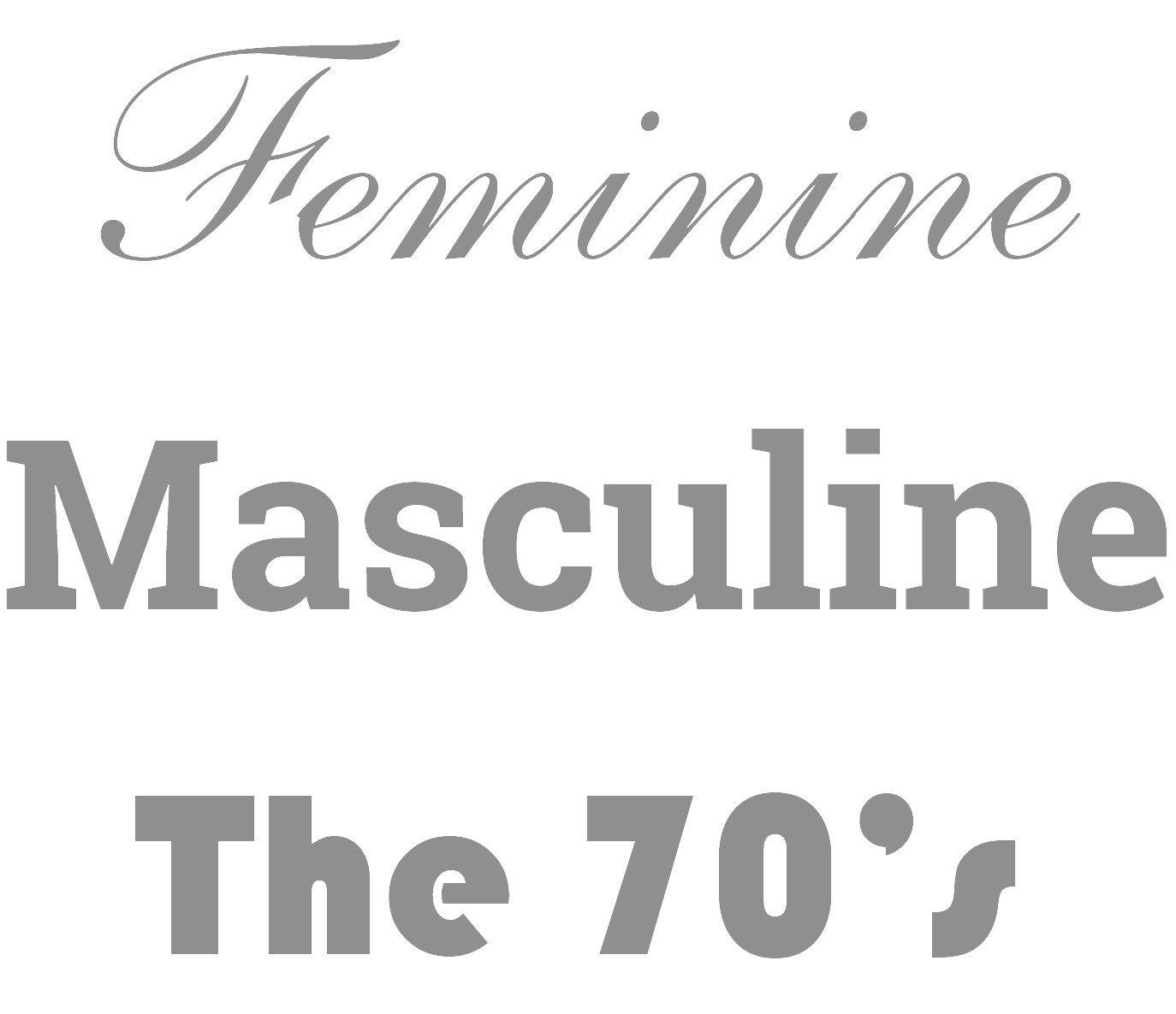
Typefaces can be used to deliberately, or even accidentally communicate certain associations on both a conscious and subconscious level. These can include: formality, gender or even a specific era. It’s worth bearing this in mind as it can have a negative or positive effect on your design and how the viewer perceives it. For example, heavy typefaces with hard edges such as slab serifs tend to look more masculine, while curvy or thin typefaces, such as scripts, appear feminine.
Weights & Styles
The weight of type can aid the hierarchy of your design, so it’s worth picking a typeface for your design that contains multiple weights and styles whenever possible. As a general rule bolder fonts should be used for headers and sub headers while regular fonts, or light fonts can be used for body copy. Never force italicise or force embolden a font as this can distort the original design and create a clumsy look.
Type classification
Serif
Serif typefaces such as Times can be identified by lines attached to the end of a stroke in a letter. They are often used in newspaper design to give a classical look to a design.

Sans serif
Sans Serif typefaces (literally translated to without serif ) such as Helvetica are more modern in appearance featuring simple lines and curves, and are typically used to create a fresh or friendly feel to a design.

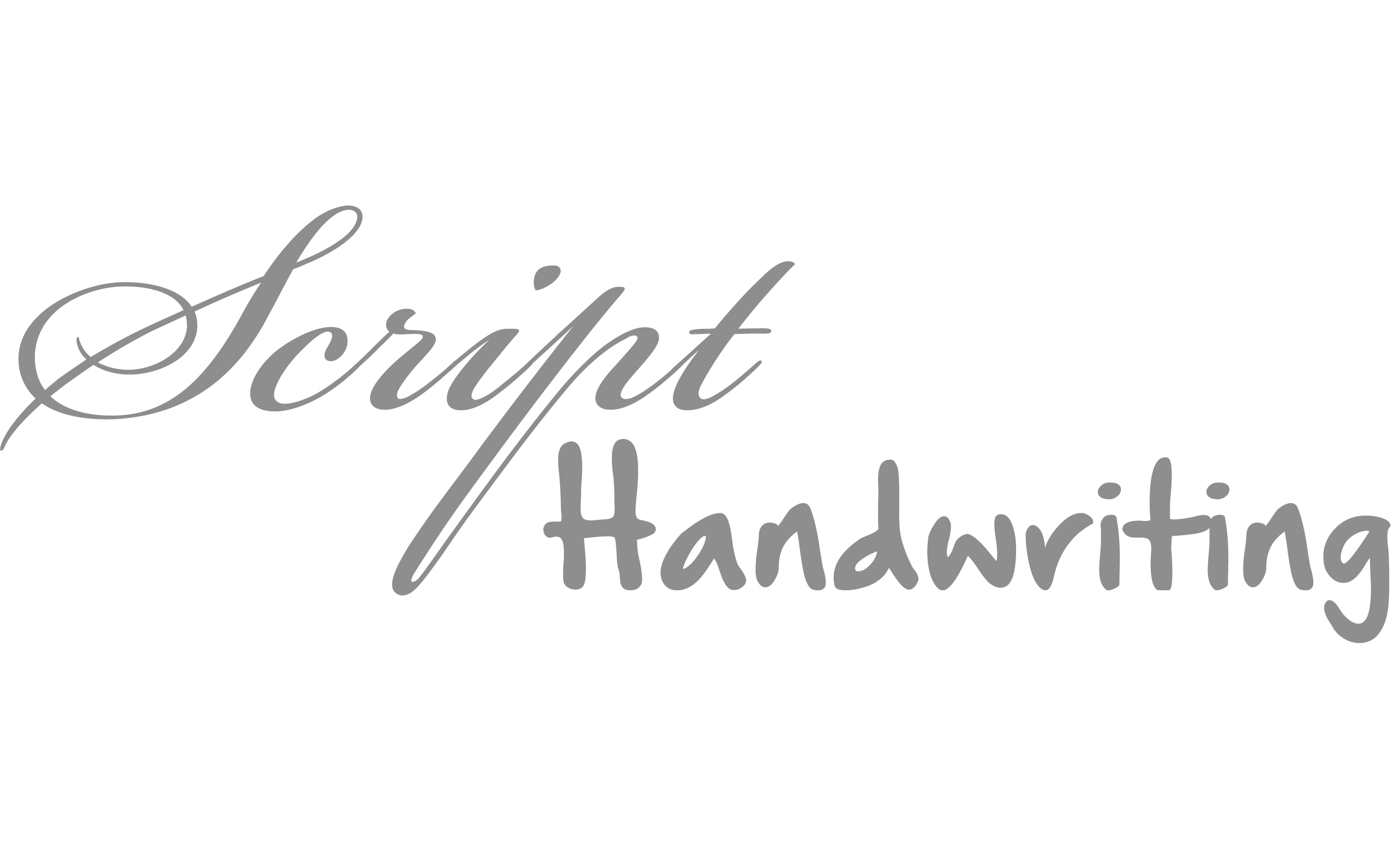
Scripts and handwriting
Scripts are based upon fluid calligraphic handwriting typical of the 17th and 18th century. They can be useful for creating a highly feminine feel to a design and are often used in wedding designs or those of a similar nature.
Handwriting fonts are far looser and varied and can be used to great effect in creating an informal and personal feel. They can vary greatly in quality however, and should be chosen wisely and used sparingly.
Display
Display tyepfaces are the loosest category and include many styles and variations. Display typefaces, as the name implies, are designed to make a statement, and should primarily be used for impactful headers. They are predominantly of a single weight and some only contain upper case characters. Never use a display typeface for body copy as legibility will be seriously harmed.

Kerning, tracking and leading
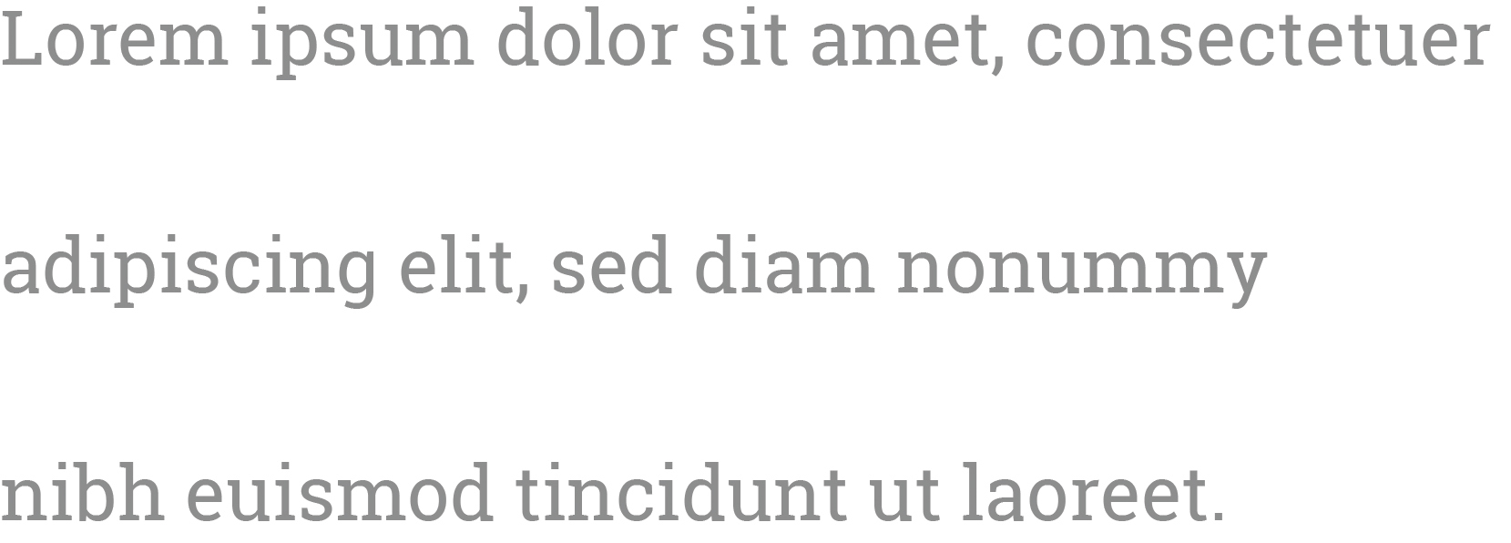
Space should be considered between individual characters, letters and lines of text. Adding line spacing is paramount to aid in the legibility of body copy while letter spacing can be used to great effect in headers.
Kerning
Kerning is the modification of the space between two letters and can be useful to avoid unwanted space between certain characters, or to increase space and avoid characters crashing into each other.

Tracking
Tracking is similar to kerning but involves the spacing of an entire word rather than individual letters. Tracking can be useful to add a lightness and space to text or decreased to create the opposite effect.

Leading
Leading refers to the spacing individual lines of text in a block. Adjusting leading can have a huge impact of how legible a block of copy can be.
Under no circumstances stretch a font either vertically or horizontally. This distorts the original font and greatly cheapens the look of a design.
Font Pairing
It is important to use contrasting fonts in a design. As a general rule of thumb a simple font should be used for body copy whilst a more elaborate font can be used for headings and to add impact, for instance the juxtaposition of serif fonts work great with sans serif fonts.

Hierarchy and Consistency.
Hierarchy
Hierarchy is important to guide the user around your design. Clear Headers and sub headers should be provided to break up the body copy into logical portions and direct the user in a logical progression to the content they value the most.
Consistency
Consistency is also of high importance in design. Keep a consistent text size for headers, sub headers and body copy across a design. It is also important to keep space between elements at a uniform size to produce a clean visual appearance.
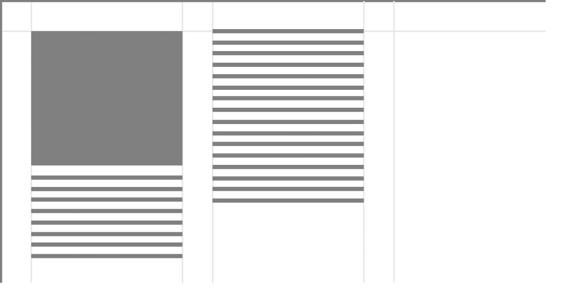
Grids
Grids are a great way to add structure to a design, helping elements work together correctly. Defining white space and borders will ultimately produce a clean and consistent layout.
They can also be used effectively to create a template which ensures consistency across many pages in a brochure, catalogue, or book, or to add content that has yet to be finalised, as is the case of newspapers and magazines.
Share this article
Like what you’ve read, then why not tell others about it... they might enjoy it too
We'd love to hear from you!
If you think Bronco has the skills to take your business forward then what are you waiting for?
Get in Touch Today!
Discussion