The Bronco Website – A retrospective

I’m Kean and I’ve been a web designer at Bronco since 2006. In the 8 years after joining I have been largely responsible for the Bronco website and how the design of this portrays our company to current and prospective clients.
So far that has led to a new Bronco website being designed and launched each year, with one exception. And true to form we’re looking to launch a new website again this year.
Again?
We always have the best intentions in trying to create a website that will last and serve us for more than just 12 months. Yet businesses can change and our focus with it. Plus as a designer I’m keen to ensure our website remains modern and reflects the best of our industry.
But as we look forward to a new website it seems right to look back over the past 8 years and see how our previous websites have evolved.
2006 – BK (Before Kean)
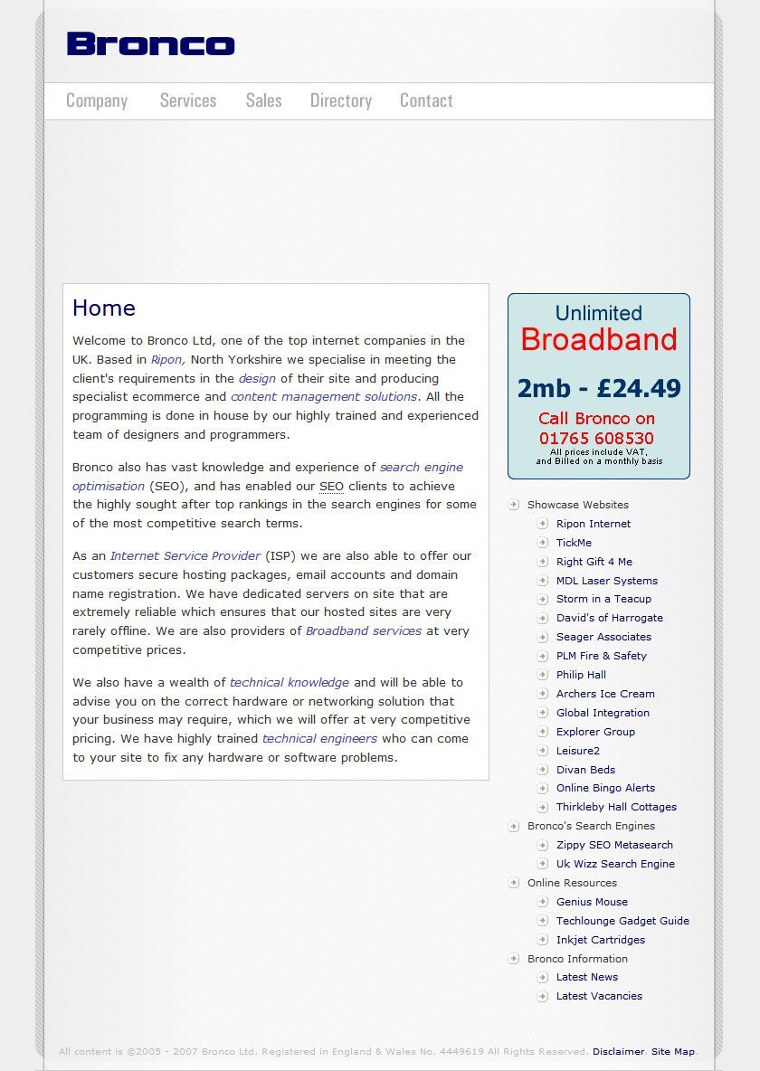
This is the website as it existed when I first started at Bronco. Or at least it would be if the Internet Archive showed the images.
After 8 years it will look rather dated and does little to engage a user. But if you were to see its brown coloured predecessors you’d see this is better looking than what came before.
This website shows possibly better than any the roots of Bronco as an ISP as well as a digital agency with the primary call to action offering unlimited broadband above our other services.
2007 – My First
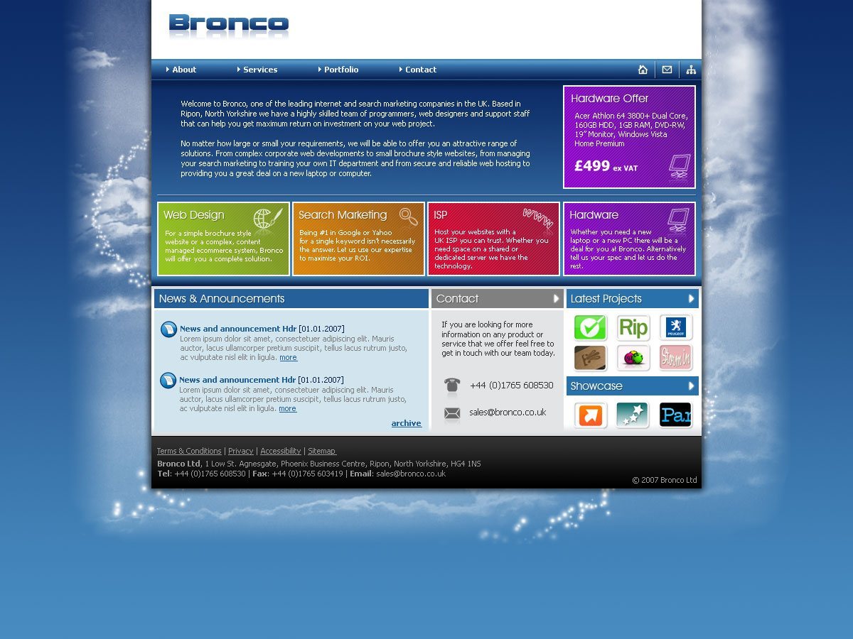
This is the first Bronco website I ever built, not yet a year from finishing University my eye for design was still under developed and I still had a big love of 11px Verdana. Thankfully over the years my go to font sizes have increased making our websites much more legible.
Though the years make remembering the exact intentions of a design a little hazy it’s clear that we looked to promote our different services more heavily on the website, using bold colours to assist, as well as introducing a portfolio section for our web work.
It was in this design where we first began using the ‘There’s always a solution’ tagline that still remains a part of Bronco today.
2008 – Increased Screen Size
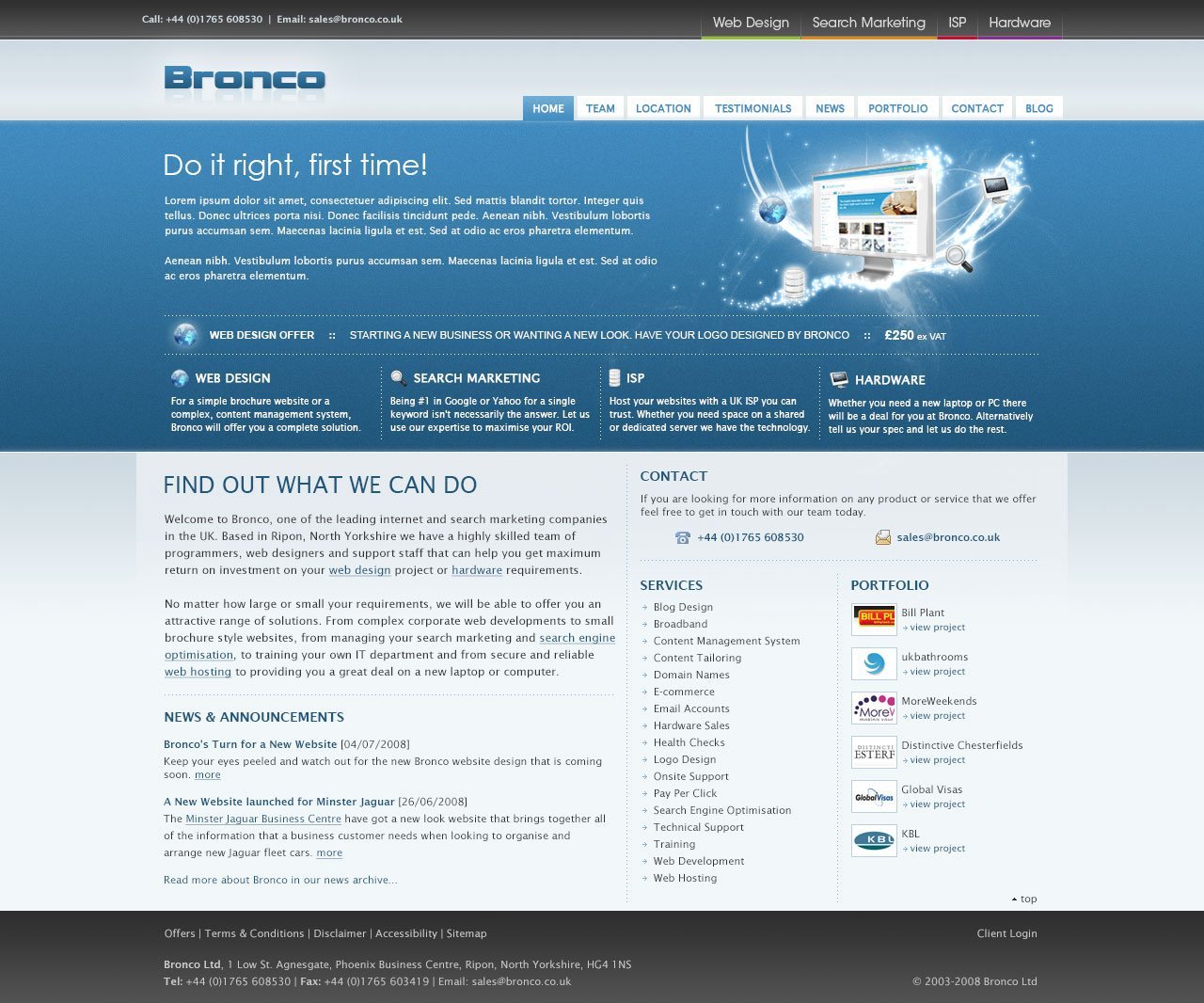
The biggest change here is the increased width of the website. As consumer screen sizes increased we were able to start developing websites for these screens knowing that a decreasing percentage of users would have to scroll horizontally to view all our website.
In increasing the width of the website we were able to introduce a greater number of services onto our homepage as well as more whitespace to spread out the different sections. However the whitespace here is nothing in comparison to how the websites have progressed since.
The colour scheme became more muted and the colours being used for individual services were used in a more subtle way. Though we were not immune to following the odd design fad. Look closely and you’ll see the reflection of the logo that you’d see much more rarely now.
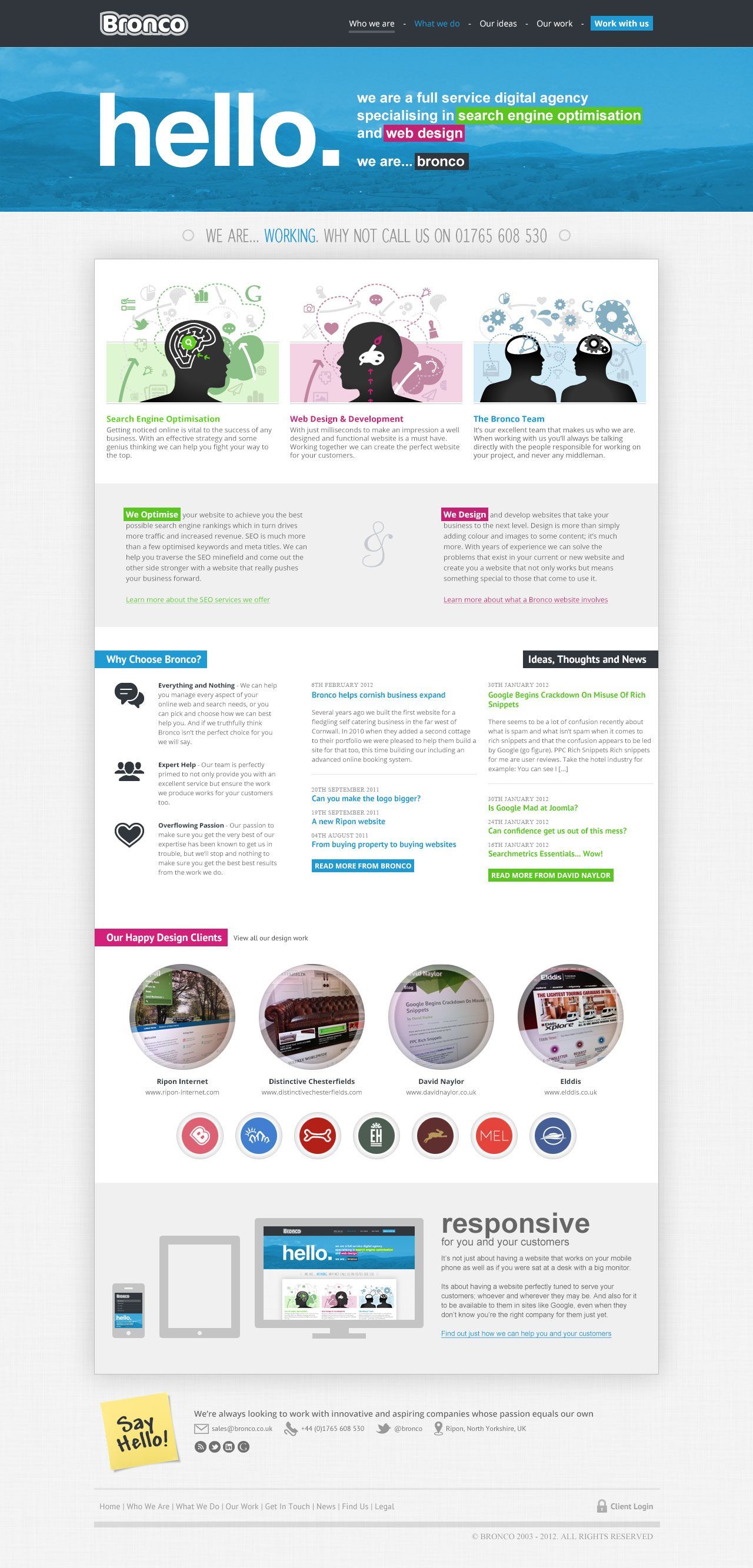
2009 – Rebrand
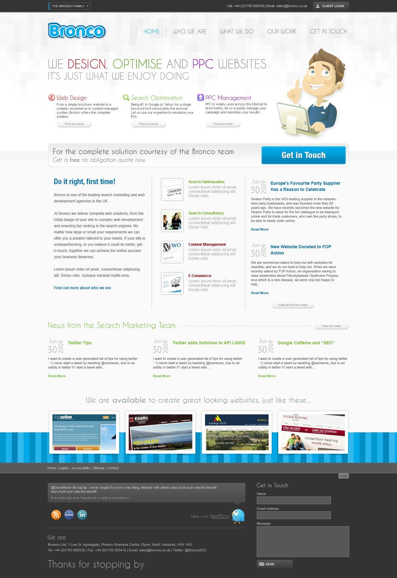
The 2009 version of the website saw two major changes.
Firstly the company closed its Hardware and ISP divisions. National and International companies began dominating much of the market and at the end of the day there was an ever decreasing profit to be made in these sectors. In the absence of these services we promoted our PPC service to the forefront.
Secondly came the rebrand of our logo. Our previous logo was never designed in great detail and we thought that it would be a good exercise to bring in The Sharp Agency to help us change our logo to something more suitable.
In commissioning a new logo we needed a new website to use it on. The choice of colour scheme for the logo necessitated a change to a predominantly white website, with blue becoming a highlight colour for headings and call to actions.
Other changes included using less clinical terms for some of our primary pages (Who We Are, What We Do and Our Work) as well as the introduction of news from Dave’s blog.
2010 – My Blue Period
Artists seems to have a blue period and possibly this was my web equivalent.
Much of the website structure stayed the same with colour and layout the biggest changes. Also we altered the logo slightly to allow us to utilise it on a wider range of background colours.
The death of this website came when we found the design had been stolen to be sold as a premium WordPress theme. We were lucky enough to find it and take it down but when we strive to have a design that is easily identifiable to our users we wanted to create something new and unique.
2011 – No new Website?
Even I was surprised to see that we hadn’t launched a new website in 2011 but when looking back at the dates it seems that our 2010 version launched late in the year and our 2012 version early in that year. So while there was no launch in 2011 we didn’t quite have a website make it to two years.
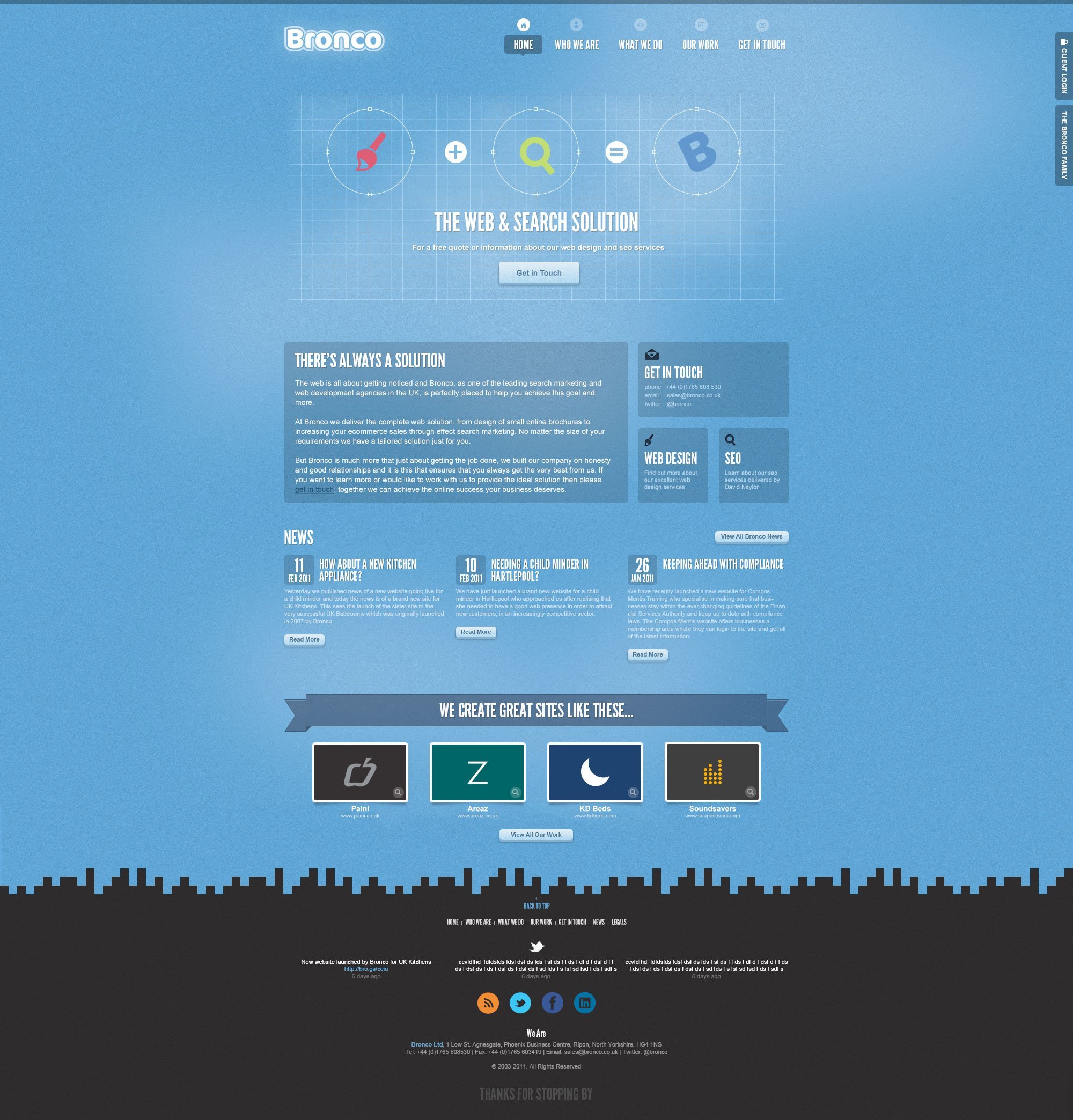
2012 – Responsive Web Design
Responsive Web Design was becoming the next big thing in web design and when trying to promote ourselves as a leading digital agency it was a requirement that our website adopted this new technique.
Though we started to introduce more call to actions, highlight our Unique Selling Points and revisit our content, as we often did, there was little else that marks this version as revolutionary.
2013 – New Office
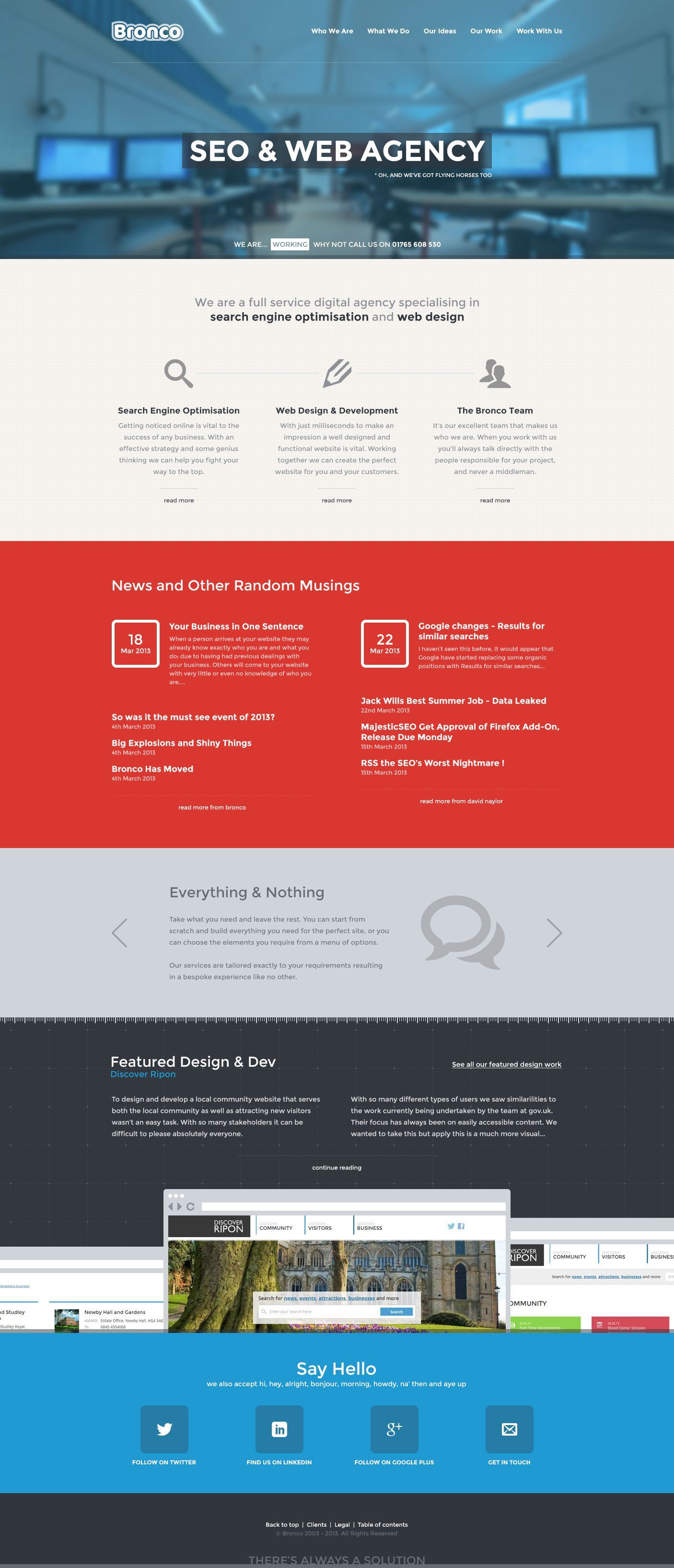
In early 2013 we moved to a new office, we wanted to change a few things on our existing website and so we combined the two using imagery of our new office space within the design.
Another goal was to go more minimal, both in the design and the content. We had a less is more approach to the website and ultimately this is a path we’ve come to regret.
2014 – All Change
Last year we thought simplicity was the answer, but we were wrong. At Bronco we’re currently trying to take stock of our position and see how we can move the company forward.
It can be a little difficult being both agency and client, sometimes we see things from one perspective and not the other and can in retrospect make a wrong decision. In 2014 we’re looking to put right what we’ve done wrong and take the website further than we ever have.
The website has a big part to play in the coming changes at Bronco as it is the first port of call for prospective clients. Our job this year is to make sure that the next version of our website fulfils our changing focus and just maybe hangs around a little longer than its predecessors.
Share this article
Like what you’ve read, then why not tell others about it... they might enjoy it too
We'd love to hear from you!
If you think Bronco has the skills to take your business forward then what are you waiting for?
Get in Touch Today!
This is a fantastic read. I always take a look at the Bronco website as I know I’m going to see a great, up-to-date design. Even the minimal design was good!