1st Galaxy Fireworks

Small incremental updates are recognised as the best way for a website to evolve over time, adapting to an ever changing online world as well as the evolving business requirements that occur as a company grows.
But for many, often smaller businesses, it’s not possible for them to employ an agency to work on their website so frequently. But even if they could, there are times, even with large businesses, where small changes are not enough and a big redesign is required either out of necessity such as to make a website responsive or because the opportunities borne from a larger redesign outweigh the benefits of maintaining the status quo.
After delivering 1st Galaxy Fireworks their last website back in early 2013 it was time to enhance the functionality of this as well as making it responsive through a redesign. At this time we’d beeen doing responsive websites a little while and had not yet scaled this up to e-commerce websites, instead taking a measured approach to ensure we delivered a quality product within our capabilities. Therefore, unfortunately, 1st Galaxy only just missed out on a responsive website back in 2013. But now 99% of all new websites are built to be responsive from the start, even our most complex builds.
All change, but still the same
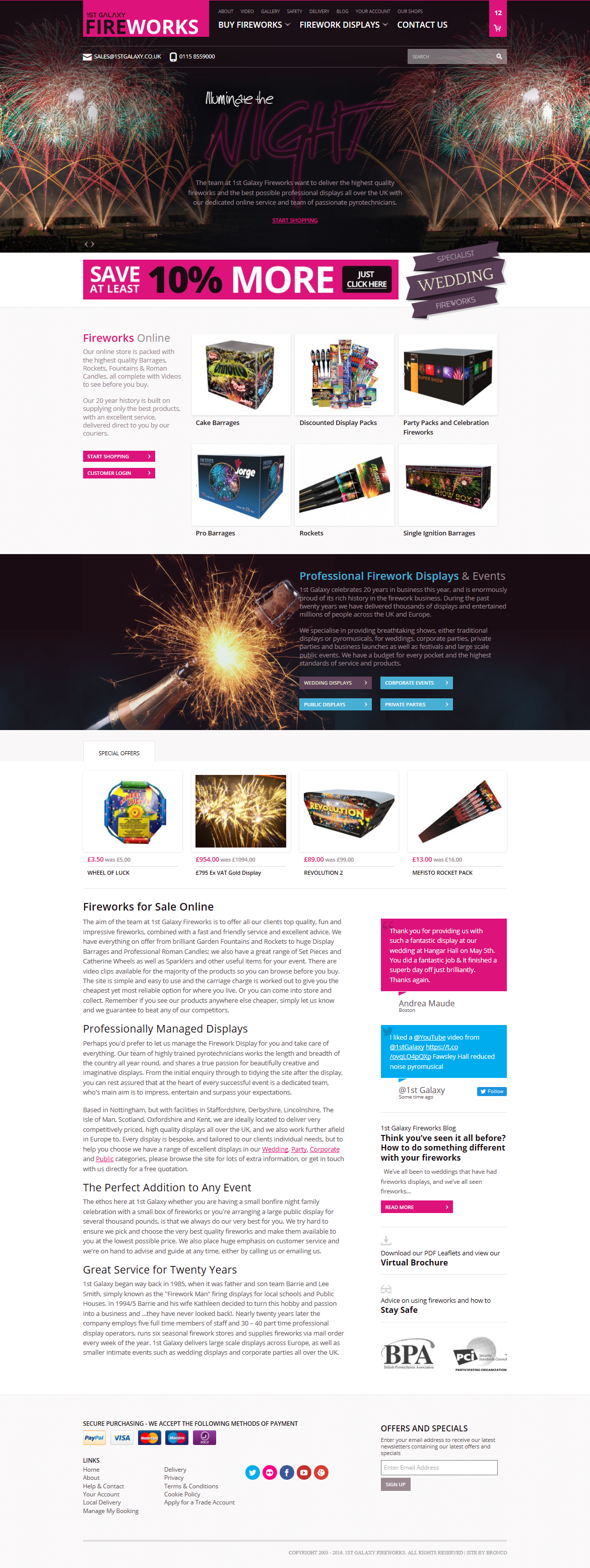
With any redesign we always look for consistency in the design so that the change from old to new isn’t a jarring experience for repeat users. However in this instance a competitor had recently redesigned their site with more than a passing resemblance to 1st Galaxy Fireworks; so it was necessary, where possible, to differentiate the two sites. To achieve this we focused on the homepage layout and colour scheme as primary areas of concern.
Frankly without the competitor website utilising a very similar neon pink we’d likely of modified the colour scheme somewhat anyway. With no brand guidelines and most offline material not 100% colour matched we felt we could bring a slightly different pink into the new design with few, if any, drawbacks. Certainly in changing the tone of the pink we were able to select a colour that was much more versatile due to the new colour having less of a “burn your eyes” quality to it. The rest of the colour scheme also followed suit to better match this primary colour.
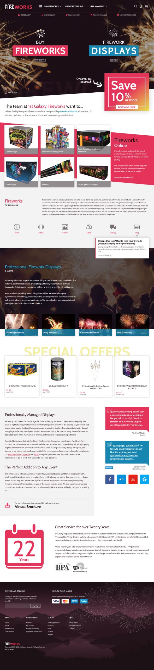
For the home page we needed to try and break away from what has become a standard and possibly over-used homepage layout incorporating a large homepage banner with text and button overlay. While the previous website didn’t necessarily adhere to this structure exactly, it was desirable to mix things up and this was helped through changing business requirements that puts a more equal emphasis on people booking displays as well as online firework sales.
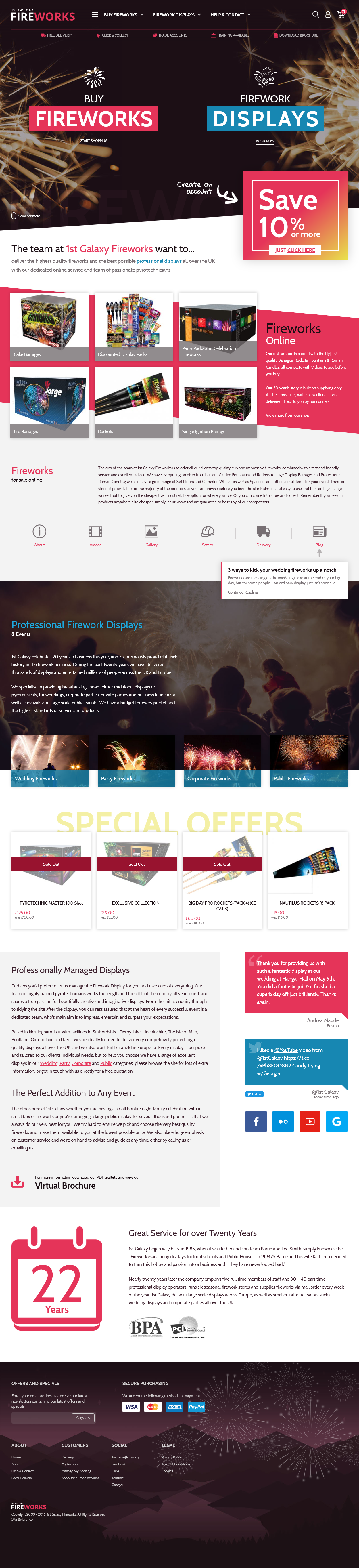
This gave us a 50/50 split to the banner promoting the two major sections of the website which coupled with other design tweaks such as a different use of imagery and diagonal divides gave us a more individual aesthetic that sets 1st Galaxy apart from their competitors.
Videos front and centre
In 2013 the website wasn’t utilising much video, certainly not within the products. But as the website evolved many of the products now include videos of the products which are a far better representation of the products than the very colourful boxes the powder comes in.
One of the earliest decisions we made in designing the new website was to promote these videos in place of standard imagery throughout all products and displays. While this would hide the product images on initial view, making the user click a button to view these, we felt that the videos are far more effective in selling the product.
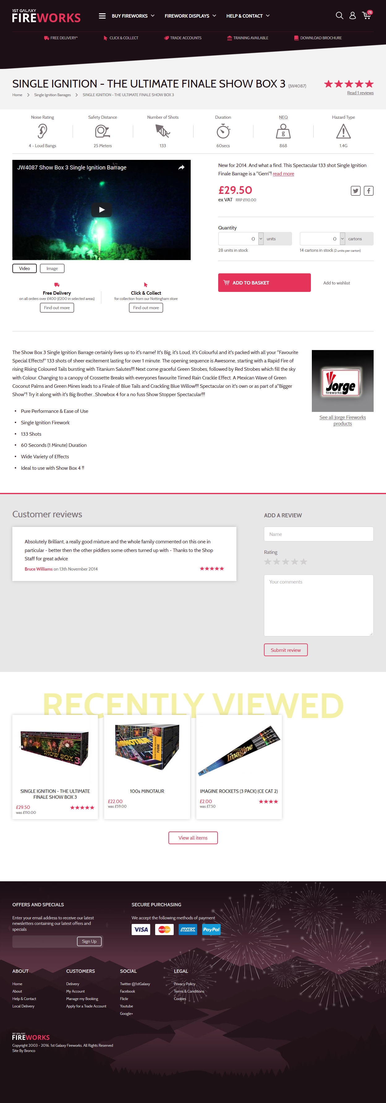
Though we could go a step further and have the video automatically play on load this is often an annoyance to users who navigate by opening multiple tabs at once and so for the sake of an extra click we’ve not yet gone down this route.
Better displays
There are benefits when redesigning a product rather than designing something brand new. With something that already exists you not only can view the product to determine what does and does not work in order to make things better but you can also rely far more on research to show you how to make improvements.
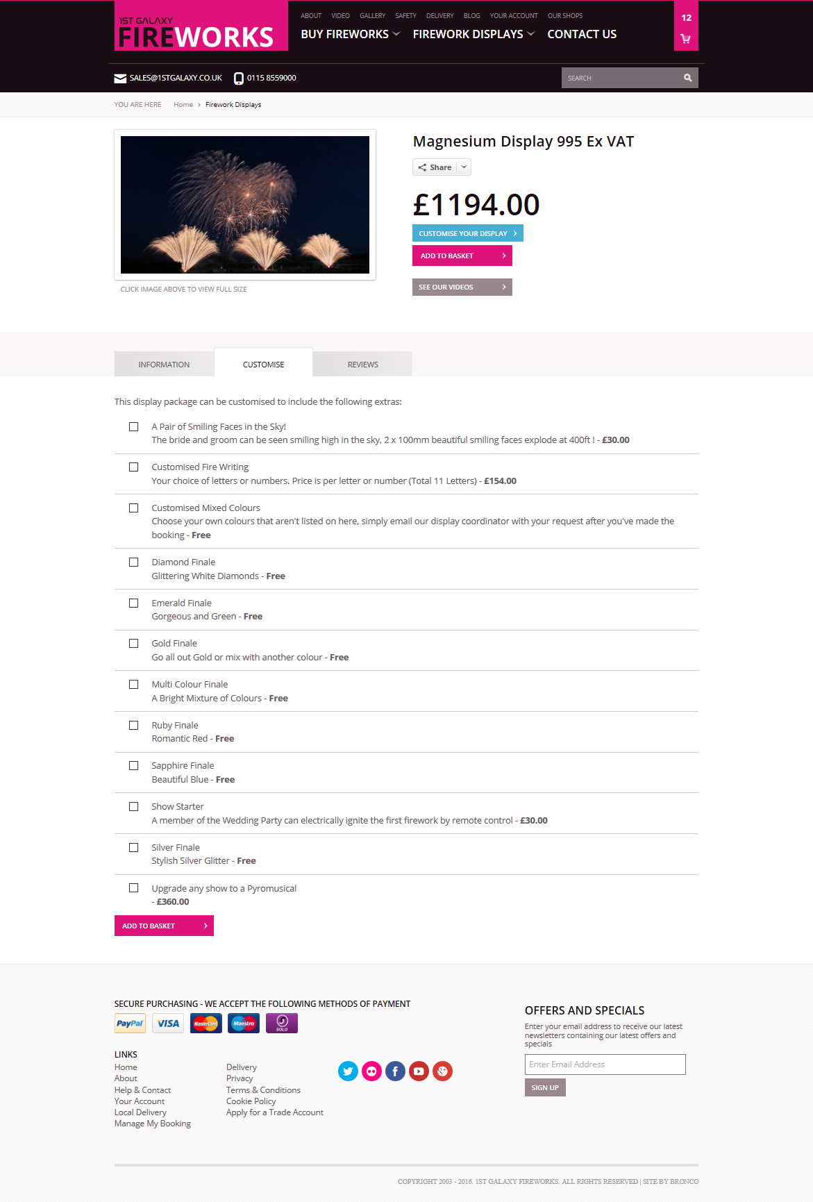
In 2013 the Displays section of the website was a new addition that did not exist on the previous iteration and so it was a part of the website we had less information to work with. Even though the website we created was far different to the one that came before, this version still informed many of the decisions we made throughout the rest of the website. But for the Displays we had less information to work with. While we gathered all the information we could we were never 100% sure how both the client will populate this section and how the user interacts with it.
This time around we had far more information and were determined to vastly improve this section in two specific ways. The first of these was to streamline the booking process…
In the previous website displays and products could all be added to a single shopping basket/cart yet the website would not allow you to purchase both product and displays together, nor did it accommodate the user adding multiple displays for different venues. In this version of the website the user bypasses the original basket step of the process to ensure they can book a single display quickly and easily without any barriers such as those I’ve described. Simply by removing such barriers and making the booking process easier we expect the client to see an uplift in bookings.
For the display pages themselves the design around customising a display was very weak. The options would be within a hidden tab, unordered and the main button to show these competed for attention with two other buttons.
In this design we made sure these options were visible, though often required the user to scroll. Had a much more visually appealing design with CSS animations to add an extra level of interest. And lastly given these may require the user to scroll to be visible we added an extra touch of a hand drawn arrow on some screen sizes to help drive users down toward this section prior to booking the display.
Refinements all-round
One of the side-effects and benefits of moving from a fixed-width website to a responsive one is it forces a re-think on every part of the website to ensure it will work on both a functional and a design level in a more fluid world.
For 1st Galaxy this means some sections are a little closer to their previous iterations while others are completely different. Why? Well, in some cases as the site has evolved and the longer we’ve worked with the site and the client we feel there are better ways to present and order information that better achieves the business needs and fulfils the user goals. While in others areas keeping things consistent is the best option for user understanding as well as being more cost effective. Not everything has to change just for the sake of it, especially if that change doesn’t bring any benefits.
In other instances the evolving nature of the web brings more toys that we can incorporate into a website to achieve different effects. This might be CSS gradients and transforms that we utilised in the diagonal dividers, but also Flexbox which provides access to more varied and fluid layouts as well as the ability to re-order elements depending on screen size.
This is all due to 3 years additional expertise in each of the team members working on the project; all who were part of the team building the last iteration. With this additional experience it allows us to achieve a better product through a greater understanding of more complex ideas as well as new techniques we’re learnt on previous projects or specifically for this project.
An explosive future?
With the website just launched it’s too early to tell how the new website will be received in regards to design, usability and functionality. With integrated stock and order control now added between the website and the bricks and mortar stores we’re sure that on a business level the website will lead to a more streamlined service overall that will benefit both our client and their customers.
So far we do know that the client is happy with the work we have produced. But of course with the client not within their own target market this isn’t our ultimate method for measuring success. Instead it is how our client’s customers respond and how the website succeeds in regards to traffic, conversion and turnover/profit that has to be how we measure how successful we’ve been.
Over time we hope the client will see the benefits from a new design, better usability and a responsive design that makes the site more accessible to a wider audience. And we look forward to integrating future ideas the client brings to us as their business continues to evolve.
Share this case study
Like what you’ve read, then why not tell others about it... they might enjoy it too