Shiva

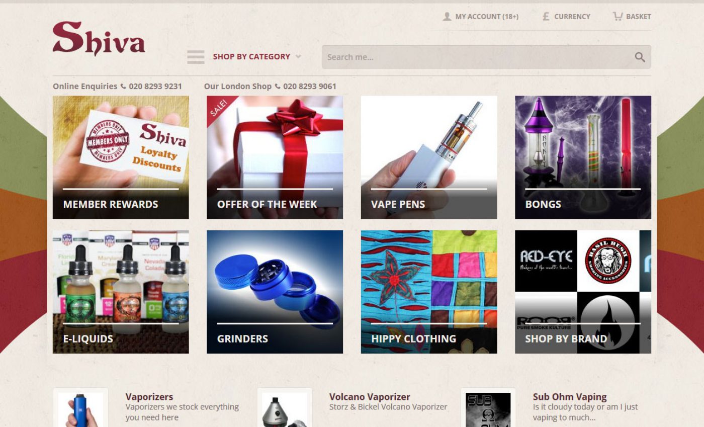
It’s the nature of business that some relationships are brief while others continue for years. Shiva is a company that we have worked closely with for many years; constantly tweaking and developing their website.
But when you work with a company like Shiva, whose previous website launched in 2007, it can be painful to see a design go unchanged when you know there is so much to be gained from a redesign.
Finally the time was right and Shiva asked us to begin work on a redesign.
Responsive Much
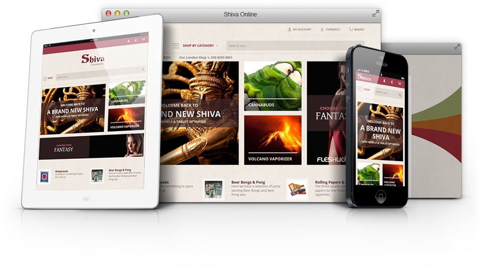
With so much to be gained from Responsive Web Design (RWD) techniques it seemed dumb to bypass the opportunity to make the next version of Shiva responsive.
As our first responsive e-commerce website we had to revisit many of the techniques and processes we used to ensure they worked effectively on a much larger scale.
In researching a number of other responsive e-commerce websites we found that many that were built using RWD techniques had put in place certain limitations making for a less than fluid solution. Instead these websites would jump at certain breakpoints rather than flowing smoothly to fill the space at any screen size. In some cases these websites would return to a fixed layout for sections such as the checkout creating an odd experience for mobile users.
Our goal was to make sure the Shiva website was completely fluid improving on the limitations of these other websites.
Easier Shopping

One thing that bugged us about the previous website was the complexity of the purchasing process. The checkout was not user friendly and the shipping value could only be displayed after the basket. The only advantage we had over many other e-commerce websites is that we didn’t require a user to register in order to buy.
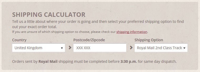
In implementing a new Shipping Calculator directly into the basket we’re able to make buying from Shiva a more honest and clear thing to do. Now a customer knows exactly the cost of their order from within the basket and only when they select a shipping option can they proceed on to the checkout.
Then when they do arrive at the checkout these pages have a much more scaled back design which removes all distractions and gives the customer a clear process to follow from entering their name through to filling in their payment details.
Our Favourite Addition
It’s got to be these little guys.

We think making an emotional connection with a user is an important part of web design, when appropriate. But every person is different so how powerful a connection is really depends on the individual.
With these stars we hoped to add something that makes people smile as well as provide more meaning to the classic 1 to 5 star rating. By making the 5 star happy and the 1 star sad we provide users with additional information about what a product rating means.
Share this case study
Like what you’ve read, then why not tell others about it... they might enjoy it too

