Thomas the Baker

At time of writing Thomas the Baker (TTB), a family run business, has 35 high street bakeries across Yorkshire and the North East. While not so recognisable outside the region, it’s a well-known and well thought of alternative to larger bakery chains.
With Sian, the grand-daughter of Chairman and Founder John Thomas having worked at Bronco for a number of years you’d think our winning this contract would be a case of who you know. But that would be a dis-service to John and Simon (Sian’s father and General Manager) who are shrewd businessmen who wouldn’t risk hiring an agency without first ensuring they could deliver a website that meets their needs and, we hope, surpass their expectations.
Time for a change
When first looking at the pre-existing Thomas the Baker website it was clear that we could make a number of big improvements to the site.
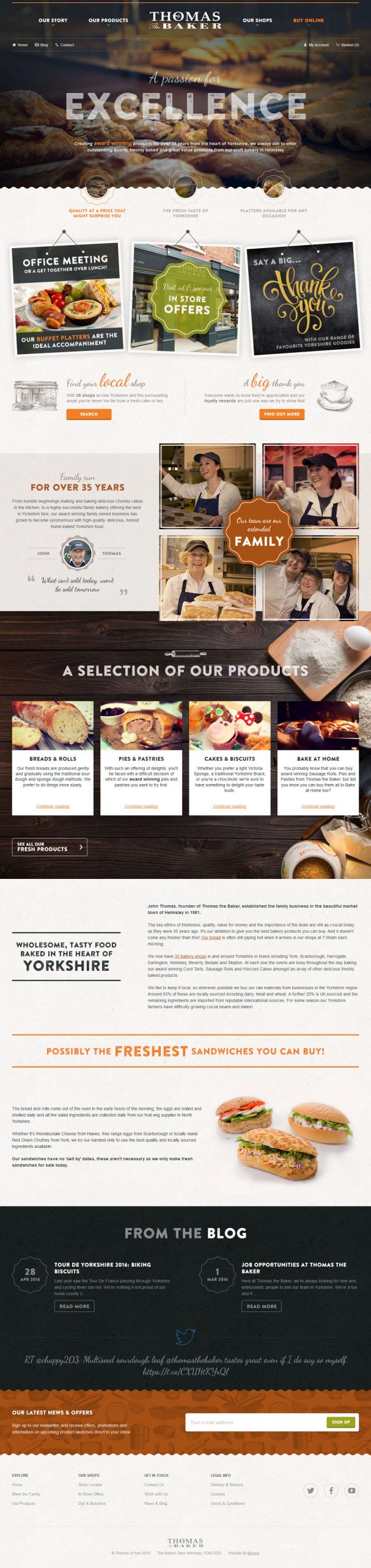
Firstly we’d make the next website responsive and ensure we’re delivering an experience tailored to a variety of devices as more people browse the web through phones and tablets rather than traditional desktops.
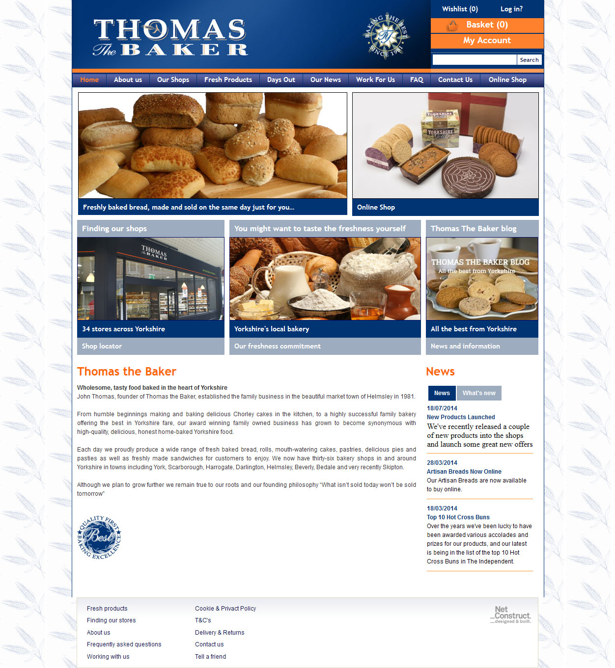
Secondly the design was really showing its age and would benefit from a more modern look that adhered not only to newer online design trends but also the evolved branding of TTB where particularly the primary blue of the old website had been largely replaced by a darker grey/blue mix.
Lastly the website could benefit from being tightened up with lots of low quality pages either merged or removed to create a more streamlined journey for users throughout the website. We’d also push all the site within the single thomasthebaker.co.uk domain, utilising sub-folders for specific sections. This would remove the oddity of having static pages, including the homepage, located on a sub-domain separated from the online shop that used the main domain.
Offline vs Online
When Thomas the Baker first came to us one of the primary reasons they were looking to update the website was to provide a better platform to promote and sell their Platter products; a range of tray based items that could be purchased online and collected fresh from your local store.
While many of our E-commerce sites are focused on selling online with TTB it felt inappropriate to push online sales as the sole focus of the site when the largest company revenues come from the 35 high street bakeries. While necessary to deliver a site that will grow the online revenue stream we knew that we must also support the offline side of the business as well.
This manifested itself mostly on the homepage and navigation. Rather than have both dominated with shop categories or special offers covering the bulk of the homepage we attempted to create a balance with the sections relating to the shop and various other parts of the site. Yet, to give that extra little focus in the navigation, we did alter the styling slightly on the Buy Online link in a way that gives this focus without adversely affecting the rest of the navigation.
Streamlined content
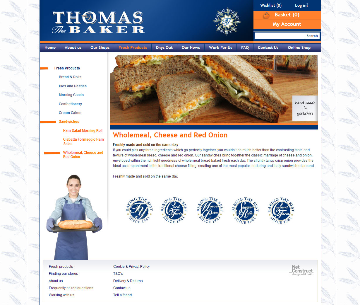
As we dug through the old site we came across a wide variety of pages which we considered low quality either due to their lack of content but also the subject matter. For example, we weren’t convinced the website needed a page specifically about Wholemeal, Cheese and Red Onion Sandwiches.
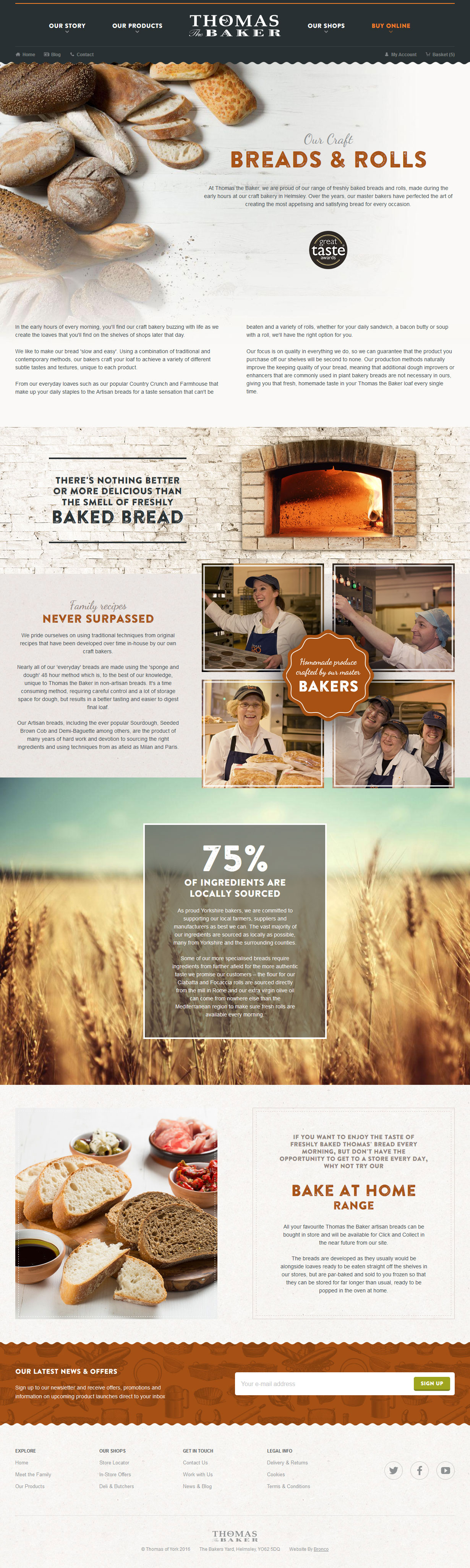
Our goal was to simplify the content, reduce the deep hierarchy of pages and give a more general overview within the Our Products section so that rather than have separate pages for Breads & Rolls, Bread Loaves and Bread Rolls we would combine and rewrite all this content to provide a single page that is more visually dynamic with engaging content.
Another important change we wanted to make to the content of the website was to reinforce the fact that Thomas the Baker is a family business. This doesn’t just include the three generations of Thomas’ working within the company but also the other members of the team that have worked for the company for years, decades even; who the Thomas family see as an extension to the family.
In addition to this, the fact that all ingredients are either locally or ethically sourced creates a positive impression of the whole company. While being family run, or even sourcing ingredients that are either local or ethical, doesn’t necessarily mean a better tasting sausage roll it often creates a more positive impression of a company. This positive impression about a company who treats its employees and suppliers well can be the deciding factor between a customer visiting Thomas the Baker or one of its more faceless competitors.
On brand with no unified brand
When starting any design project we will ask a client to send across their existing design materials, examples of other websites they like and also a list of competitors. From this we create a design that fits the client and which the user will find engaging.
With Thomas the Baker their existing branding was rather diverse. As expected different product lines would adopt different design styles based on their perceived quality. For example, a sourdough might have a more classic design than a sliced white. But outside of this there were other deviations in the brand, possibly due to a number of factors.
For us it was necessary to try and pick out of this a coherent style that could be applied to the website whilst retaining the freedom to express what we felt would work best in this medium. We therefore zoned in on one particular piece of packaging that we felt aligned with what we knew about Thomas the Baker and it’s positioning in the market.
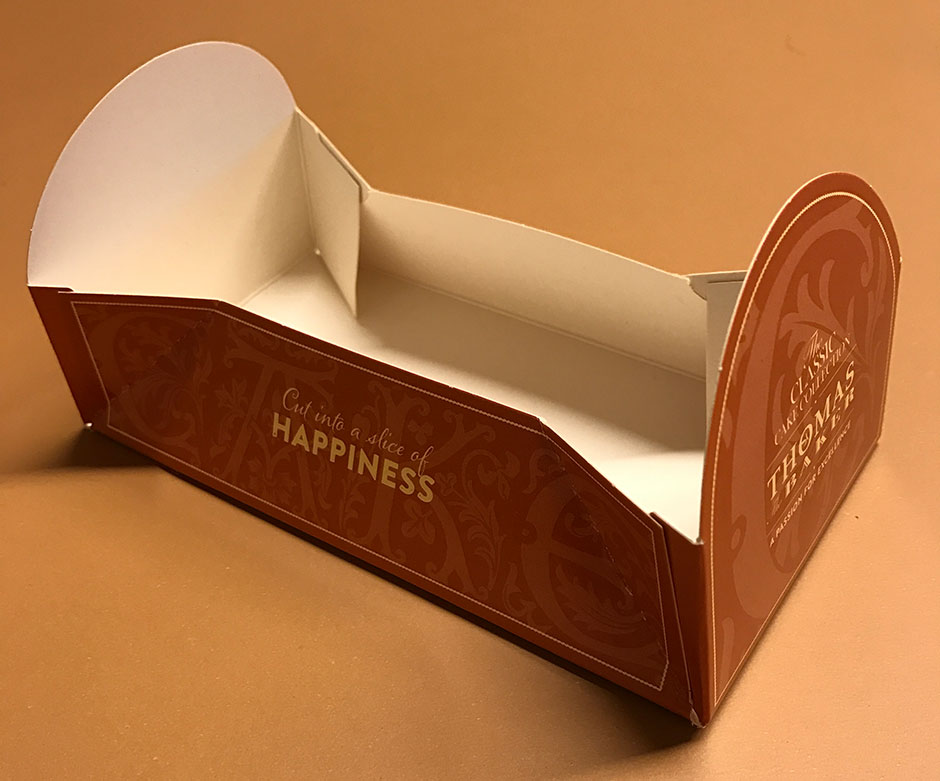
From this we brought in the existing brand colours scheme (with a few tweaks to work on screen) and added Arial to the two main fonts we extracted from the packaging above. Our choice of Arial was dictated by having to restrict our use of non-standard fonts. With Dancing Script and Brandon Printed One already contributing a lot to the overall download size of the site, using a standard system font was our only choice to balance style and speed.
Some technical mastery
The Thomas the Baker website isn’t about creating functionality that sets it apart from its competitors. Being at the bleeding edge of web technology isn’t going to have vast appeal in their marketplace. Instead our job was to take more common functionality and make sure it works well for their customers.
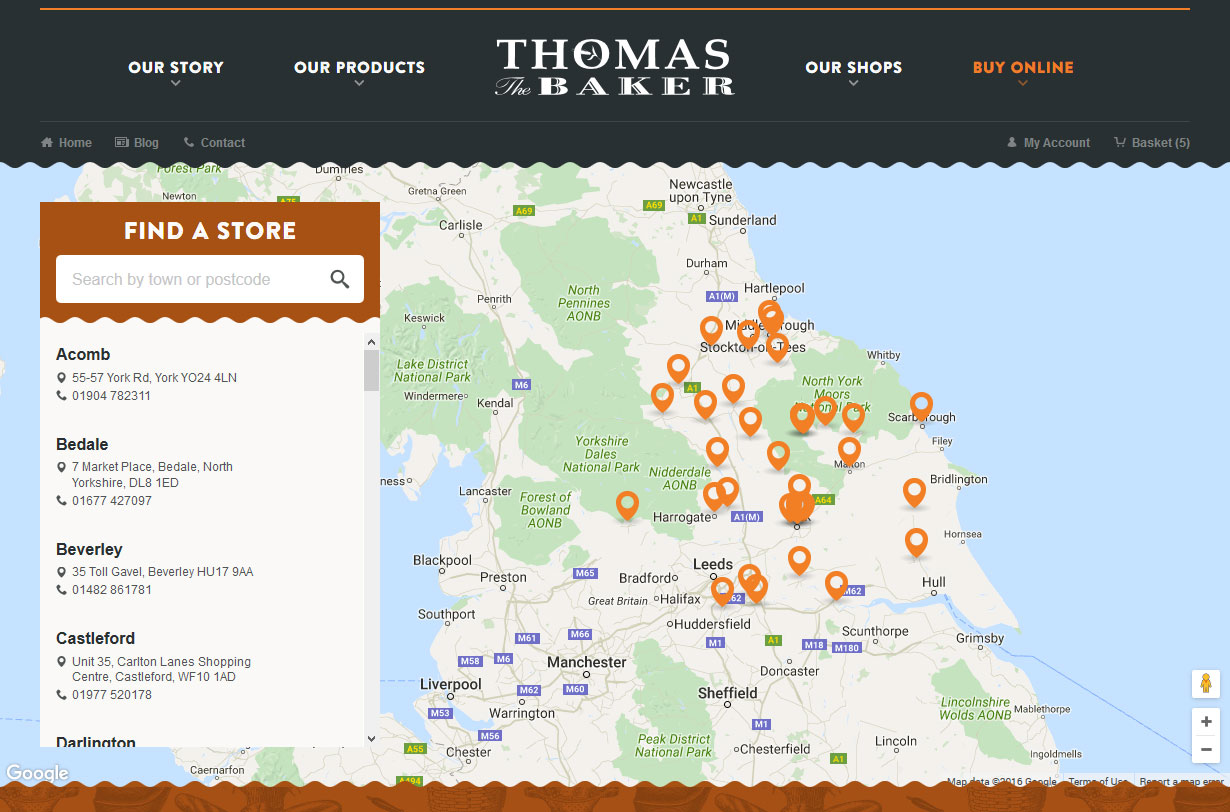
The first instance of this is their Store Locator. The existing website had this split across multiple pages for different regions displaying contact details within a Google Map as well as on individual pages. The postcode search would also error in some instances. We knew we could take all this functionality and streamline it.
Now the Store Locator is in a single page, mixing the map with the text list of locations and with a search feature that works all the time thanks to the Google Maps API. Much of this comes from the new design that provides space to enlarge the map and overlay the search and stores list over the map rather than below the map where it’s less visible.
The store locator also leads to the Click & Collect functionality that is a big part of the online shop; with their Platter products available only to pick up in store. While Click & Collect is a feature we’ve integrated into other E-commerce websites this is the first time we’ve also had the ability to search and select the specific store for pickup. In addition to a datepicker for selecting the date the customer wants their order this is a great feature for customers that we hope will help grow this side of the business.
A tasty conclusion
As the website goes to launch we think that the end result is a great representation of Thomas the Baker. The design aligns as best it can with their offline branding and their store fronts. As an aside to this project we also undertook the design of their latest Platters leaflet to deliver a design in-keeping with the website.
Having just launched (at time of writing) it’s too early to tell if the website has delivered on the goals of the client or that users are finding the website easy to use and engaging. However we do know that the client is very pleased with the result and we hope this is the beginning of a long partnership.
Share this case study
Like what you’ve read, then why not tell others about it... they might enjoy it too