Making responsive websites easier to understand

- By Kean Richmond Web Designer
- Published
- Category Web & UX
Update : The resource mentioned in this post is no longer available. We have chosen to retain this article but remove any inactive links.
Blank faces. This is the response you’ll receive when you mention responsive web design to some clients. In the web community it’s an understood term, one we could talk about for hours but for clients it doesn’t really explain what it is within the term itself nor is it always so easy to explain.
You can try and simplify it by saying it’s about creating a fluid website that adjusts to the screen size of the user. But this doesn’t go into the speed implications or the advantages and disadvantages of this technique over separate websites or native applications.
We can try and explain all this to our clients but the starting point has to be understanding that a responsive website is about delivering a single, optimised website for any screen size. It’s something that they can easily observe.
Make it Visual
Up until recently we didn’t go into all that much detail about responsive web design on our website. It would need a page of its own to just scratch the surface; so we built one.
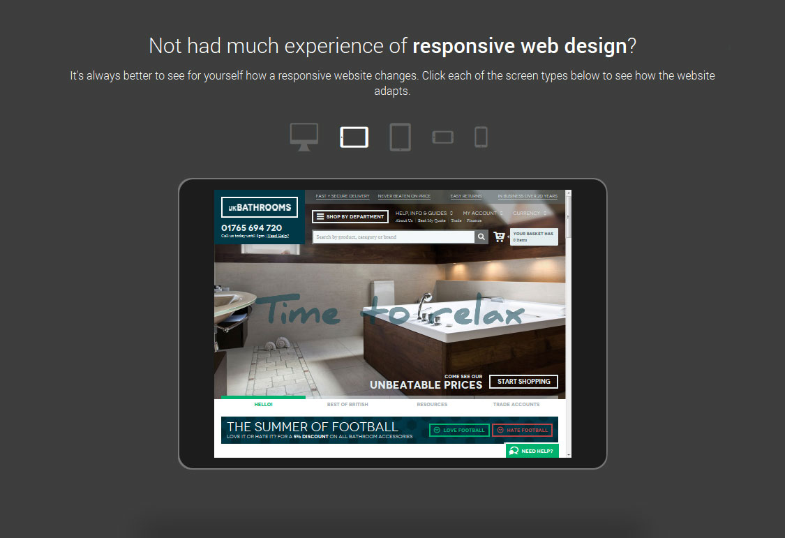
We’ve not exactly done anything revolutionary here, we try to explain what Responsive Web Design is, what benefits it provides and also show some of our existing responsive clients. But the main goal for this page was to try and show visually what a responsive website looks like, without the user needing to mess around with multiple devices or the width of their browser.
So we created a small preview of five devices sizes that animate to show how a website alters between different screen sizes. Sometimes these changes are subtle whilst jumping down to mobile sizes can result in a big change to the layout.
The preview isn’t perfect but it tries to show prospective clients the fluidity of a responsive website and how the website design changes. It doesn’t explain everything but it starts a conversation and also gives users a solution to the question of having a mobile friendly website; something most clients are now becoming more aware of.
The Next Step
Rather than show just one responsive website why not let users test their own website to see if it’s responsive or if not how it survives on different devices. We created a more tailored page dedicated to this task.
But there are limitations to the page. The first being that some website such as google can’t be tested. They actively block their website from being visible in iframes on different domains. Instead we simply get a black screen. It’s a shame but I don’t think this page is really aimed at Google.
Secondly there are some technical limitations that result in us displaying this screen…
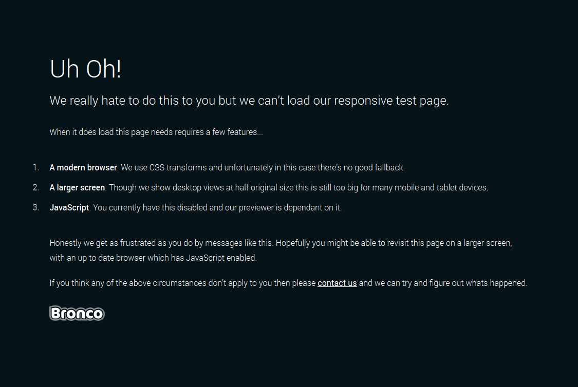
We hate restricting access to webpages due to these kinds of things but the biggest issue is displaying the desktop preview on small screen sizes where it just won’t fit.
To find out more about responsive design either go to our services page or get in touch.