How To Maximise your Reports in Google Data Studio

- By Steve Robinson Digital Marketing Executive
- Published
- Category Content & PR
Are you wanting to present weekly or monthly data to clients effectively and efficiently? You’ll find there are many ways to present your data with various software and tools out there. But let’s talk about Google Data Studio, a popular online tool that makes things easy to use and digest.
Google Data Studio allows marketers to create reports and dashboards based on data from a variety of sources. We’ll discuss how to get started using Google Data Studio, how to correctly format and style your report, and we’ll also discuss some handy tips for using the online tool.
But why use Data Studio?
Creating detailed reports that are easy to comprehend has been made achievable with Google Data Studio ever since 2016, and the tool has been free to use since 2018.
You can make informative and easy-to-read dashboards and reports from your data. This allows you to present your monthly or weekly metrics to clients and your colleagues effortlessly.
You will know how to manually pull your data from Google Analytics, Google Ads or Facebook Ads Manager, but these tools can be overwhelming if you don’t work with them all the time. Clients may want an easy to view, short report that gives them a quick overview of weekly or monthly progress.
Benefits of Google Data Studio
There are plenty of benefits so that you can best achieve your reporting strategies.
- Google Data Studio is free to use.
- Multiple colleagues can edit the same document (just like Google docs).
- Your reports are easily shareable with 1 link or you can download a PDF version.
- Clients don’t need to have a Google account set up in order to view the report. They only need the link being sent or the downloadable PDF.
- With the link granted to clients, they can easily navigate and select monthly date ranges to see comparisons. They can also view interactive widgets and see data over time.
- Summarise and combine your data sources into 1 easy to view canvas.
Getting Started
1) Head to Google Data Studio
2) You will need to set up a Google account to edit reports and data sources.
3) Once you have your account set up and logged in, click “Create” top left and select “Report”.
4) Then, you will see a range of connectors that will look like this:
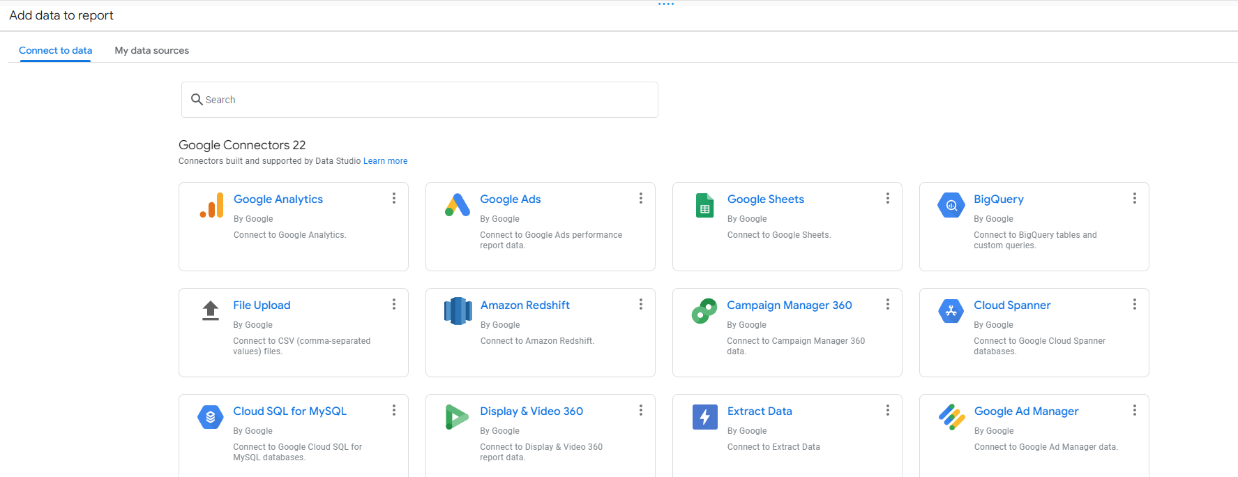
You will find all kinds of metrics that you can use to pull into your report. Gathering data from several sources, including Google Analytics, and assembling it into one report that is easy to edit, share, and read.
Also, the platform features graphs, charts, widgets and maps to visualise your data.
You can also use the search bar to quickly access the metric you want.
5) Select your chosen data source you wish to pull in. Your Data Studio report will now update to include your brand new data source.
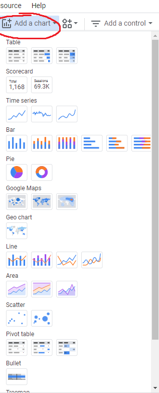
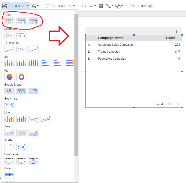
6) Next, we can pull that data into the blank report canvas you’ve just created by adding a table. We can visualise and create this data in many different ways from bar charts, pie, line, scatter and many more options. Visualise how you best want to present your data and click “Add a chart” and select your new table.
7) Click onto your new chart and proceed to the right-hand side, you will find two tabs, select “Data”.
Inside the data tab, you can now include the new data source from before and easily set up the metrics you want to display. You have full control of what you want to display and the metrics you do not wish to display. Click “Select Data Source” and now the new data source you pulled in will be ready to select.
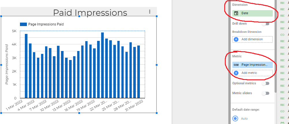
To change dimensions or metrics, simply select the appropriate field inside the data tab, and find the metric you wish to include. You can add more than one metric and you will find several options in there, to speed things up you can manually search for what you’re looking for. You can also rename your dimensions and metrics for ease of use.
Now that you’ve successfully selected all the data you want to showcase, we can now style it and present it professionally.
Styling
Using the same example from the previous steps, select the chart you added to your report and select the “Style” tab.
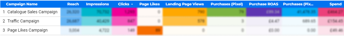
Here, you can present your data in many different styles to better showcase a simplistic breakdown. The table option is one of the easiest ways to digest information.
You have 3 table options available.
- Table
- Table with bars
- Table with heatmap
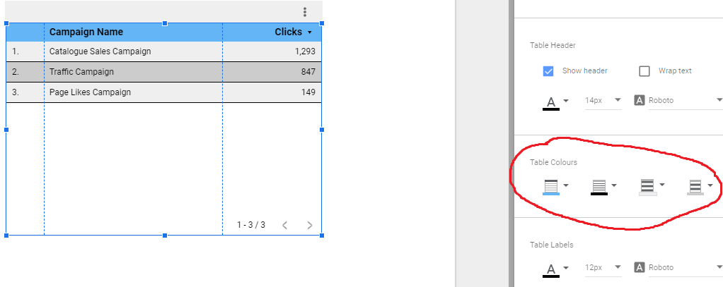
You can then find and tweak table colours:
- Header background colour
- Cell border colour
- Odd row colour
- Even row colour
If you wanted to highlight a specific piece of data, you can easily do this with the table colours option. Also, you can make your table stand out and easy to visualise.
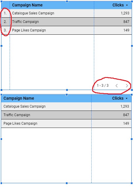
To remove the bottom right pagination, and to also toggle on/off the row numbers, you can find these options in the style tab under “Table body” & “Table footer”.
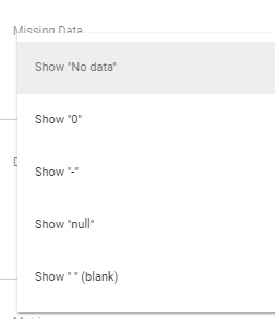
If data is unavailable in some of your segments, but you still want to display the available data you have, you can mark this blank data in the “Missing data” section.
You can also add a filter to your chart by excluding certain data that is either missing or not relevant.
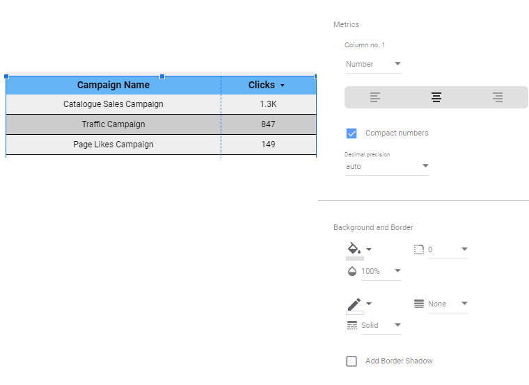
Within your table, you can also align your data to how you want it and compact the numbers so they’re easier to read, for e.g “1,293” would be rounded up to 1.3k.
If you have included lots of metrics and you’re wondering how to squeeze all the information in, then you can carefully adjust the font size, adjust the width of the table and further extend your information so it can easily be showcased. For example:
Now that you’ve successfully formatted your table with all the relevant metrics you want and learnt how to style it. Let’s move on to styling the rest of the blank report canvas.
Styling Your Report Canvas
It’s important to get the right balance with your report. You don’t want to overload it with information, however, you do want to get your message and data across.
There are templates you can use to get started quickly with different colours and formats, but we’ll go through how you can create your report to look something like this: (minus the blur of course 😉)
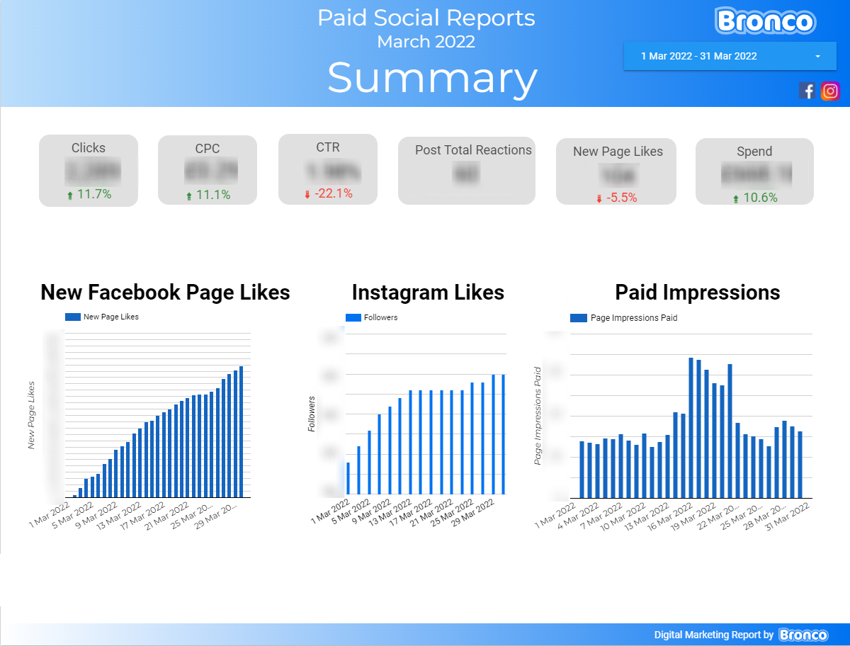
Also, how to set up multiple pages if you need more than one page to fit your data in.
Let’s start by adding in some shapes.
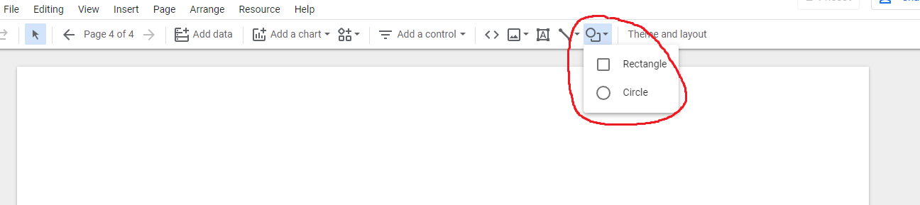
My personal choice is the rectangle. Adding shapes to your report will simply make your text, logos and any data stand out.
Top tip, if you are needing multiple pages for your report, you can save yourself some time by making all fixed designs you create at the report level. This means, your multiple pages will carry across your headers, logos and anything you wish to grant report level.
The report level can be found in “Arrange” and then “Report level”. You will know this has been successful if it says “Make page-level”.
To add new pages, select “Page” and “new page”. Then, to edit page names, click “Manage pages”.
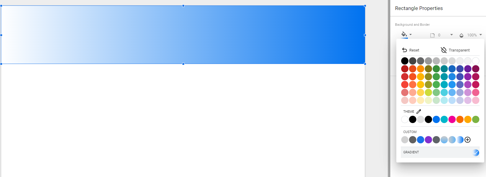
Select your new shape and align it so it fills the top. Once selected, you can tweak the colours to better match the logo and style of your choosing.
I personally like the gradient effect.
Once you’re happy, we can move on to the next step.
Next to the “Shape” option, you will see “Text”. Add your new text box and overlap the shape you created. If your text has accidentally faded into the background, you will need to make your text report level, as well as the shape, inserted.
Select your text box and on the right-hand side, you can align it, resize it, and create background and borders.
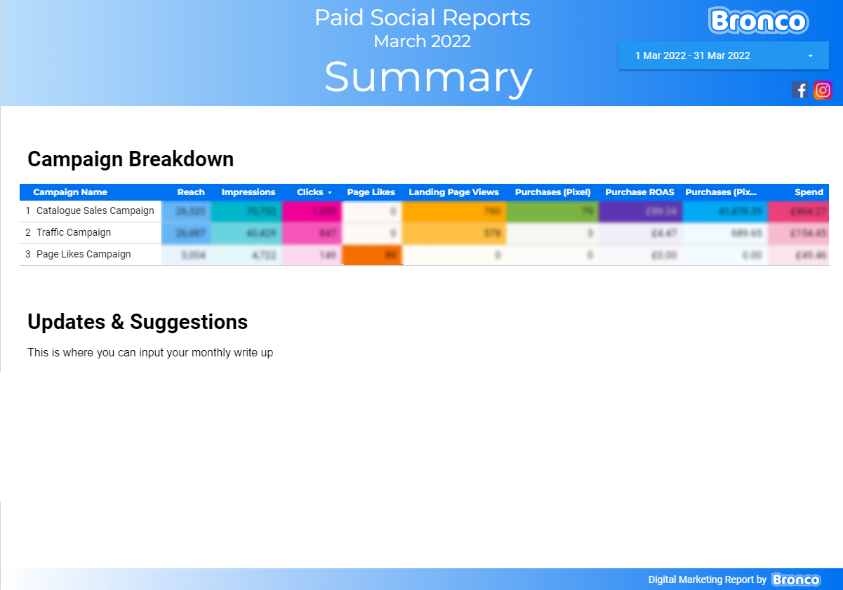
Here’s an example of how you can set up your report:
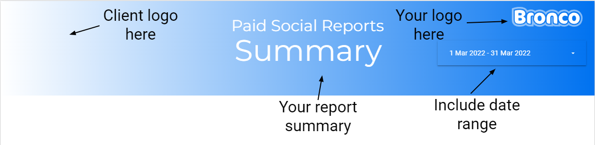
Include the report summary of what your report is showcasing in the centre.
Include your client’s logo as it’s directed to them about their data.
Your company’s logo or your own logo is important to include for professionalism. Click insert and image.
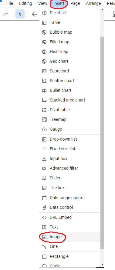
After clicking the image, you will see a box appear. You can reposition this box and on the right-hand side you will see “Image file” or “Image link URL”. This is how you can upload your logo.
Next, include the date range for your data. This is also important to add to your report. This allows you to see data over time. You can choose specific dates, daily, weekly or monthly.
To add a date range:
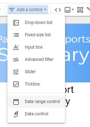
Once you’ve added “Date range control” you can tweak the dates you wish to include. You can also style the date range in the “Style” tab.
Next, you can add a smart footer for your report, along with the chosen way you wish to showcase your data. Graphs are a great way to showcase progress in an easy way to digest.
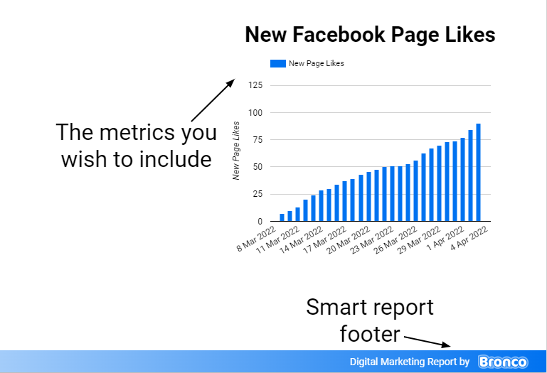
When you insert graphs, head to the “style” tab on the right-hand side and tweak the settings to better showcase your results. The “show axes” will benefit your graph and provide an easy to read structure.
The great thing about Google Data Studio is any changes you or your colleagues make inside the report, you can see those changes unfold live.
Try out the “Scorecard” in the “Add a chart” section. This allows you to pull your data into a text format. With your previous data range in place, this will update your report each week or month as you set it up accordingly.
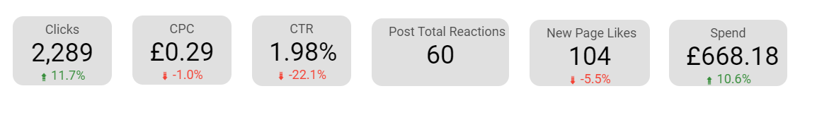
You can format your scorecard, just like other designs we’ve learnt, by aligning it, resizing and creating colour borders.
To include the positive and negative styles underneath your scorecard data, on the “Data” tab underneath “Comparison date range, select “Previous period”. Now you can see the positive and negative changes.
Final Say
I hope this guide was useful and you have found some new ways of displaying your data. There’s plenty to learn with Google Data Studio and there are multiple options to wrap your head around. Once you’ve got a report that’s easy to visualise, a basic report canvas to work with, you can then pull in your weekly or monthly data to showcase to colleagues or clients productively.