Rewinding 11 years of web design

- By Kean Richmond Web Designer
- Published
- Category Web & UX
What follows is an experiment in professional embarrassment. In just a few months I’ll be marking 11 years working as a professional web designer; all of that time spent at Bronco. Less a job, more a life sentence at this point 😉
To mark this milestone, and because Becky suggested such a post when an old client recently got in touch, I thought I’d reflect on some of the early designs I produced when I started working at Bronco over a decade ago.
Clearly in that time the web as an industry has grown, as too have my skills. So what comes next are designs that represent a moment in time and I hope looked better at the time, even if they’re rather dated now. So here goes…
Rewind
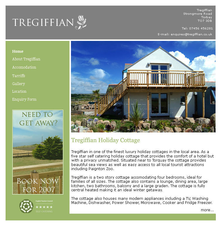
Tregiffian
Part of my interview process involved creating this design that as well as helping me get this job later became a fully functioning website where the original design remains to this day.
While it clearly shows it’s age through the adherence to a two column fixed layout and small type the simplicity of the design means it’s held up better than others that dove more into the particular trends of the day.
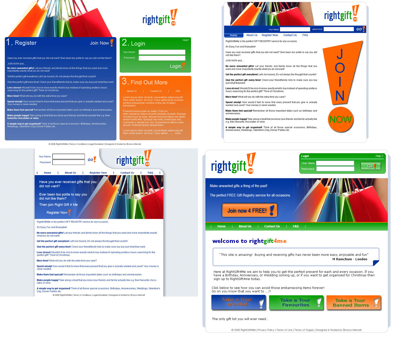
Right Gift 4 Me
These were the designs I created on day one at Bronco. It’s the only time in 11 years I’ve created multiple initial designs for a client and I have to cringe at all of them.
At a time where border-radius and box-shadow required the use of imagery rather than CSS any of these designs would use a huge number of images in build. The right most option is the closest to the launched website, but unfortunately the business didn’t go on to great success.
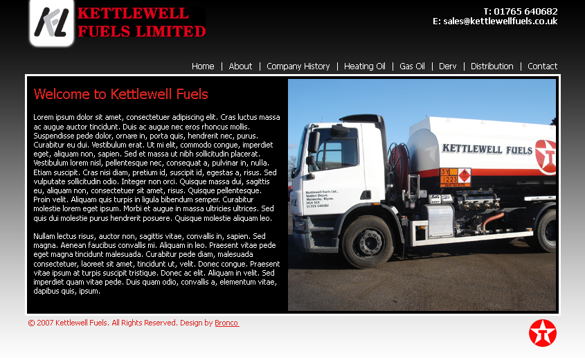
Kettlewell Fuels
Kettlewell’s design was heavily influenced by their existing colour scheme which in turn was inspired by their association with their supplier at the time; Texaco. Their existing site (not one of ours) maintains this approach but in the intervening years they’ve changed supplier.
There’s not much to like about the design, but the big points of pain are the small font size and the logos. Though dictated by what the client supplied the mis-matched logo on the website compared to the one on the vehicle doesn’t suggest a very cohesive brand throughout the company at that time.
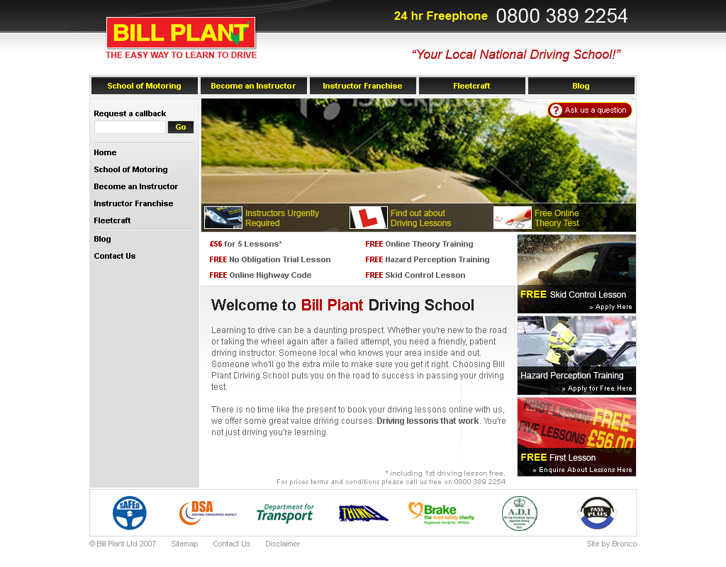
Bill Plant
Moving into 2007 the Bill Plant website proved a lot more difficult than some of the previous designs as this was a website heavy with information as well as a number of different sections of the business to accommodate. Functionality and ease of use was really important here, more so than in anything else I’d done to that point.
Remembering the previous iteration of the website, before we took over, I think our design was less visually appealing. However with different requirements due to evolving business needs and client tastes it’s difficult to say now if we could have done better at the time. I’m confident that we’d do far better now and could easily improve upon the existing website as well.
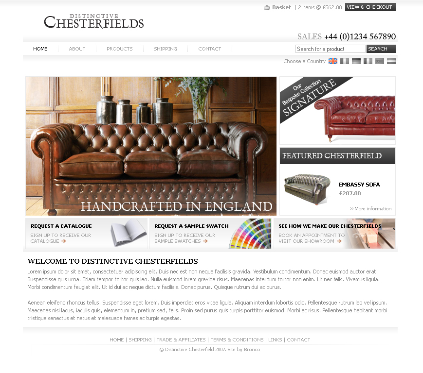
Distinctive Chesterfields
Still a client today, Distinctive Chesterfields, are one of the companies I’ve had the longest relationship with. It’s also a client where I also created the logo as the client hired us at the company’s inception. While the logo has remained the website has evolved, with us making various changes and refreshing the design periodically, most notably with a new design created a couple of years ago.
While this design is rough around the edges with small fonts and a lack of whitespace there’s not really anything that feels too amateurish here. The big issue I see when reflecting on this is that the e-commerce elements aren’t strong enough to give a strong impression that purchasing online is possible.
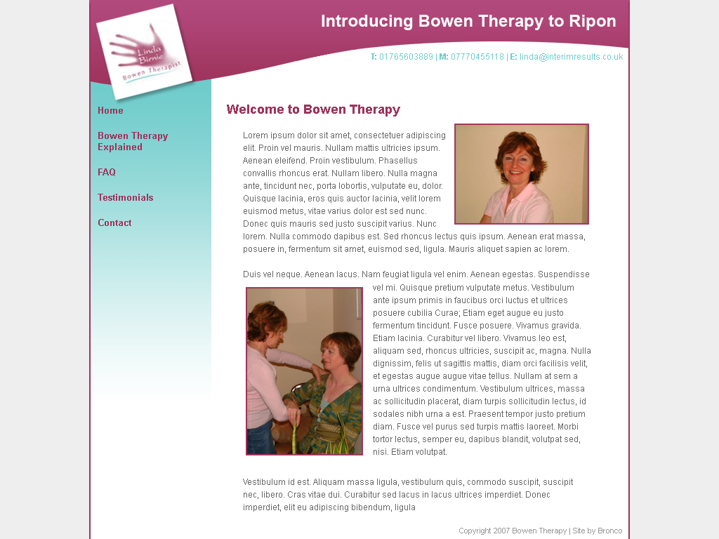
Yorkshire Bowen Therapy
This is another of those websites that remains close to its original design, though with expanded content.
Reflecting on this website I can see the improvements that could be made in a number of areas, but with experience I understand comes greater perspective. Any business ideally must see a return on investment from any spending they make, websites included. For a small business owner such as this it’s difficult to say that an updated website would lead to increased business and so the website will most likely remain for some time to come.
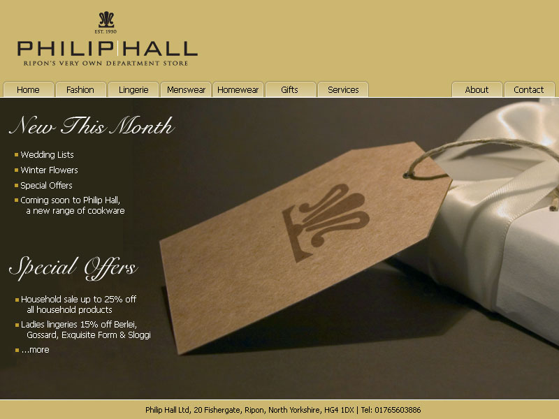
Philip Hall
Philip Hall was a department store located in Ripon, which closed its doors a few years ago as buying habits on the high street changed.
While we went on to redesign a more complex version of the website this first version is very much a reflection of the lack of usable content. While we had fantastic imagery that the client had either commissioned or could source from their suppliers it still left little to work with. Even today a lack of usable content on which to base a design will lead to subpar final product.
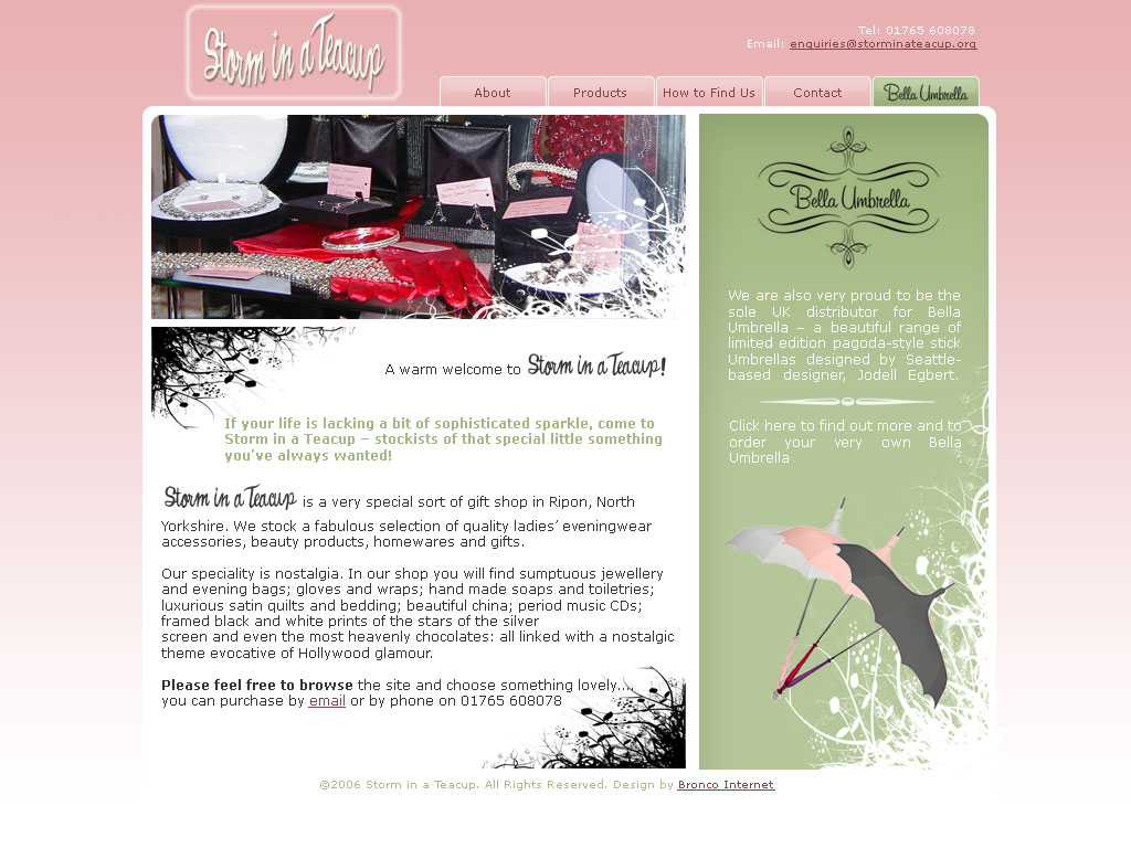
Storm in a Teacup
Storm in a Teacup was another Ripon store that unfortunately is no longer trading. The website was a lightweight ecommerce website selling primarily one product in a few variations while also showcasing other products only available in-store.
This design marks a time where I began experimenting more with imagery and textures to create a more visually dynamic design. The biggest question I would have for past me is “What the hell was I try to do with the blurred border around the logo?”
A popular feature of websites at the time was the welcome message. Whilst largely avoided today it did give a website a friendlier personality. Now alternative methods are used to achieve the same result whilst retaining valuable screen real-estate for introductions that give greater insight into the business.
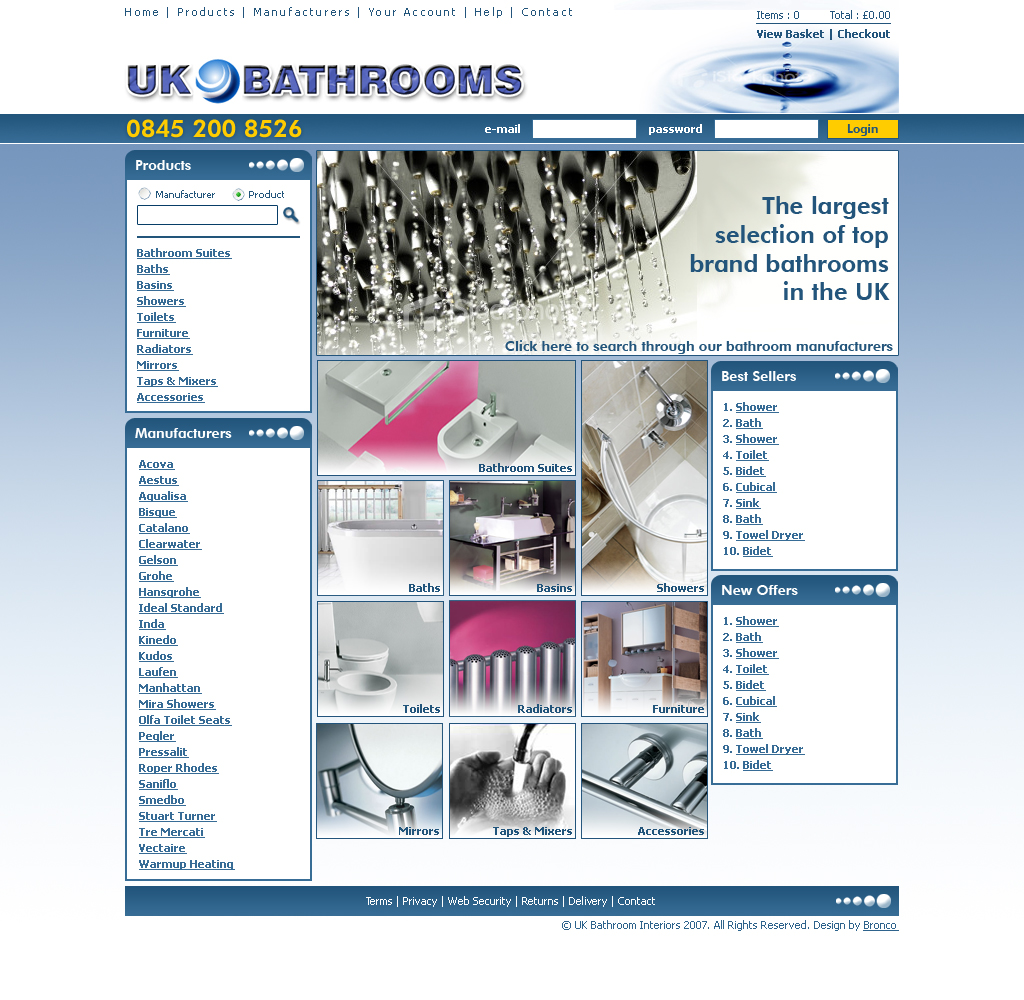
ukBathrooms
The current ukBathrooms website is the third version we’ve designed for this client, and we still continue to amend and expand the website to this day. The first version we designed for this client was one of the first e-commerce websites I had designed and was largely based on a pre-existing website that would go on to run side-by-side with our version for a number of years.
Thankfully over the years the website has grown and with it the design. Though we’ve never been tasked to design the client’s logo the most recent version was professionally created as part of a larger branding exercise. We were able to build on this and provide a more professional design for the website than the early version seen here.
Comparing this and the current website shows the impact that content can have on a design. This doesn’t just mean text but imagery and other features. By building out the elements contained on a homepage and making them more complex, rather than simple lists as seen here you can create something far more engaging.
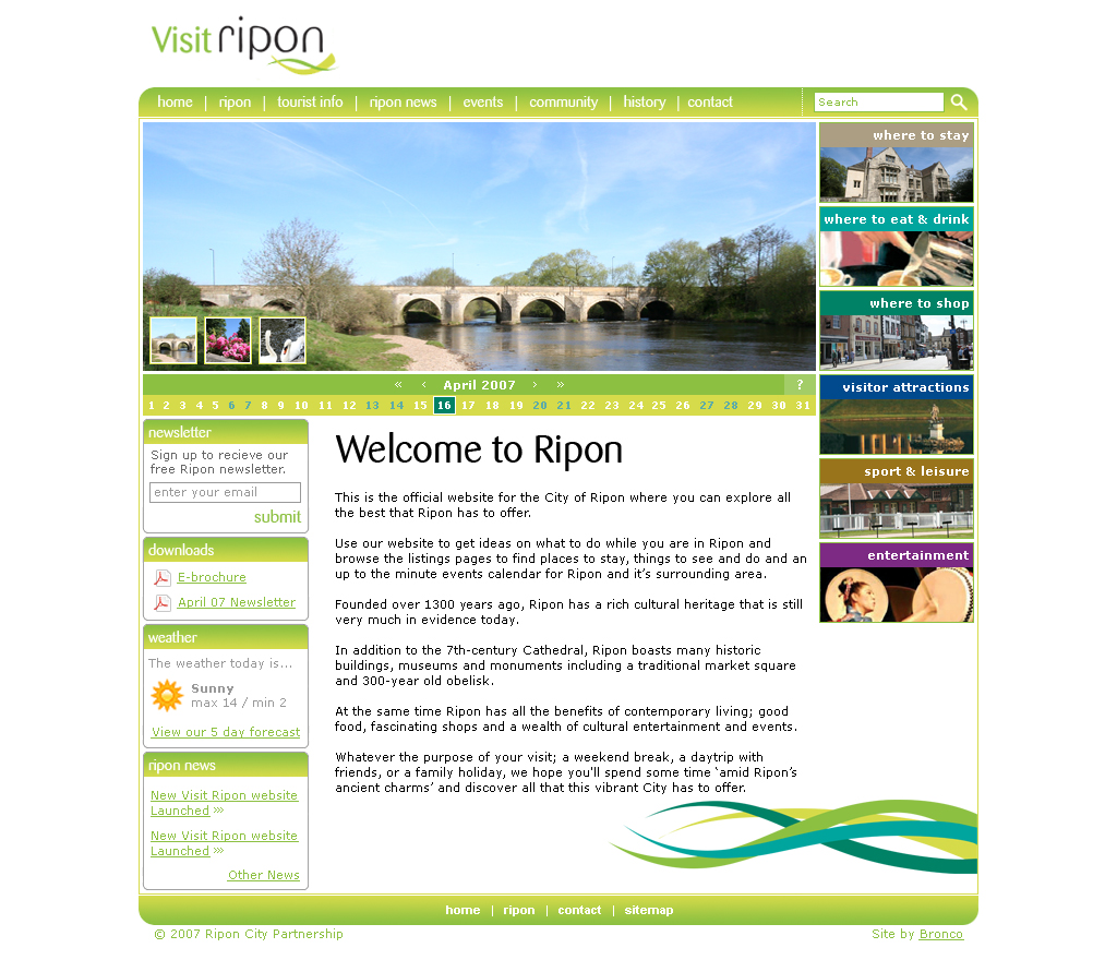
Visit Ripon
When a business has a predefined colour scheme it can be challenging to incorporate this into a website as colours work different depending on the amount of space they fill and in how they interact with other colours.
Looking back at Visit Ripon I feel this is a good showcase of this. While the colours work in the logo they become a little too much in the design, even though there’s no huge blocks of colour and they certainly don’t contrast well with white overlaid text at 11px.
When the website evolved into Discover Ripon some years later and the website was re-developed, again by us, the use of colour was more restrained, instead used primarily for actionable elements.
Fast-Forward
After all that I feel I now need to prove that my work has improved. In addition to the current Bronco website here’s some of my most recent work that I’m confident look and work better than what I produced 11 years ago.
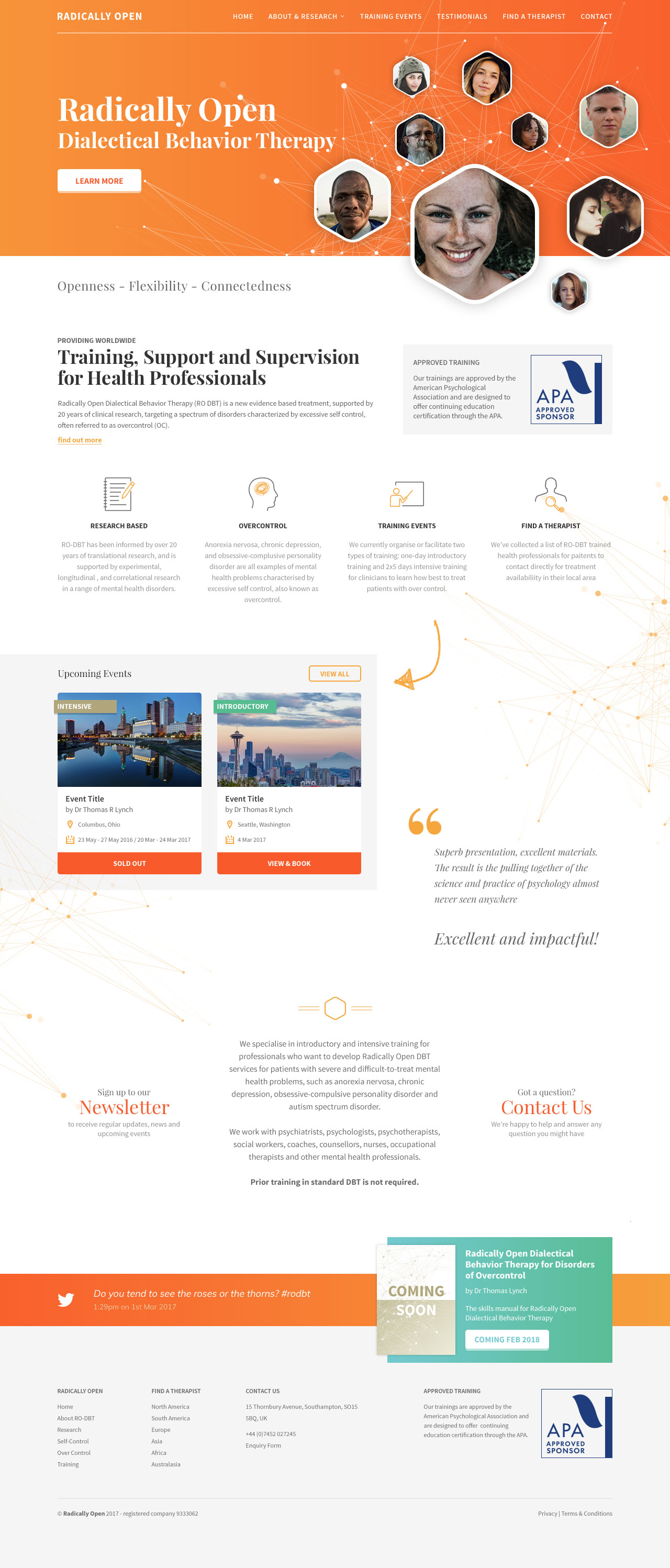
Radically Open
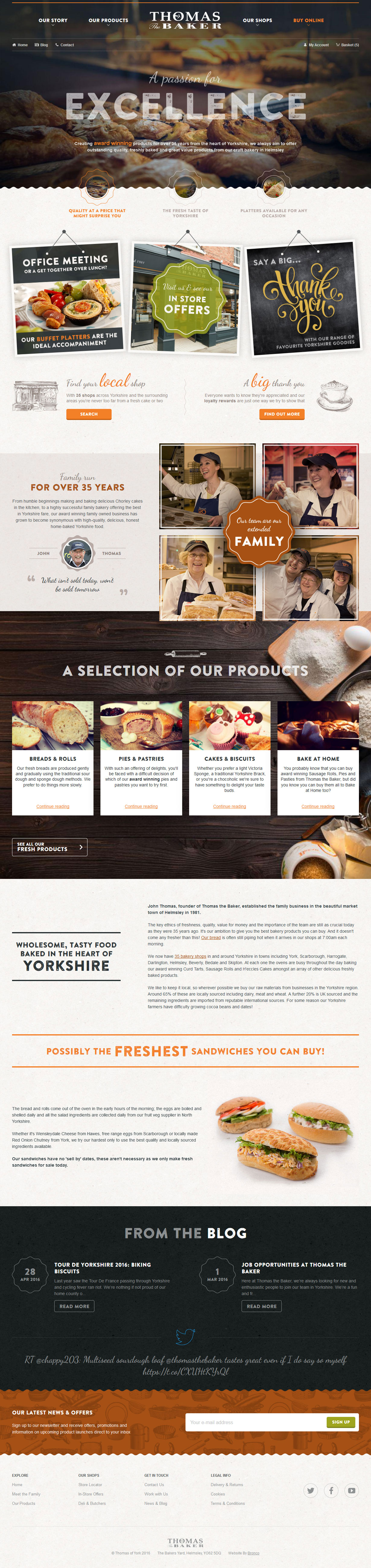
Thomas the Baker
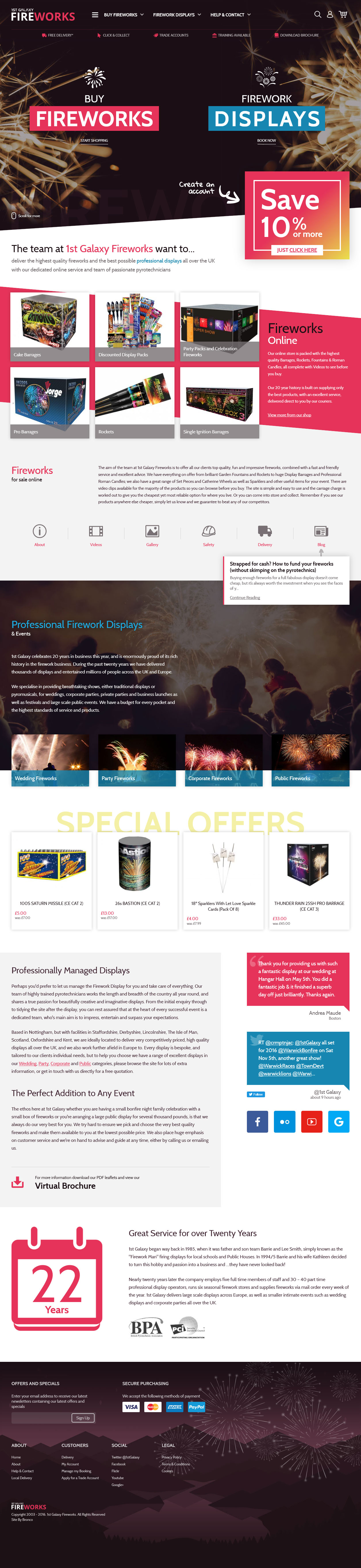
1st Galaxy
Pause
While reflecting on some of the websites above there were a few things that occurred to me that I’ve done that have helped improve the work I’ve created over the past decade. It’s not just been a case of practice makes perfect.
Here’s a little insight to what I’ve learnt along the way…
It takes 3-4 years
It took me around 3 years until I started feeling confident in the work I was producing, while I can look back now and see issues in these designs it was certainly at this point that I began to feel that the work I was producing had taken a leap forward. I became more thoughtful and restrained in what I produced ultimately creating results that looked and worked better.
This will differ for other designers, many now build up more experience prior to landing their first job or have a wider team of co-workers or mentors that provide more nuanced feedback from other designers that I lacked working for a smaller company with myself as the only designer for a number of years.
Build your own websites
I’ve never not been a designer and a developer so 99% of the time I have built my own designs. It’s an argument that rages within the community as to whether a designer should code or not, but for me it’s a necessity as it allows me to maintain the integrity of the design throughout the build and make changes as I see fit if something doesn’t work.
Knowing how to code also informs the designs I create. In understanding the limitations of the technology I can push into the limits of what’s possible without taking things too far and creating designs that are either impossible to replicate or would cause issues such as with site-speed.
Become a copy-writer
You’ll see a number of my early designs lack any real content and the designs are worse for it as I had to leave space for an unknown amount of content. Nowadays I’ll work with the clients to ensure that content is available prior to beginning any design work.
But getting the content is only the first step. I think it’s important to be able to remix the content provided or even author your own to achieve a better design. It will also allow you to improve readability through converting long text into smaller content blocks, especially on the homepage.
As microcopy is something clients can often forget it’s often down to the designer to create straplines or text for call to actions. It may be that the client ultimately changes what you author but its far better for the design to have something to work with and show the client.
Don’t be afraid to have a voice
When you start in any career you’re sure to somewhat keep your head down and follow the instructions of clients and supervisors. As you develop your skills and become more confident you find that you’re more likely to push back a little when you have an opposing view and your work will improve because of it.
We all hope that clients are paying for our expertise and don’t just want a pixel pusher or code monkey to realise their exact vision. So it’s important to find your voice and begin discussing with your team and clients when you disagree with something. Even if decisions don’t go your way it’s another learning experience where you might learn more about the client and their needs that ultimately widens your perspective when it comes to future projects.
That’s it, now onto design #237.