Alglas
Website sameness is a term coined to encapsulate the view that many newly launched websites are converging on one or two similar styles. For a number of reasons, standardisation as a trend has become more prevalent in recent years resulting in a lack of innovation in many new websites.
At Bronco we challenge ourselves to bridge the divide between innovation and standardisation and make unique designs that benefit from good user experience conventions. Alglas is one such client where we think we’ve achieved this balance and provided a solution that isn’t cookie cutter.
A site about glass cleaners
Alglas have been serving the aviation industry for over 30 years and though they provide only a small range of products, do so to a wide range of high-profile companies, as well as military organisations, worldwide.
With their existing website more than a few years old the design was beginning to show its age and lacked many of the best practices that are a default part of web design today. Alglas saw Bronco as the perfect company to deliver them a new solution.
Getting inspiration
Writing about inspiration can be as hard as actually recalling what initially inspires the various ideas that come together to form a finished design. Some designers will look to other websites for inspiration, others may draw from different artistic mediums or even the random objects (big and small) we see in our daily lives. Some will actively seek these out for each new project, while some solutions spring forth from the subconscious when a problem requires a particular solution.
Short of copying another website most designers will draw on many different sources for inspiration. Here’s some insight into what led us to the final Alglas design…
Illustrations
It’s not often we show work that didn’t make it into the final design, but at the start of the project our initial plan was to utilise illustrations rather than photography for the homepage banner.
Having decided early on in the project to use aviation instead of products images in this space we intended to use illustrations, as shown below, with subtle motion that together would help differentiate Alglas from their competitors.
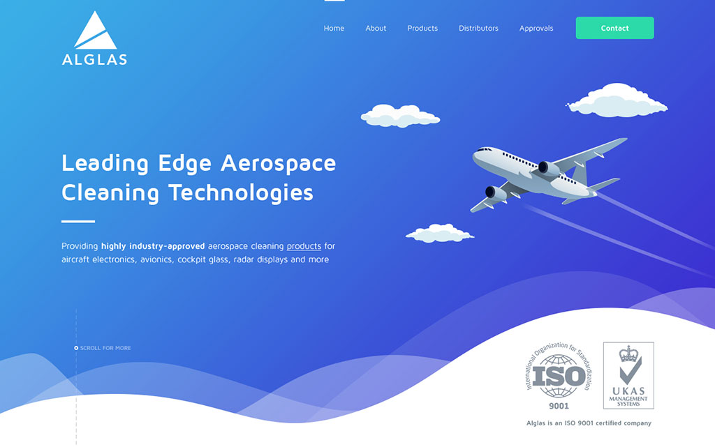
Ultimately the client felt that this style didn’t reflect the image they wished to portray and so we reverted to a photographic background image. While this is a style more widely adopted and may be a little less unique, we’re confident that the other decisions made in the design deliver on the goals we set.
Waves
On redesign projects we try to reuse ideas from the previous website to provide a level of consistency. The colour scheme and logo are often the most visible ways to do this but including more subtle elements can help too.
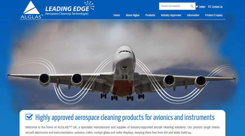
When it came to looking to do this with Alglas the old site didn’t have much to inspire. But one design element did stand out; the use of curved lines that ran through the homepage carousel. While we could have replicated this exactly we could only hypothesise what these represented to the original designer. Unsure of this we simplified the idea taking the curves shapes but using them in instances where we knew the purpose they would be serving.
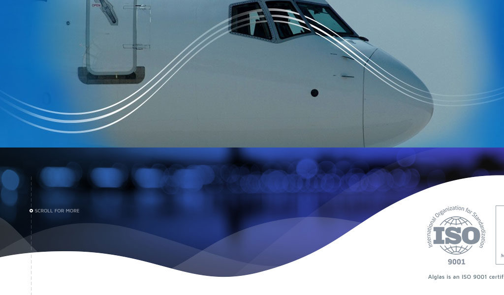
One such example of this is as the mask between the banner and content areas. Creating a multi-layered mask we could achieve quite a lot from a fairly simple effect. For some it may evoke the idea of clouds or contrails. From a user experience perspective the non-linear break should promote scrolling. But its primary function was as an element that deviates from the straight lines that often differentiate sections like these on a website and so give the design a more unique look.
Bubbles
Having determined to use curves throughout the design, thus reducing the number of straight lines we next looked at how best to adapt the imagery we would use in the website to be sympathetic to this.
In adopting image masks, bubble shapes and drop shadows we could create a more visually dynamic way to present much of the imagery included throughout the home and other pages. However it did bring up concerns regarding responsiveness and loading times but in reviewing this after the build, the images didn’t have a large adverse effect on the development.

Icons
Inspired by their competition and other non-aviation sites the client had requested the use of icons to visualise the features and uses of the products. In some instances it was going to prove tough to visualise some of the features of the products such as being simple to use, or the approvals the products had received. So in these instances we picked out a couple of these to sit above a text based list.
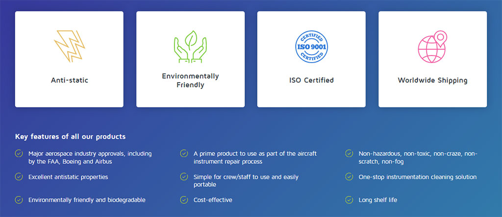
For the primary usage icons we had to create the entire set of 5 icons. But this did still pose a challenge in differentiating hings such as cockpit and cabin glass. If the icons are to be literal representations it’s not obvious how you create two different icons representing glass. Thankfully by combining the icons with text we can instead use a pilot icon to represent cockpit glass. However, even a more literal representation would need to be highly detailed to have communicated this meaning without associated text.

While based on icons purchased from stock libraries we did have to rebuild many of the icons we used. Sourcing icons from different designers usually means the icons are created at different sizes, stroke widths, outlined and with white fills where you don’t want them. So in order to get the icons consistent we had to recreate all of them either from scratch or through editing the original vectors.
A challenge
This arguably represented one of the most visually complex designs we’ve created and built and thankfully we achieved much of what we set out to do. When using so many complex shapes for particular elements and backgrounds it can take some extra effort to ensure things work well across all screen sizes as elements grow or shrink in relation to one another. While this will have resulted in more HTML and CSS code to accommodate these, the extra kilobytes downloaded was well within what we would expect for a site like this.
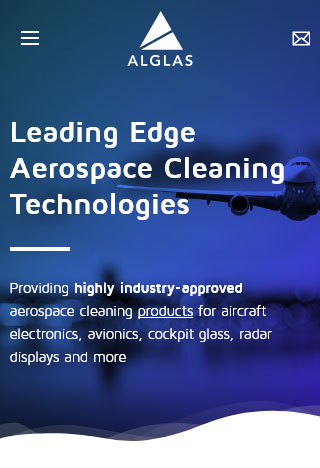
All the goals we set at the start of the project have been achieved by creating a fluid design that works well across all devices, is lightweight and visually engaging. We believe we better communicate to users who Alglas are and that the content is structured in a natural way that promotes user engagement.
Along the way we even managed to learn and expand our knowledge of new techniques including CSS blend modes, viewport units, transitions, fixed backgrounds and a little bit of grid layout.
A word from our happy client
Bronco are alchemists who turn ideas into a cohesive pictorial story read many times. – Alan O’Nions
