Redesigning for new functionality: A Case Study

- By Kean Richmond Web Designer
- Published
- Category Web & UX
At a basic level isn’t designing just a process of arranging elements in order to achieve particular goals? Take the elements in front of you and design a layout that meets the brief today. But, on the web especially, as features are added or changed the original design can begin to crumble under the strain.
We’ve worked with Yotspot for many years, last redesigning their website in 2016, and four years later one such design element was beginning to struggle.
Stretched to bursting
With a website the size of Yotspot a big redesign is an exercise in restraint. The version previous to 2016 was the very first, growing and flexing through those early years of growth and with many new features added with custom design and code.
In redesigning the website in 2016, we aimed to make it more modular, reutilising the same design and code for similar content. One such instance was for Job Listings, Crew/Candidate search results and later Training Courses.
But as the website has continued to grow and new features have been added there are instances where this module has become far more complex.
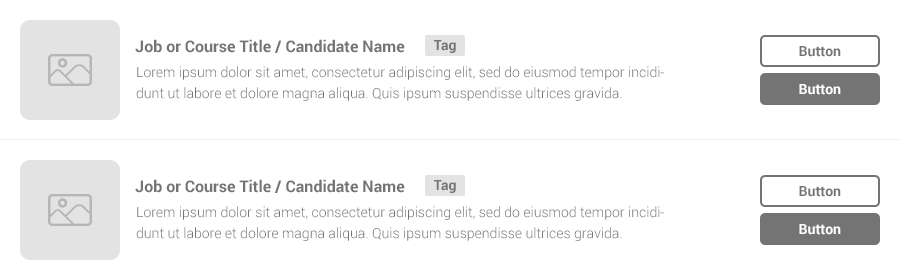
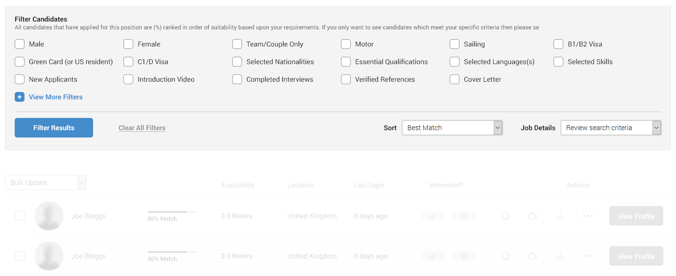
The tag section, originally intended to display only a single element, has grown due to many new features requiring visibility. There’s also increasing demand for additional links and buttons which would result in a big increase in whitespace, stretching the design beyond what was visually pleasing and user friendly.
The spark that lit the flame
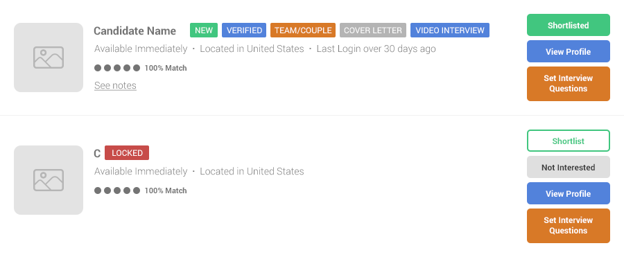
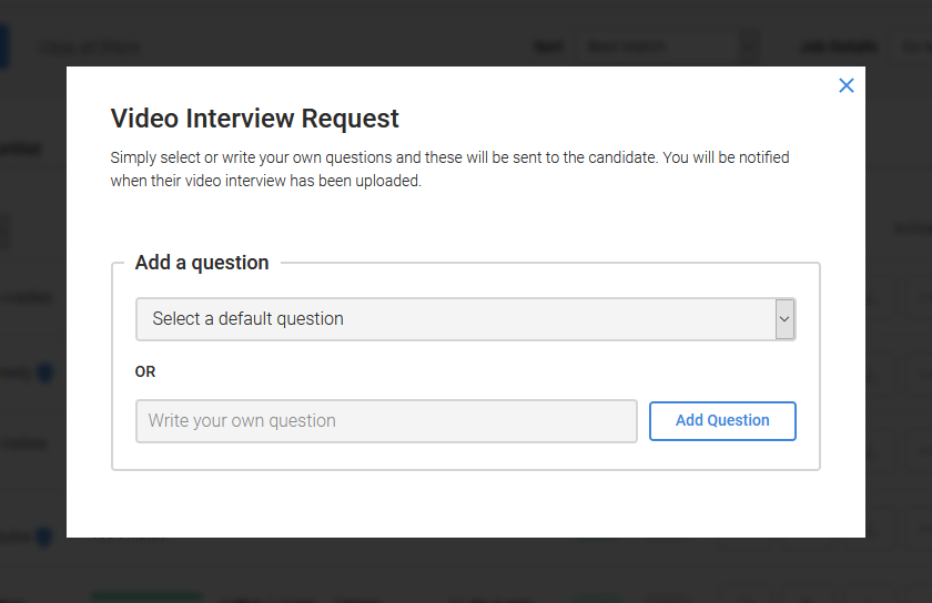
Upon completing the recent addition of a video interview feature, conversations turned to how we could improve the usage of this feature; one that only appeared after a candidate was shortlisted. Exposing this to all candidates would make it more visible, but the existing implementation would see four buttons displayed per candidate (as shown in fig.2).
We also discussed options to make the feature easier for employers to use, such as the ability to bulk set interview questions. This would radically reduce the time employers would need to invest using this feature and thus increase uptake.
All routes led to at least some form of redesign of the listings present on these pages.
The brief
Through the redesign of the Candidate listings module we aimed to achieve the following:
- Expose video interviews to all candidates, irrespective of employer’s choice of interest
- Include a bulk update option
- Improve the overall design, including standardisation of layout
- Utilise modals for any functionality currently displayed inline between listings
- Reduce the reliance on the tags for communicating information
The client also expanded the brief by wishing to include additional functionality such as document downloads and contact options.
The design
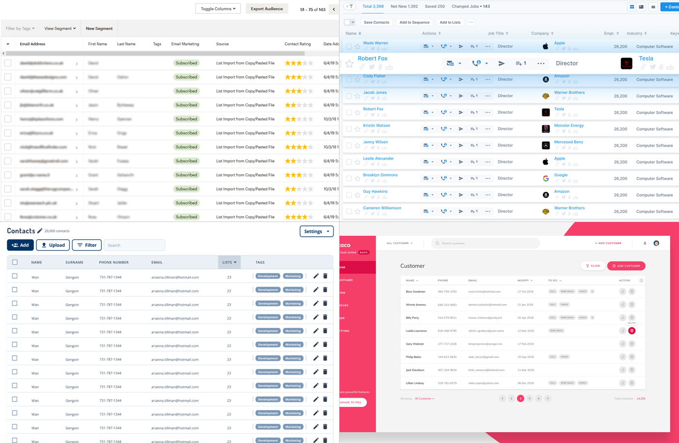
If you look at similar online services that display a list of contacts, such as Mailchimp, most will do so in a tabular format. In 2016 when designing a module to suit this use case, as well as others previously mentioned, we took a different route to the layout as this served all instances well when there was less information being presented and fewer actions to be performed.
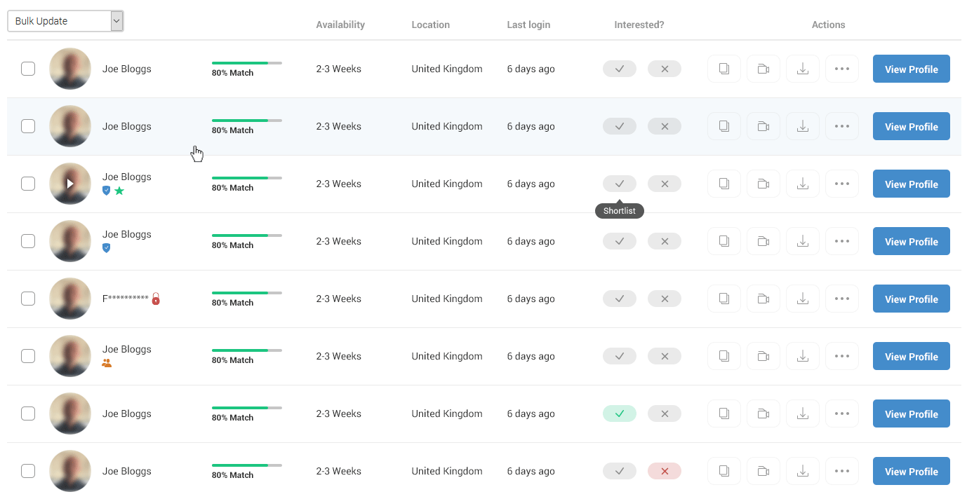
But as the feature set on the Active Posts page has expanded the difference between this and other uses of this module has grown beyond the point where they would all suit a similar design. This disparity meant a solution specifically for this use case would be needed and in turn open us up to utilising a tabular layout that we felt would improve the user’s ability to quickly review the information presented as well as complete any actions required.
Breaking down the changes…
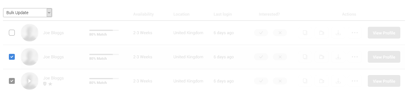
Bulk update
Though much of this project is taken up in redesigning pre-existing elements, the bulk update option is a brand-new feature and one of the main instigators in us redesigning the candidate listings.
In the existing design we were concerned that the new element would not be clear without additional labelling. In a new tabular layout, we could inherit from other similar systems our users may be familiar with and so can apply their understanding of different systems to this feature.
Removing the tags
In the old design, the number of tags was high and only likely to increase further. We wanted to reposition many of these and in most instances replace the text with iconography where we thought doing so wouldn’t adversely affect user understanding.
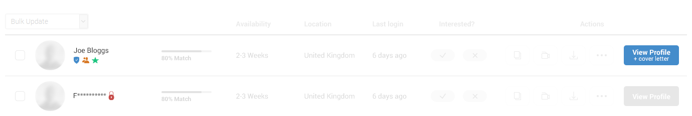
As the image above shows, the verified, locked and team/couple tags have been replaced with icons. Though less explicit, the verified and locked icons also have textual tooltips to provide additional meaning. The New tag has remained as text, but designed in such a way to attract less focus.
The cover letter tag previously lacked clarity as it only stated this existed rather than also being clickable and thus providing a route for employers to read this. By combining this with the View Profile button we retain visibility for this feature, but tie this to an actionable element without any repetition given the cover letter is located on the candidates profile page.
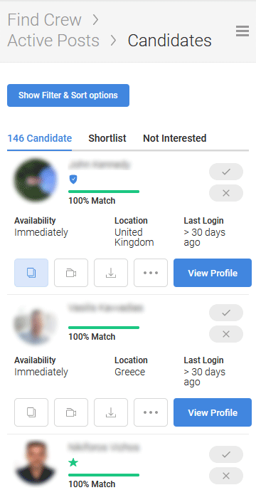
Interested?
In the previous version these buttons could appear in a variety of different states (border/fill, colour & text) depending on what page a user was viewing or what action they had previously taken. This requires the user to realign their thinking in different instances to reaffirm the action a particular button will have.
In the new design we wanted to really simplify this process, and again rely on icons to help standardise these buttons, as well as reduce the screen space they required. Now we’re providing a much clearer Yes/No option to users.
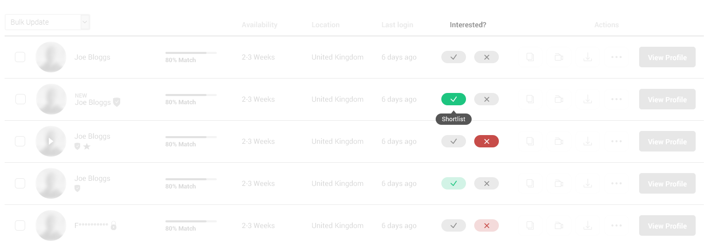
With these being core functionality, we were concerned that the loss of text labels would have a negative impact. To combat this, we introduced tooltips to appear on hover of these buttons so that we could be explicit of the action performed upon click.
Action buttons
In looking to provide scope for additional functionality, as well as accommodate existing functionality, we wanted to include menu options that would expand the available actions a user could take. Though an option could be to bundle all these within a ‘more’ button we didn’t wish to bury certain functionality. The starting point of this project was to improve usage of the video interview system, not to bury it.
With the action buttons we were able to group the existing functionality into one of 4 groups; Documents/Notes, Video, Downloads & More. We then also retained the View Profile button as this provides a route for employers to learn much more information about each candidate.
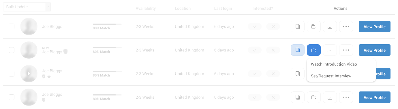
Keeping the layout consistent was important, yet in some instances an individual button may not be required, resulting in the position of elements changing from row to row. Rather than allow this we chose to disable the button by reducing the opacity and removing any click function when no links were available.
On the flip side, if the employer has written any notes or the candidate had submitted a video the buttons would be highlighted to show additional content is available.
Full width & moving filters
In moving to a tabular layout and wanting all information displayed in a single row it was necessary to utilise the full width of the page. To limit the width would require us to place items on multiple rows, or hide part of the listings in a hidden overflow. Though using multiple rows is the solution we adopted on mobile we aimed for a clean single row design on desktop.
The previous version of the page would display filters in a sidebar column, and so in the first design we presented we hid the filters below a clickable show/hide element, as they currently were on mobile. However, the client expressed concern given that they already had users who seemed blind to the filters positioned on the right. A solution that displayed the filters by default was required.
Given the filters are numerous and could only grow larger we were concerned about these dominating the top of the page, effectively hiding the candidates on first load. Our solution was to display only some of the filters whilst hiding the rest and making these accessible use a ‘View more filters’ option. This allowed us to control the height of this section to ensure that listings would still be visible on most device screens.
Mobile
Mobile is really tricky when it comes to displaying information like this. One option we’ve already discussed is to maintain the desktop design and hide the bulk of the information into a scrollable overflow.
But we didn’t wish to hide core information or actions in this way, even though desktop represents 95%+ usage on this page.
In excluding the overflow technique, we were left with either placing each piece of information on its own row, leaving lots of whitespace, or trying for a more complex layouts that you hope doesn’t overcrowd the information. The solution below adopts a more complex layout to that we hope maintains usability for all the elements displayed whilst reducing unnecessary whitespace that leads to lots of scrolling.
Modals
In the previous version of the listings when users would add Notes or Interview Questions this functionality would appear inserted between the listings. For the new design we wanted to utilise modals for this instead. Aside from the benefits in design and coding these sections we felt it would aid users in focusing on the task ahead of them rather than being distracted by lots of dense candidate information remaining visible and in focus.
These modals will also prove helpful when extending the bulk update options such as setting interview questions to many candidates.
The Future
Arguably we’ve created a design that is more complex with limited space to add additional features in future. While this might be true if the requirement is to add further columns to the layout, our intention is to ensure the candidate listings don’t become overly dense with information through added columns as we believe this will reduce the usability of these listings for employers.
In the action buttons/drop downs we have provided the opportunity to expand functionality far more without adversely affecting usability. But only time will tell how future feature changes impact the design we’ve produced today.