Insurance Hero

When clients like our work so much that they tell others, or come back to us again and again, it’s a welcome confirmation that what we’re producing is fulfilling or even surpassing their expectations.
It’s through our dealings with another client that we were asked to help with another of their websites; Insurance Hero.
Time for an update
Not all clients come to us with a specific problem to solve, many get to a point where they’re looking at an aging solution and recognise that to maintain or grow that a change is required.
The client knew that the design of Insurance Hero was a little dated but it still performed consistently after a number of years, with additional content added regularly to help tap into new niches. Starting the conversation, he asked us our thoughts and how we might approach an update to the website.
It took a little back and forth to get a clear plan together, one that would match the budget available whilst delivering improvements that went beyond just a design facelift. Eventually we set out on the new project with the following goals…
- Create a more engaging design for the homepage
- Follow this design through internal pages (however with some 150+ individual pages we’d be restricted on making changes to existing content and it’s supporting code)
- Improve navigation by giving meaning to the existing footer links
- Improve conversion through clearer call to actions, including floating sidebar call to actions
- Improve site speed
- Clean up the plugins and the rest of the WordPress admin
The building blocks of a design
Colour
When we spoke with the client about his current design he was happy to give us free reign after seeing how we transformed the previous website we had worked with him on, but had mentioned that he felt the orange and green colour scheme of the existing website worked well and was indicative of the Insurance industry. Conversely we weren’t fans of the existing colour scheme.
We tested a number of different colour schemes, but within certain limits. It wasn’t our intention to make radical changes by using purple and yellow for example, but instead we tried different oranges, pushing towards red and in addition to greens we looked at shades of teal.
The final colour scheme was perhaps closer to the original than we had planned at the start, but the changes we made, and the addition of variant colours, would give a brighter and more welcoming feel to the design.
Logo
A colour change necessitated an updated logo. With unlimited budget we may have looked into a complete rebrand but with budget needed for the website we instead focused on smaller tweaks. These included recolouring the logo, removing the top level domain (something of a pet hate when it comes to logos) and remixing the wordmark to better compliment the other changes coming throughout the design.
Fonts
Raleway, the typeface used on the old website, is one we really like but its descending numbers look odd in many instances and no content delivery network (that we’ve found) offers a workaround to output the non-descending variations easily.
So instead we used Poppins. It’s a typeface with some similarities to Raleway in that it adopts wider characters. For example, the lowercase o is more circular than ellipse. But using a heavier weight we create more impact and more personality than the typography of the old website.
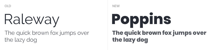
We’re confident that Poppins would look fantastic for our headings and micro copy, but we also wanted a contrast between these and our body copy. Having adopted Poppins at a few weights we knew downloading additional web fonts would be difficult to justify. While Arial and Verdana have been popular fallbacks for many years we instead adopted the system font option.
System fonts are the default font bundled into each operating system which these systems use for all their content and microcopy needs. On Microsoft this is Segoe UI, Google has Roboto and Apple uses San Francisco, though you can refer to their system font in a more future proof way. We’re able to reference all of these in a font-stack with operating systems ignoring those fonts inaccessible to them. See below…
body {
  font-family: -apple-system, BlinkMacSystemFont, "Segoe UI", Roboto, Oxygen-Sans, Ubuntu, Cantarell, "Helvetica Neue", sans-serif;
}
By allowing the operating system to choose from a set of fonts we release control and can no longer guarantee that any text will be a specific width or number of lines. But pixel perfect designs are a thing of the past since responsive design made them near impossible. Instead we implement a design in a fluid way and test as much as we can to ensure that our text doesn’t render outside the limits we expect… where such limits do exist.
2017 was the year of The Blob
No, not the 1958 B-movie. Not even the 1988 remake. It’s the term given to less geometric and more organic shapes that have become a popular trend in web design over the past 2 years and that we have also adopted in the new Insurance Hero design.
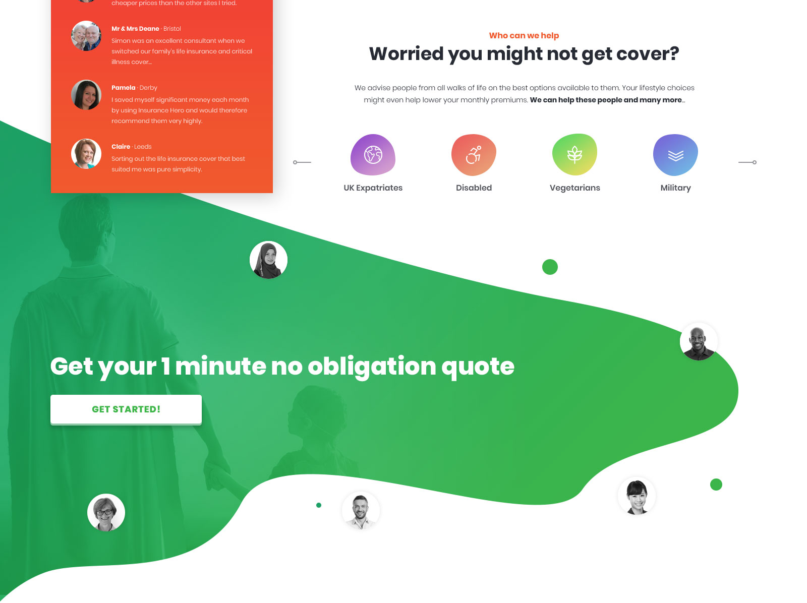
At Bronco we’re mindful of adopting design trends purely because they’re fashionable at the time. Remember when the trend was for websites to include coffee stains? Instead we try to adapt to modern design styles when we feel it compliments ours and the clients’ goals and won’t become dated quickly. Insurance Hero just happened to be one such instance where the design evolved to include blobs.
Character design
Much of the design comes from an idea that ultimately we weren’t able to achieve. Our original intention was to expand on the superhero idea within the logo and adopt an illustrated character that would appear throughout the design, but most prominently on the homepage. We’d also play on this superhero idea within the content, which we have been able to achieve in some instances.
But with limited budget to create custom illustrations, and a lack of enticing options on stock libraries we changed tack and found the photo of the child seen in the design. While not our original plan it arguably delivers better on our goals. She not only adopts a dynamic posture we couldn’t find in a stock character, but she creates an emotive connection that reinforces why many of us have life insurance; to take care of our loved ones if anything bad happens.
The use of the blob then came from being a complimentary way of adding some extra colour behind the image whilst retaining a good amount of the white background which served a number of purposes, not least in order to retain a full colour version of the logo (though we opted to use a white version on the homepage at mobile sizes).
A better navigation
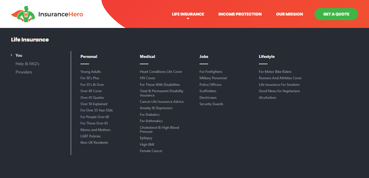
Before we even thought about blobs and superheroes we were designing the navigation. Insurance Hero is a little unusual in that it doesn’t promote browsing of the website. Its intention is to capture search traffic to specific landing pages and convert those users with the call to actions on that page.
The main navigation listed a few pages aimed at helping users or instilling trust and a huge footer menu also listed around half of all the pages in the website while any remaining orphan pages would be accessible from the sitemap only. But the links in the footer menu weren’t organised as well as they might be and if users were looking for something specific they were not aided in this endeavour.
With one of our goals being to give meaning to the navigation this was our first problem to solve. Taking all the pages in the website we organised these into different categories and sub-categories as required that would be contained within a multi-level mega menu.
The result is a far simpler main navigation that reinforces the products offered, provides a clear route to conversion and organises many of the site pages, within the mega menu, into a structure that enhances a user’s ability to browse the website if they wish to.
Improving conversions
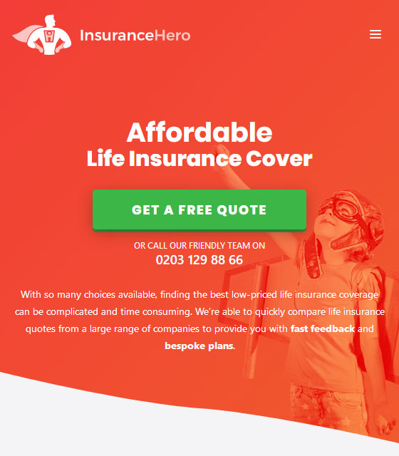
When first navigating to the old Insurance Hero homepage you’re met with a call to action button and phone number. On internal pages there are similar buttons in the sidebar as well as quotation forms within the content of the page. None of these methods appeared particularly optimised to maximise conversions.
The quote button on the homepage didn’t look necessarily clickable or eye catching enough, even when it’s front and centre and on a page with few distractions. The buttons on internal pages faired a little better with shadows and contrast that mark them out better as buttons and the forms were clear if not consistently designed.
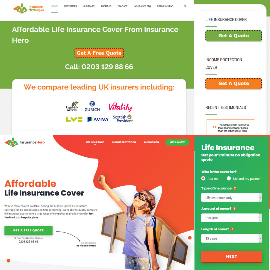
With conversion the goal of the website we looked to improve on these issues. We cleaned up the in-content forms a little (budget stopped us rebuilding these from scratch… for now anyway), and rather than have just buttons in the sidebar we placed the main life insurance form here too. In this position we could have it appear to float on user scroll on occasions when the height of the browser would accommodate it. This means on larger screens there is always a route to conversion visible.
On the homepage we’ve added a number of additional elements that appear on initial load, yet the 3D styling of the button, its contrast to the background and even surrounding elements all work to draw users to this element. Early on we also made the decision to use the green colour predominantly for elements related to getting a quote, creating a language in the design that while many may not consciously recognise, will benefit users as they move around the website.
WordPress
Fire up WordPress and install a few plugins and the WordPress admin looks a mess. Different plugins are all fighting for prominence whether that’s through menu position, top of page notices or by adding numerous CSS or JavaScript files into your website.
Plugins are a necessary evil in WordPress, some you can remove and replace with a custom solution, but other plugins are too complex to custom build a similar solution within budget, especially one that you can keep up development for when future WordPress updates break it.
In building a new website we wanted to strip as much of this back as we could and have those additions we do have make sense, we’ll even force plugin menu items to move if we must.
Gutenberg
Within the old website a visual layout plugin was used by the client to create more complex layouts. But only very few of its features were used and only really on the homepage. These types of plugins cause a lot of bloat, and unless you’re doing something really complex the new Gutenberg editor is a far better solution.
If you know WordPress you may know that in a future release a new editor is due that will revolutionise the WordPress editor. Through a plugin this Gutenberg editor is already available and with a full rollout due imminently we felt it was important for new sites we’re developing, like Insurance Hero, to adopt this new editor.
Though we’ve adopted Gutenberg, in this case, we’ve not added any additional blocks beyond those offered by the WordPress core. But with this in place we can expand the available blocks either through custom development or plugins that will provide the client with a wider variety of presentational elements to use compared to the classic editor.
URL’s
In the old website a vast number of the pages were created as posts, but were not displayed as such in the website. Even though the website does not have a blog section or much content that could be considered time sensitive it made sense to move these pages out of this section and create new custom post types for these; ones that more closely reflected the navigation structure.
We could have pushed these within the existing pages section but having these custom post types is a more manageable approach given the number of pages and would allow for greater differentiation of certain page types, if required, in the future.
The problem was maintaining the old URL structure for these. Though 301 redirects could have been used to ensure no loss of traffic it was important to the client to maintain the old URL’s, which included category names that weren’t wholly consistent. Through the use of a permalink management plugin we have been able to maintain these URL’s while any new pages can adopt a new URL’s structure or be adapted using this plugin if necessary.
Site Speed
We bang on about site speed for every new website we launch. But we think it’s important and surprisingly we see some agencies bafflingly create excellent work only to pay little attention to the huge monsters they’re asking people to download.
Our benchmark goal is to deliver a homepage that comes in less than 1MB and this actually proved to be really easy. On first appearances the old website downloaded far more bytes (3MB+ in some instances) than you’d expect looking at the design. But when you strip away all the additional social scripts the old site was more lightweight than it first appeared. These scripts would not be making it into the new website.
While we did hit below 1MB and did come under the overall weight of the old website, we didn’t quite hit a lower size when you exclude the third party assets from the equation. But with a more graphical website we’ve achieved a website that still comes in below our target.
However loading the website was slower than we’d like. When testing the speed of the website we discovered over a 2 second delay in Time to First Byte (TTFB). This is a downside of using content management systems like WordPress and using a number of plugins. The code that runs on the server and the database queries all work to create a long delay before anything is sent back to the browser client. We couldn’t take the website out of WordPress and we couldn’t remove plugins we depended on.
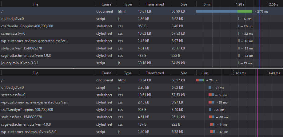
Short of accepting this delay the only feasible decision appeared to be to use a caching plugin. This is something we don’t often use due to the issues that can be caused with caching content that’s frequently updated. However for Insurance Hero we know the content is infrequently updated, and with testing showing a TTFB almost identical to serving a blank HTML file, the benefits outweighed the potential downsides.
Conclusion
We’ve mentioned budget a few times. While we would always love to deliver the perfect solution no matter the budget we have to be realistic about what is achievable in the time granted. There are areas of the site where we still believe improvements could be made, but these are small in comparison to what we have already achieved.
Instead we’ve focused on fulfilling the goals of our client and achieving the kind of improvements that would deliver the greatest returns. Ultimately the users and the conversion figures will be the final judge for how successful we’ve been, but we’ve delivered a more engaging homepage, with improved routes to conversion and ways to navigate the website.
The internal pages and forms have had a little spruce up with quote forms more visible on these pages. We’ve been through the WordPress admin to clean things up for the client and make this side of things easier to manage whilst delivering a less bloated site overall thanks to removing unnecessary scripts and employing a caching plugin that delivers a site that is more lightweight and faster to load.
A note from the client
It came as no surprise that Bronco’s chief designer Kean came up with an exceptional design concept for the new Insurance Hero website which was starting to show it’s age. The new design is both visually appealing, loads very quickly and looks good on all platforms; including smart phones and tablets.
I have designed quite a few sites myself over the years, but sometimes if you want to create an exceptional impression you have to put your trust in the best.
Bronco, and Kean in particular can be trusted to deliver world class solutions to discerning clients who realise that generic template sites are rarely the best option.
Share this case study
Like what you’ve read, then why not tell others about it... they might enjoy it too