Raise Your Hats

Its really great to see a project through from beginning to end, building a strong relationship and understanding with the client, creating a site which fits their vision and their ethos. Working with Raise Your Hats allowed us develop a site from the outset; designing the logo and to building it out into a full site, fitting in all that the client wanted to achieve from this project.
Raise Your Hats is dedicated to thanking the women of World War II, sharing their stories and raising awareness of their services and dedication to the country during that time and after. Their aim is to raise awareness of the sacrifices 7.1 million women during WWII, the roles they played and their contribution to the war effort.
“Bronco is an exceptional digital marketing company, not just because they have the skills and solutions to every technological question but that they never lost faith, never lost sight of our vision. Whatever ideas we had, they made better until we almost believed they were mind readers! They grew the idea with us, they were not afraid to challenge assumptions, divert from potentially time wasting escapades. They were efficient, direct and prompt in all communications and absolutely, totally organised. We raise our hats to the Bronco team, with a special thank you to Becky, there at the start when our educational campaign was barely a pixel, let alone a posy.”
Peri Langdale – Raise Your Hats
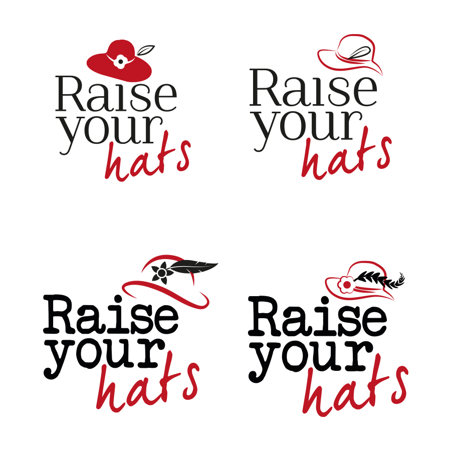
Designing the logo
Raise Your Hats initially contacted us to design a logo that would incorporate many different symbolic elements.
Several items needed to be included in the logo. Firstly, a woman’s hat from the time period. The hat needed to be as generic as possible to avoid connotations with any one particular group of women. For instance an army hat was out of the question. A variety of 1930’s felt hat photos were found on google images and were simplified into various shapes and refined over time.
A flower also needed to be included. This was originally to be a poppy but was changed to a generic flower due to the heavy symbolism of various colours of poppy. If the logo was to be used in white for example its meaning would be one of pacifism rather than the traditional red poppy of remembrance.
A feather was added as a later revision. It featured on many ceremonial hats (military, royalty, and civic) plus as a reference to Churchill’s mother who said ‘a life without passion is like a garden without flowers, a hat without a feather’. It was later changed to a quill to represent the writing of the heroine’s stories that will be uploaded to the website.
Typography wise, a typewriter font was chosen by the client as it is in keeping with the time period. In contrast to this, the word ‘hats’ is written in red script to symbolise red lipstick.
Creating the website
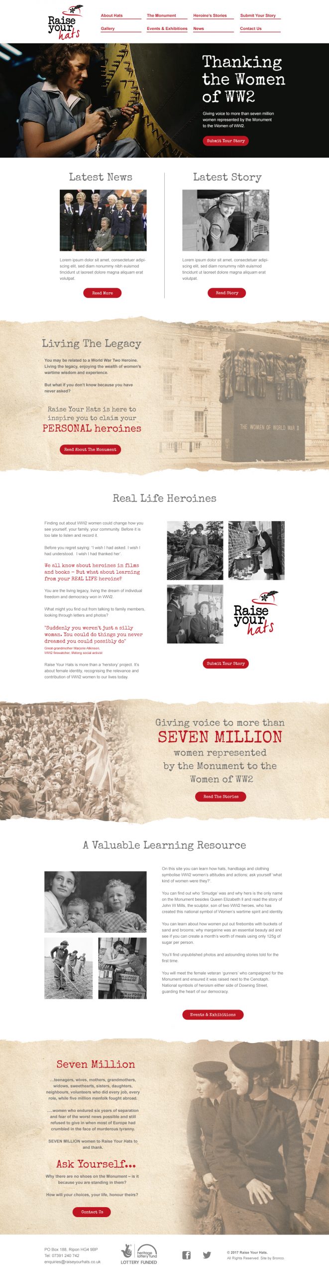
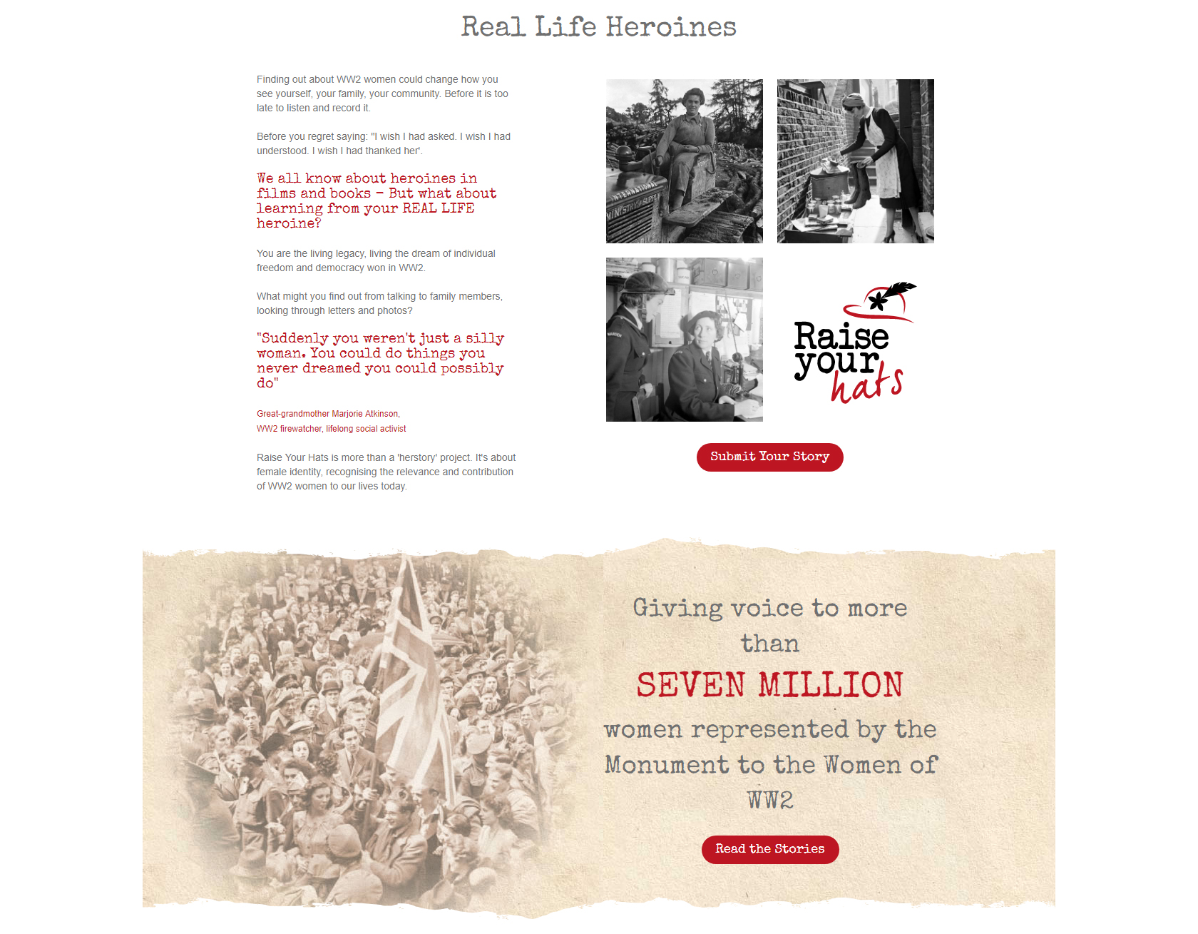
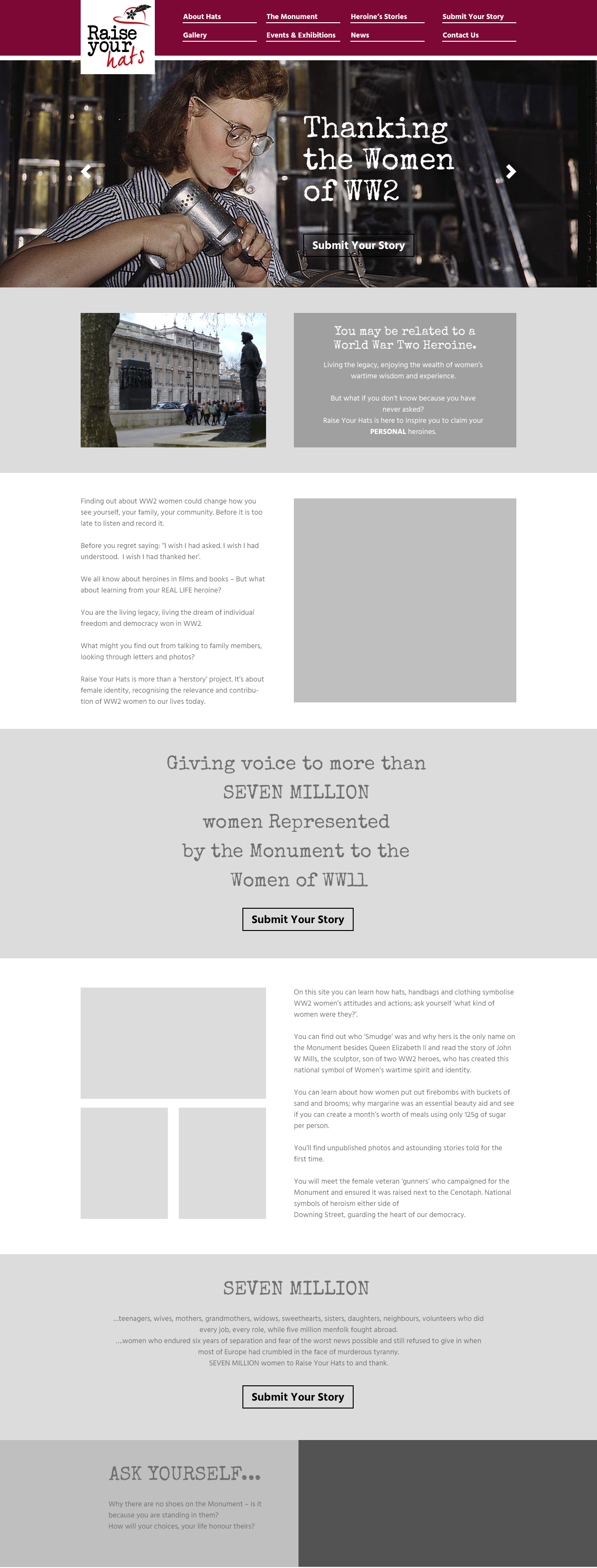
We were asked by Raise your Hats to create a website to educate people to the massive contribution women made during WW2. The site allows users to upload stories of their grandmother’s and family’s bravery during the conflict and also serves as an invaluable learning resource for generations to come.
The key to the website was finding a genuine historical source of photography that we could use without breaking copyright. Stock image websites were of no use as they had no genuine historical images and only a limited amount of re-enactment shots. Searching images ‘labelled for reuse’ in the ‘more tools’ section of google images lead us to The Imperial War Museums archives.
The Imperial war museum has released a huge selection of WWII image resources into the public domain. These images can also be found on Wikimedia commons and are totally copyright free as they were taken by the government, before 1957. This archive of images provided us with an invaluable selection of high resolution photography to add to the Raise your Hats website including shots of women working in factories, the armed services and on the home front. There are even some rare colour images available which could be used for the main header.
Bands with vintage torn paper backgrounds were chosen to highlight important text and also to break up the long sections of body copy on the home page. Large sepia toned images were integrated into the bands to provide a big visual impact. These really help to convey the historical aspect of the website.
Blocks of images were also used to add interest to the body copy sections. The client was keen to make sure that all aspects of the women of WW2 were shown, from serving in the Air Force, Army and Navy to the girls of the land army and the women who fought on the home front.
A Typewriter font was chosen as a feature typeface as it provides a stark contrast to the simple sans serif font used for the body copy. A typewriter font is also used for the Raise your hats logo so it was an obvious choice to make. Due to the large file size and intricate nature of the typewriter font, we decided to use Arial for the body text as it’s available on every PC it wouldn’t need downloading from external servers.
Developing the website
This was an interesting responsive WordPress based site to build. We made use of quite complex templates in the theme to achieve the seamless result in the design. One of the main challenges of the build was getting the sepia images on parchment paper to be responsive at various screen sizes as well as the column based photographs to ensure it still worked across desktop, tablet and mobile devices without losing the quality and the important effect which was key to the overall design.
The ‘Submit your story’ also makes 100% use of Ajax to send an attachment rather than a traditional iframe solution, much better for the site design and for users submitting content. Additionally we made sure the theme makes extensive use of custom posts, this allows content such as the committee to be edited dynamically, again so it does not negatively effect the overall design.
Share this case study
Like what you’ve read, then why not tell others about it... they might enjoy it too