Ripon Farm Services

When we talk about supporting local businesses it really doesn’t get much more local than Ripon Farm Services, whose head office is located on the same small business park as Bronco.
It’s this ability to wander across the car park to talk directly with the team that first attracted them to Bronco. Though the web is a maturing industry many businesses lack in-house knowledge of the web and so having an agency close by to offer support when needed is very attractive.
But local support wasn’t all Ripon Farm Services (RFS) were looking for, they also wanted a new website.
A quick change
It’s unusual to see a company looking to commission a new website only 18 months after the launch of their existing website. In that time it’s unlikely a business has evolved enough that the website no longer represents their offerings and the design should remain fresh enough to not feel tired and in need of an update.
In the case of Ripon Farm Services they felt the website was slow and not easy to navigate; fundamental issues that needed to be resolved. We also identified other issues including intermittent error messages appearing and homepage banners linking to empty pages.
While it may have been possible to correct these issues and maintain the existing website the results would always have been hampered by working with an unfamiliar system with dependencies that may be difficult to change. The benefit of starting with a clean slate is that we can provide much better support over the long term by working with a solution we’re more familiar with.
Aside – When identifying issues in a website it can be easy to blame the developers/agency who built the site. There are many stakeholders that come together to build a website and so in outlining the issues above we do so only to explain how we contributed to delivering a new, and hopefully improved, solution and not to point the finger.
An evolved user interface
Design is a combination of different aspects, most commonly seperated into User Interface (UI) and User Experience (UX). While the user experience of RFS was lacking in some areas, as identified above, the UI itself largely aligned with what we’d expect for a business like Ripon Farm Services.
So with this in mind we didn’t seek to make wild changes to the core aesthetics of the design but evolve these to support the changes we were making in order to make the site more user friendly.
This manifests itself in maintaining the corporate colour scheme and also the clean and simple look from the old website. An alternative solution may have been to take a more illustrative approach that reflected farming and agriculture but in this instance we felt it would be more of a distraction and not appropriate for the target market.
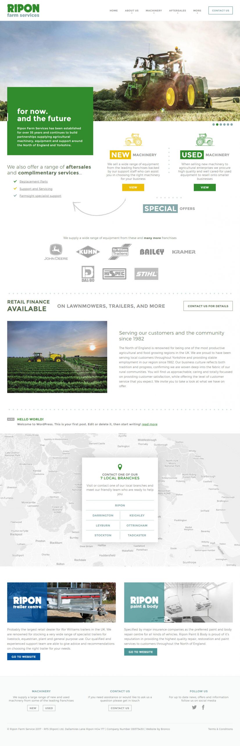
The biggest change repeat users will see on arriving at the homepage is the uncluttering of the initial screen. For the banner we stripped this back to something far simpler. Rather than overloading this with various different messages we switched to a simple image banner, with carousel, to show a wider range of machinery the client offers but without additional messaging or links that often serve as a convenient, but ultimately poor, way of getting more call to actions above the fold.
Next, we also made the links [below the banner] through to New and Used Machinery far more prominent, utilising whitespace more effectively to allow these elements to gain increased prominence within the design.
A focused navigation
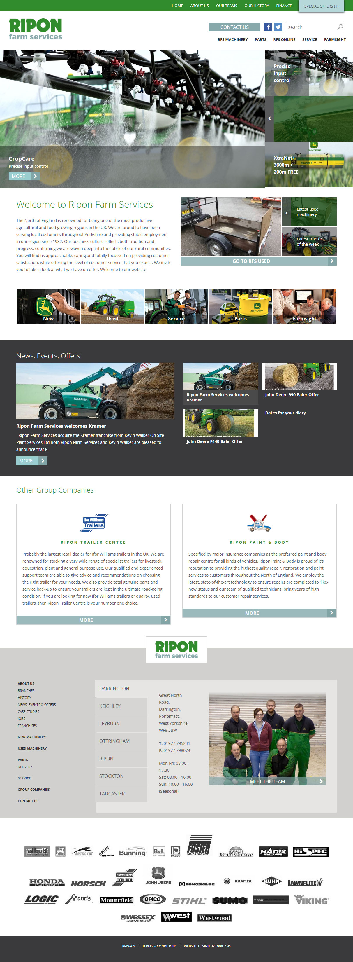
The previous website split the navigation across three areas; secondary navigation, contact/social/search and main navigation.
While splitting a navigation is a good way of promoting certain links above others it’s important that the design reflects the hierarchy that’s trying to be achieved by creating this split. In the case of RFS’s old website, this hierarchy wasn’t obvious; the main navigation simply doesn’t have the impact necessary to draw the user away from the secondary navigation (with a colour background) and contact us (button with larger text).
Our approach was to unify the navigation, integrating a dropdown navigation to help decrease the number of main links and ensure focus is given to major sections such as ‘Machinery’ as well as combine relevant pages under a new, more widely recognised term of ‘Aftersales’.
To simplify things further we moved the social links into the footer and removed the global search functionality. With the exception of the Machinery and News sections, which both have their own search, we felt the site wasn’t large enough, and the navigation included enough of the website, to make the global search unnecessary.
We expect this combined with a breadcrumb navigation throughout the website will make the website much easier to navigate and for users to find the information they require; in turn solving one of the primary issues the client identified with their previous website.
Speeding things up
Using the Drupal content management system, the homepage of the old RFS website is heavy with images, multiple CSS/JavaScript files and when it rocks in at 3.5Mb (2Mb on mobile) the old website could hardly be described as lean and built for speed.
Our belief is that if you want a fast website you have to take a lean approach to the build from the beginning. Though improvements can be made to an existing website we see far greater benefits when considering the speed of the website throughout the design and development process.
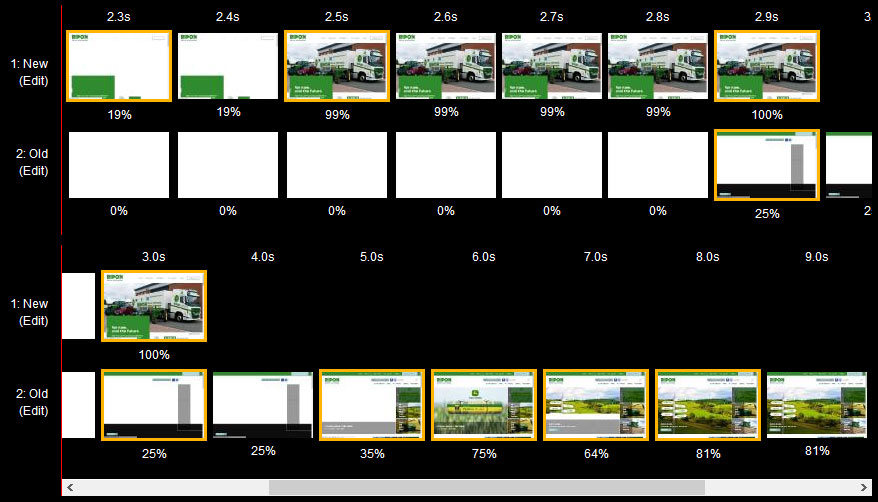
Top 0.1s per frame, Bottom 1s per frame
The new website loads fully in the time the old website takes to start rendering the page
Upon completing the website our version is 280kb on mobile and 4.3Mb on large desktops. As a headline figure, 4.3Mb on desktop sounds like we’ve ultimately made things worse. But when you look again at this figure with JavaScript disabled the site is 860kb; but why the huge difference?
The reason why there is such a big difference between the two figures is because we load all but the first image in the homepage banner/carousel using JavaScript. We do this so the images load only after the rest of the page has finished, making users perceive the page as loading faster and also reducing the time where users can begin to interact with the page.
Unfortunately this doesn’t help the fact we’re transferring a large amount of data. We attempt to address this for smaller devices, where more data can mean more cost, by delivering smaller images that are appropriate for the dimensions of the screen in use. This is how we get the website down to 280kb on mobile.
Share this case study
Like what you’ve read, then why not tell others about it... they might enjoy it too