Ripon Rugby Club Beer Festival
Bronco has supported Ripon Rugby club for a number of years. We support the club financially as a sponsor and we also work with them to produce all of their promotional materials, giving them clear branding and a professional appearance throughout the season as well as the closed season.
We were approached by the club to create the branding and all of the promotional materials for a brand new beer festival.
We aimed to create a sophisticated yet friendly range of collateral united by a consistent colour scheme and typography.
‘Thirsty Script’ was chosen for header text because of its nods to vintage signage and beer labels whilst the Rugby club’s usual font ‘Avant Garde’ was kept for body copy.
We chose a colour scheme of gold, orange and brown taken from wheat and beer. This contrasts nicely against the blue tones of the club’s normal promotional materials.
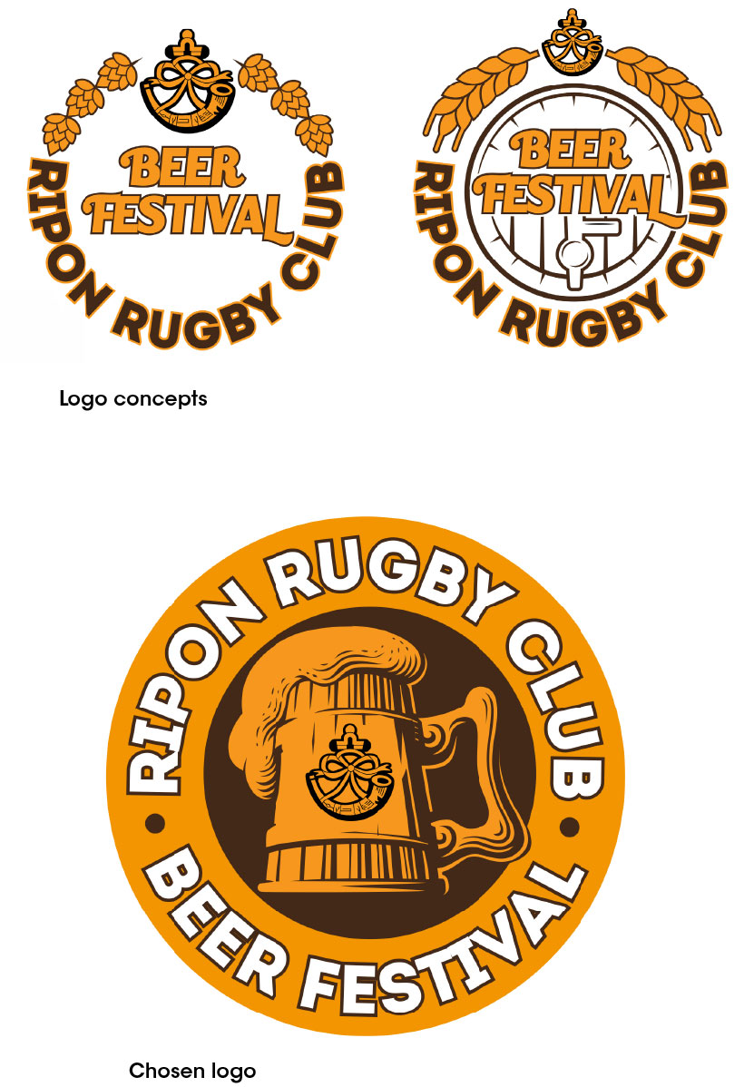
Logo
The first step was to create a brand for the beer festival.
A selection of logos were created featuring wheat and hops illustrations and the RRUFC logo. These were refined and were whittled down to a simple design featuring a wood engraved style beer tankard.
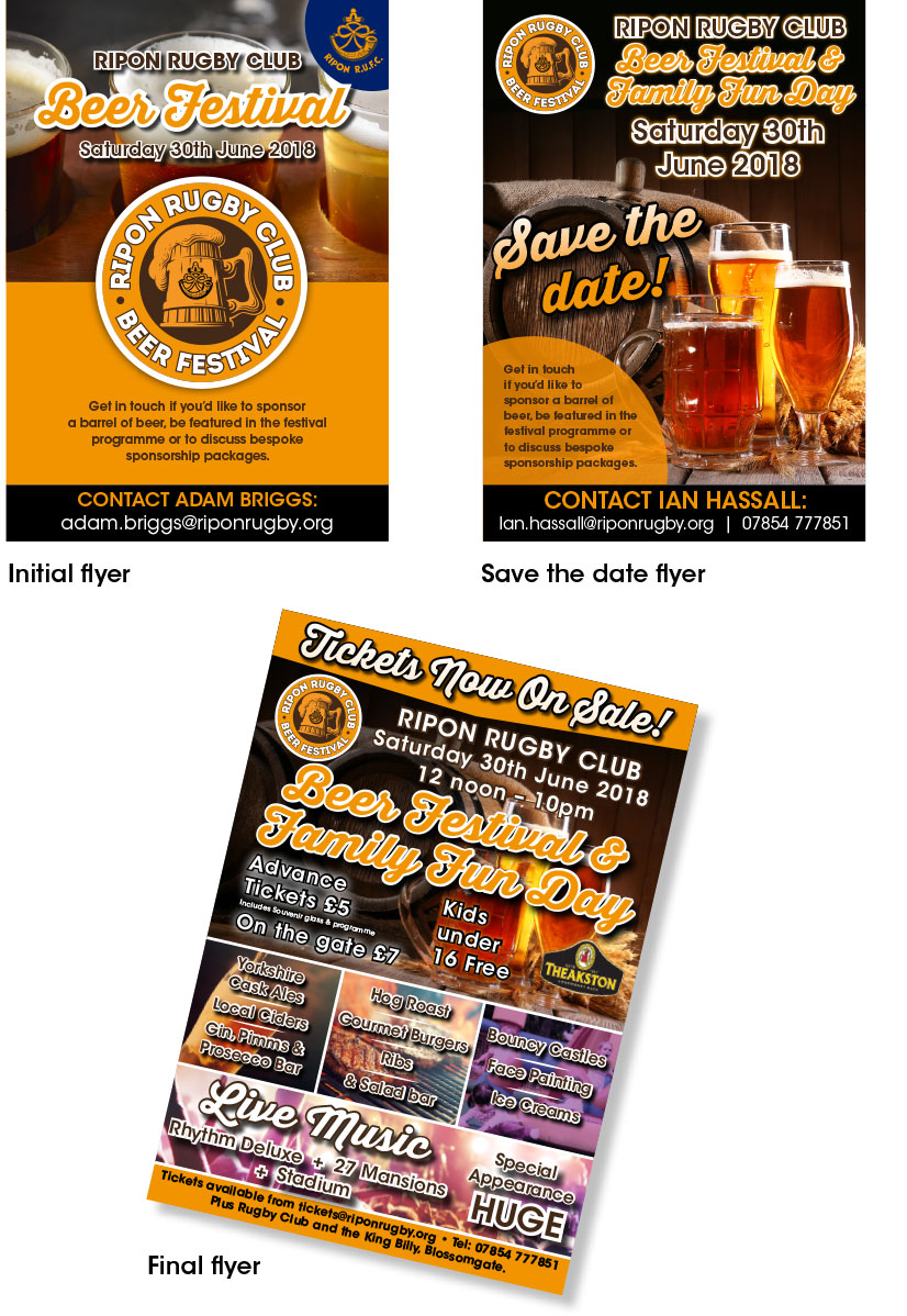
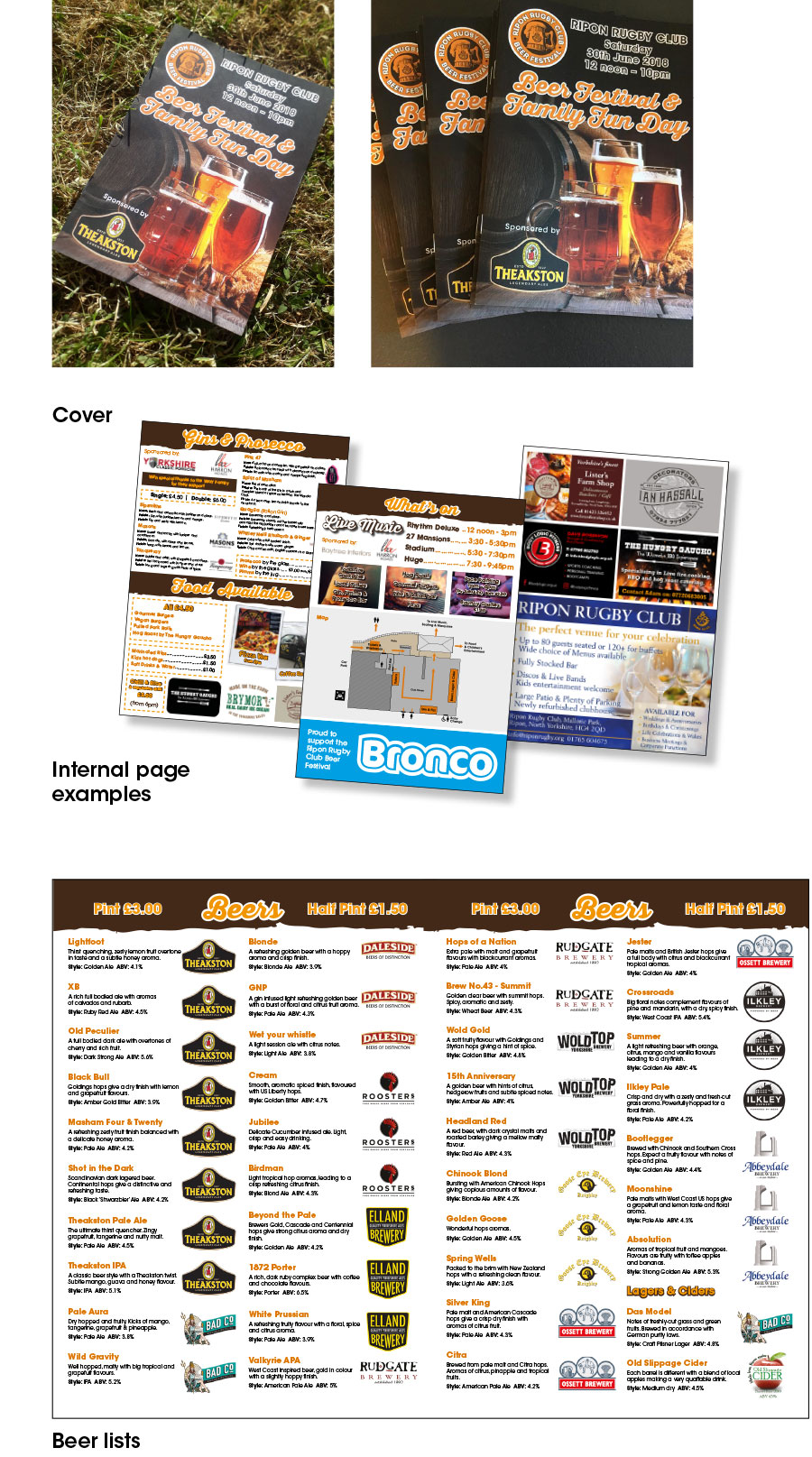
Flyers
A range of flyers and adverts needed to be created to publicise the event in the local community and get the attention of sponsors.
A simple flyer featuring a prominent logo was initially produced to gauge interest from barrel sponsors.
It was re-designed shortly after into a ‘Save the date’ flyer. A classy understated stock image of beer glasses and barrels on a dark background was chosen and would end up being used throughout the campaign.
After some small revisions a final flyer was designed featuring more details of the event such as bands and prices. This was distributed to the public and printed in ‘Review Ripon’ magazine.
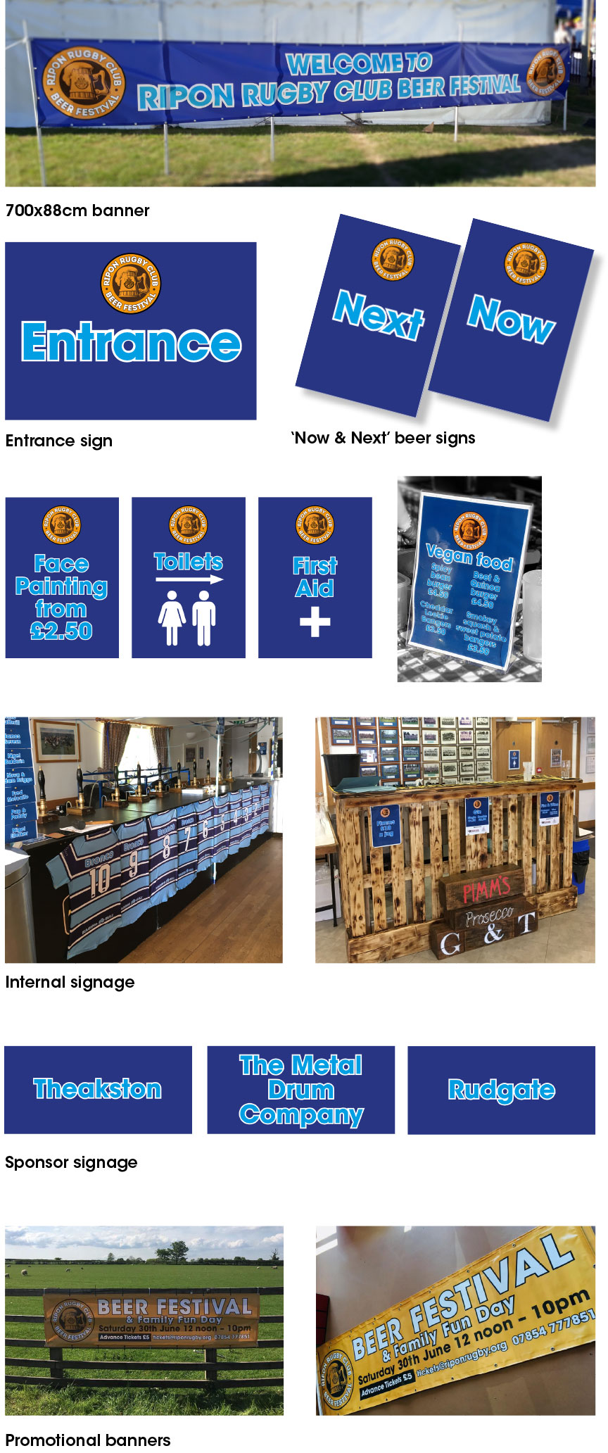
Signage
A wide range of signage needed to be produced for the event from a huge 7 metre x 88cm welcome banner, to roadside hoardings and staggered signs, to directional and informational signs for the day.
The “on the day” signage took on the club existing blue colour scheme as we moved away from the golds.
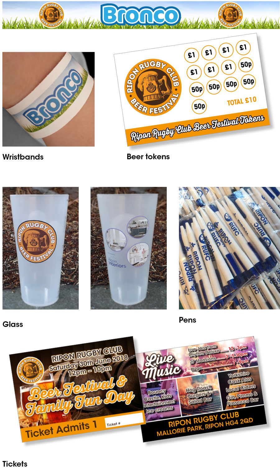
Collateral
Various collateral items were produced including festival style wrist bands and promotional Rugby club pens.
Beer tokens were designed to be used instead of currency, upon receipt of a beer, the token would be stamped up to the value of £10.
A reusable promotional pint beaker was also produced. Plastic was chosen to avoid the possibility of broken glass. It was branded with one of the events major sponsors and the beer festival logo. White was printed behind the shots to help them stand out more.
Programme
The final job was to produce a programme featuring details of the beers on offer, key information and adverts.
The programme followed the same design principals as the flyer but the main concern was laying out all of the information and drinks lists in a legible manner.
Multiple revisions needed to be made as information, adverts and sponsors were added and removed.
The programme was also matte printed to allow people to make notes on the beers.
After much hard work the rugby club were delighted by our design work and the quality of the final printed collateral.
The beer festival turned out to be a huge success for RRUFC and it also provided a great deal of local exposure for Bronco.