Royal Engineers Association

If you’re familiar with our armed forces you may know that the British Army is sub-divided into regiments or corps, each with a certain specialism; Medical, Engineering, Infantry. Alongside each of these regiments sits an Association; a group whose purpose it is to support serving and retired members of the regiment and their families.
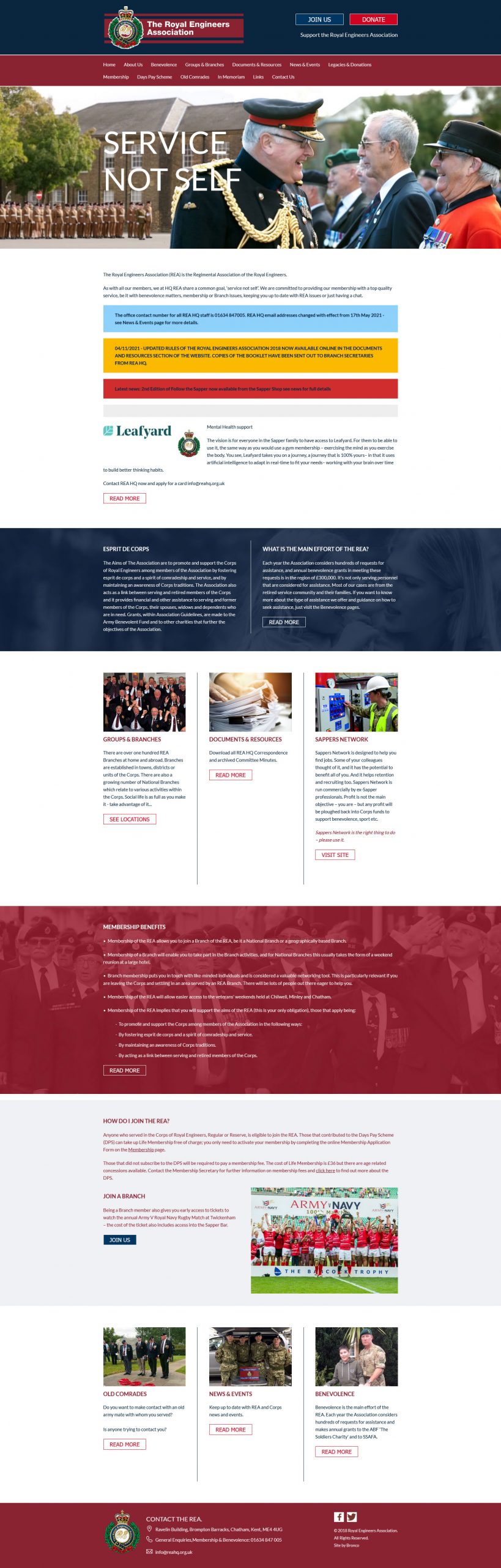
The Royal Engineers Association (REA) are a group that we have worked with since 2017, launching the previous iteration of their website in 2018. After receiving new funding, the REA looked to refresh the website to be more inclusive to a younger and more diverse audience. Bronco was tasked with revisiting the website and bringing it up to date.
How do you redesign your own work?
This can be tough, but it comes down to how much the current design serves the needs of the client today, and how it fits within the wider landscape of similar groups.
As a Regimental Association, the REA’s userbase is fairly specific in respect to appealing to and converting members. But as a charity accepting donations, there’s always scope for attracting attention from outside the Sapper (a term attributed to combat engineers) family.
Looking at some of the better designed (and often better funded) military charity websites it was clear that even with a smaller budget there was scope to modernise the REA website to learn from the approach taken by these organisations and apply them for the benefit of existing REA members whilst attracting a new generation.
Simple, but effective
When approaching a new design, we often look to what will make the website stand out to users as they browse the web, often comparing our client against their competitors. But rather than aim for something too flashy, what the REA required was something more solid; a simple, but effective design that elevates the content and aids the user in achieving their goals.
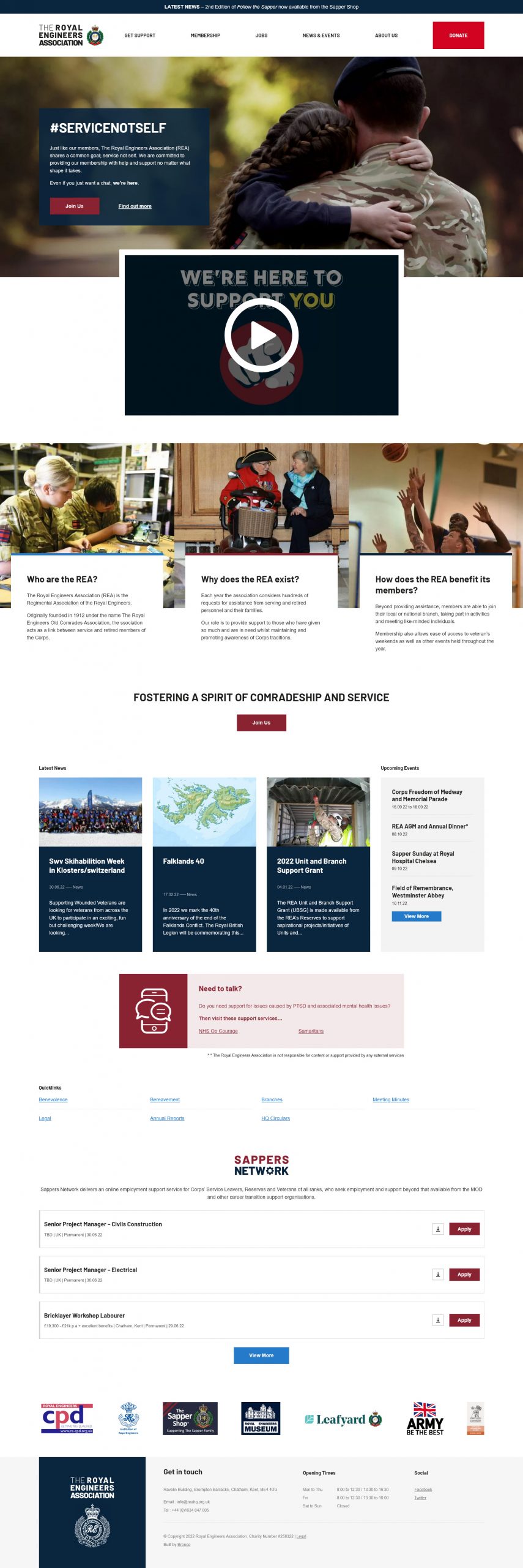
In reviewing the previous version of the website, we were concerned that the content was often difficult to read, especially for its older users. Aside from being too small and with little spacing, the content would also be placed over background images compounding the difficulties.
Through the new design we committed to increasing the font size, reducing the amount of text/image overlays and increase the use of white (colour and space) to give a clean and modern look to the design. The old colour scheme was retained (as the navy and burgundy form the regimental insignia) but used more sparingly given the darkness of these colours.
Life-saving content
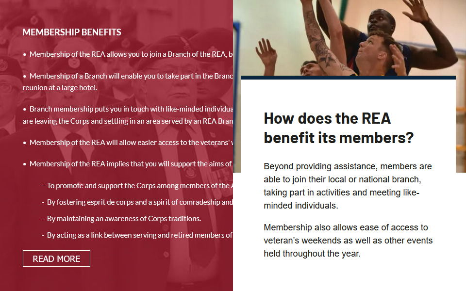
Beyond how easy the content is to read, the website navigation was very flat, with the content on pages hidden in an accordion thus requiring more clicks than was necessary. Streamlining and grouping the navigation was important in improving the user journey and making content more easily discoverable.
One big benefit to the new website is in grouping related pages within a ‘Get support’ section. Providing support is as primary motivation behind regimental associations, and with health (especially mental health) issues so prevalent within the veteran community it’s clear that providing clear routes to this content could be life-saving.
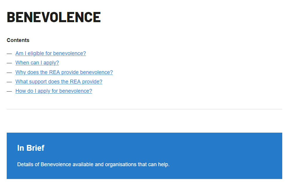
With the accordion effect retired, the result was a number of text heavy pages. Though splitting the content was a possibility it didn’t make sense to split content on a single subject. To aid the user we introduced a contents section to the top of the page. Listing and linking to the main sections of the page below this allows the user to see an overview of the content headings and access them quickly.
In addition, we introduced ‘in brief’ sections which would allow the client to further expand the users understanding of the purpose of the page before starting on the main content of the page.
Making it family orientated
One of the criticisms of the old website was the use of imagery, especially at the top of the homepage. Though the image ticked many boxes; communicating purpose, emotive, high quality. It too greatly reinforces the view that the Association is primarily for older members.
In replacing this for the new website we knew that we wanted to retain the benefits of the former image, but represent family more. We believe the new image hits this brief.
Whilst many of the older members won’t be dissuaded from the Association or its activities by the website alone it’s important that the new website did not alienate these users, or make them believe the Association as a whole no longer represents them. Through utilising more diverse imagery, including elder veterans all members should feel represented through the website.
#servicenotself
Use of language is always a key difference between generations, and while the content is largely driven from within the REA, where we did have influence, we aimed to ensure the content is as neutral as possible.
Where a younger viewpoint does exist is in the use of the Service Not Self hashtag. It’s a subtle cue that aims to show the Association is always evolving.
Lifting barriers
Another requirement of the REA was to improve the accessibility of the website. We felt it important to avoid creating various accessibility options, or alternative versions of the website and instead focus on making the main version of the website accessible.
With browser settings and assistive technologies available that assist a number of disabled users, we focused on the things we could do to ensure the design considers accessibility from the start and that the way we developed the website would not add additional barriers.
We’re aware that issues may exist in the website, especially in a CMS driven website where the client is required to observe certain standards. While accessibility overlays could plug these holes, it appears that these can cause more harm than good, and instead hope through considerate design and development that we’ve delivered a platform accessible to all.
Share this case study
Like what you’ve read, then why not tell others about it... they might enjoy it too