Responsive Design for Dummies

- By Kean Richmond Web Designer
- Published
- Category Web & UX
At Bronco we work hard to keep up with the big changes in our industry and adopt those that are of benefit to our clients. Last year saw the rise of a new method of designing and building websites; this process has been named Responsive Web Design (RWD).
While most active web designers have an understanding of what responsive web design is, it’s not something that is so well known outside our community. So for those outside the bubble here’s an explanation of the basics.
But first some fun
The best way to explain what responsive web design is, is to simply show you. The image below shows our website as seen on different devices, but if you have the ability to alter the width of your browser you can see our website flow as it adjusts to the changes in the browser size.
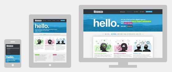
This ability to flow and adjust to the width of a device or browser is what makes a website responsive.
But most people won’t ever notice a website does this, instead they just see a website that seems perfectly sized to how they view the web. For those on the smallest of devices this means no horizontal scrolling and for those with larger screens it means more of your website on their screen.
One website to rule them all
Designing for the web is unlike any other design profession in that we have absolutely no clue about how a user is likely to view our work. Where print designers can design to specific measurements we have no way to judge the screen size of a user. We’ve tried previously to impose constraints to help us; but be it mobile, tablet or desktop a website should just work and not be restricted by false constraints.
Before responsive web design was conceived, for a website to work optimally on different devices it required multiple versions of the same website, built to adhere to the constraints of that particular medium.
Responsive web design negates the necessity to create multiple versions of the same site and instead we can build a single website that works on a multitude of devices. This is big news given the rise of smart phones and tablets which many are using more and more to go online.
The silver bullet?
This method of designing and building websites would act as the ideal solution for many websites, but it doesn’t simply replace everything that came before.
Implementing RWD involves a number of compromises, many are small and perfectly acceptable given the benefits but in some instances RWD is not the perfect solution. The larger or more feature heavy a website is the more compromises that need to be made. In such instances it can reach a point where the user experience is harmed by the introduction of RWD.
When this occurs then the old ways still provide the best solution. This may be a separate mobile website or apps built specifically for devices like the iPhone. A user will always get a greater benefit from using a system that has been specifically designed and built for the device they are using.
Not everyone can invest in creating multiple versions of their website or device specific apps so RWD allows us to create websites that suit a large number of people, without the need for an expensive second version.
Can my website be made responsive?
Responsive design is something that needs to be addressed at the very earliest stages of the design process. It’s not really something that can be retrofitted into an existing website.
There is the possibility of using some of the same techniques to optimise your current website for certain devices. If the existing site is built well then it is possible to add additional layers so a website adapts to devices such as phones or tablets.
This way of working is more akin to Adaptive Web Design. Rather than adjusting to every possible screen size you pick a couple of additional sizes like that for phones and tablets and create new layouts specifically for these. Then depending on the device a person is using they will either see a fixed mobile, tablet or desktop view of the website.
Is responsive design more costly?
The time taken to implement RWD depends on the size and complexity of the website, for small websites implementing RWD does take a little more time over the old method. But if you do it when you’re already launching a brand new website the additional cost can be rather minimal and should certainly be written off by the increased revenue generated by providing users with a version of your website optimised for how they are accessing the Internet.
Want to learn more?
If you want more information or a more technical insight into Responsive Web Design then read the article that helped start it all.