Bathroom Planet

The reasons behind a company wanting to rebuild their website are numerous and varied. After a few years, some might feel the time is right for a refresh while others will find their business has evolved beyond what their website can feasibly adapt to.
At Bathroom Planet, a new website became a necessity in order to overcome the limitations of the existing system, which over the past year had really been holding them back.
The Problem
Developed on an open source e-commerce solution, Bathroom Planet would periodically find themselves unable to move forward with plans to develop their website. The system never appeared malleable enough for their needs and the website would grind to a halt when product updates forced the creation of numerous cache files.
With various options available to them, Bathroom Planet initially partnered with a company whose system would seamlessly integrate with the various product feeds released by their suppliers. However, though capable of this task, the system was not as customisable as originally thought and Bronco was instead charged with creating a system that would be perfectly attuned to the needs of Bathroom Planet.
Pushing the envelope
With the bathroom market fairly saturated, and with a few big players becoming household brands due to extensive marketing efforts, it’s necessary to find points of difference that set a website (and by extension the business) apart in a congested marketplace.
The team at Bathroom Planet were aware that a radical approach might be needed when it came to redeveloping their website, and for us it started with the logo…
The Logo
While we had plans for radical changes elsewhere, when it came to the logo, we felt being conservative was the best approach. We had no desire to completely throw out the existing logo, instead all that was required was a process of rebuilding and refining in order to simplify the lines and remove extraneous elements (such as the .com pillbox).
The biggest difference is of course the removal of the .com. It’s an element often associated with online only companies dating back to the early web and the dot com bubble era. We wanted to free the company and the logo from this while allowing the brand the ability to move beyond the web if the need ever arose.
In simplifying the lines, we reduced the number of dashes that form the top part of the bubble, as well as increasing the gaps within the bottom left ‘shine’. We also reworked the curves at the centre of the bubble so that the angles became reflections of one another. The extra space we generated throughout the bubble icon allows the individual lines to become more defined at smaller sizes while dialling down the complexity of the logo across the board.
The wordmark underwent only a small change in vertically centring this in relation to the bubble, improving the balance of the logo and with other changes ultimately creating a logo that remains recognisable but further refined.
Colour Scheme
The colour scheme was one area of the new website where we wished to provide something unique. Feeling the teal and greys of the original website were a little uninspiring we initially took a more radical approach to the colour scheme.
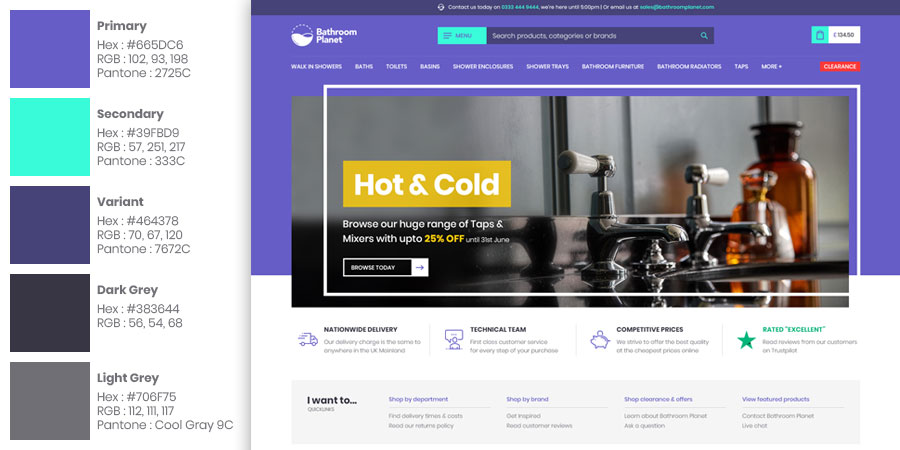
One requirement of Bathroom Planet was that any principle colours have Pantone equivalents for offline printing. Though used to working within brand guidelines it was a different challenge to come up with a new colour scheme from a restricted subset of colours. Normally with no brand guidelines we’d have the ability to select, mix and tweak colours from a million possibilities, but in this instance anything we did wish to use had to be matched against the Pantone collection.
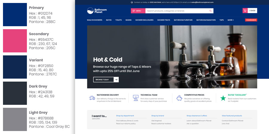
We were happy that we hit upon a colour scheme that would be fairly unique, yet still appropriate within the bathroom industry; but by launch of the website the colour scheme had altered. With purple and teal deemed too radical the colour scheme was adjusted to a deep blue and pink combination. Though using blue would be more traditional we felt the use of pink as a contrast colour would stand out and still provide the design a style that would be unique within the industry.
Layout
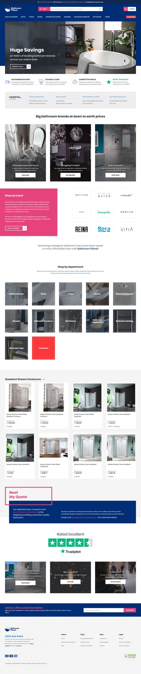
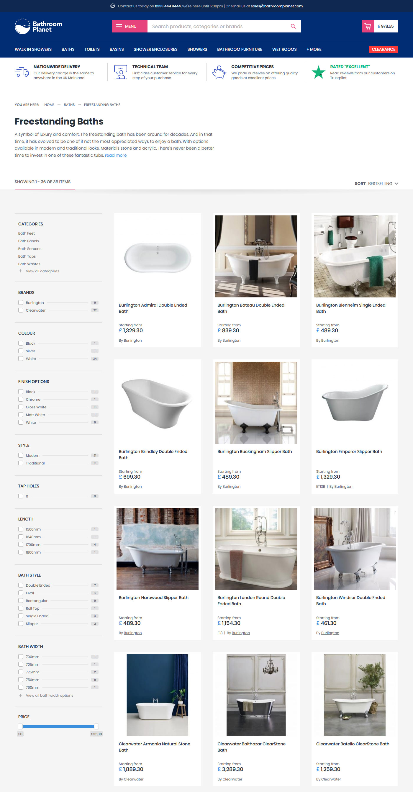
The layout of many e-Commerce websites follows a fairly standard kind of layout, with certain elements expected in one, or limited, places. Those websites that don’t conform to these types of layouts are often those with high value, luxury products where companies have the budget and control over product imagery to create far more complex layouts and with a design team on call to support ongoing changes.
But for a project like Bathroom Planet there’s more to be gained by conforming to user expectations of where things should be. Having a search bar in the header, or filters in a left-hand column, are standard parts of many e-Commerce websites and for us it’s important to fit into what users will expect as doing the opposite will only harm the potential success of the website.
A ground up re-build
At Bronco we build custom, bespoke solutions for all our e-Commerce clients, but this doesn’t mean every line is hand coded from scratch every time we work on a new client. In most cases the basic underlying framework of all our e-Commerce systems is the same. For some clients we may take this and build upon it, adding new features, while for others we might need to tweak even the basics to suit their specific requirements.
What is highly likely however, is that somewhere in each of our recent e-Commerce websites lies code unchanged since it was originally authored over a decade ago.
This doesn’t mean that the vast majority of the code hasn’t had to undergo some changes over the years in order to take advantage of new coding practices and technological advancements. But given the specific and complex needs of Bathroom Planet the time was right to rebuild our core system from the ground up to deliver the best possible solution we could deliver in 2020.
What’s in the box
One reason that makes Bathroom Planet the perfect project in which to rebuild our core system is that the website omits a few of the more time-consuming sections often found in an e-Commerce website, such as user accounts and order histories. Instead we had the ability to instead focus on optimising more integral features such as complex product options and filters.
In taking this ground up approach we found we could really finesse the features we were adding to the website. Here’s just a few examples of things we’ve done to try and improve things for our clients and users…
Product Options
At Bronco we’re well versed in providing clients with the ability to set multiple product options per product and these impact things such as the product imagery and price. But in Bathroom Planet we’ve gone a step further.
Not only have we been able to engineer the dropdowns to better signal available selections based on a previous option selection, and to allow selection of the options in any order the user would like, but the options and filters are now more tightly integrated so that the accuracy of the category filters is even greater.
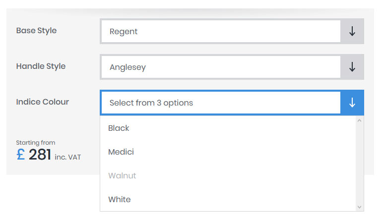
We’re also conscious that on small devices, the iPhone especially, that the standard select box does not always display long text strings in their entirely. To ensure that Bathroom Planet users do not suffer from not being able to fully interrogate the available options we have replaced the standard <select> element with a custom alternative that allows the full text to be visible on all screens.
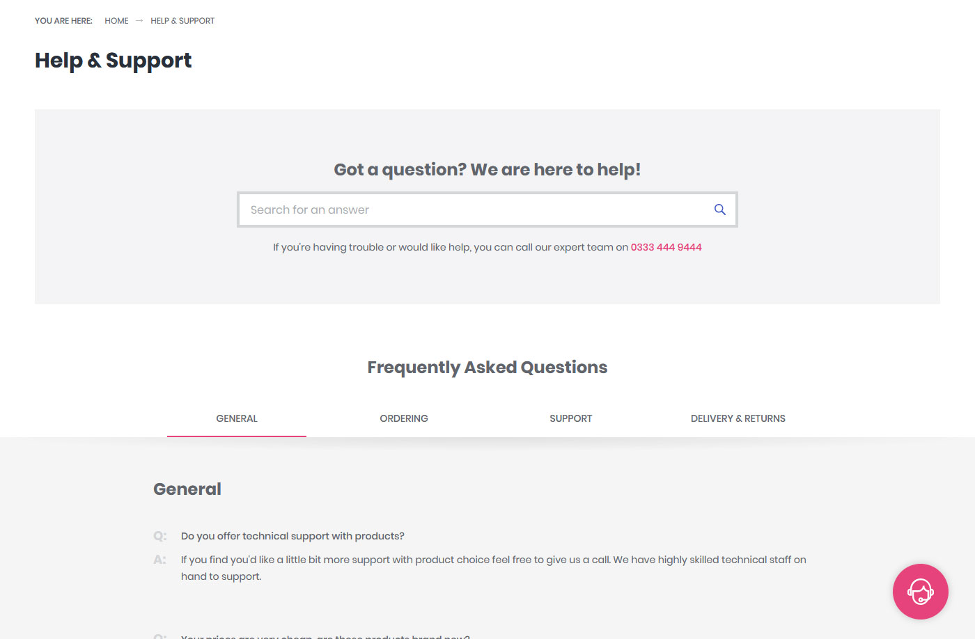
Help & Support section
It’s common to see a website include a Frequently Asked Questions page on their website. Though we’re conscious that these can become a dumping ground for information that should be located elsewhere on the website, we also recognise the benefits of having such information available in one place.
For Bathroom Planet we took the decision to improve the functionality of this page further by building this more like a mini knowledge base. While the number of questions and length of the answers meant they could still be displayed on a single page, we also chose to implement a search function so that users could enter a simple query and have matching responses provided. This provides a system that has the ability to grow without the page overflowing with content that users would then struggle to consume.
Postcode checker, with manual backup
Adding a postcode checker isn’t a complicated addition to an e-Commerce checkout, but what you can find in some websites is the inability to select anything other than the addresses provided through this feature, or that you must go through this checking process prior to being able to manually update the address.
We were determined to provide the user ultimate control. If required they could use the postcode checker and select their address in a user-friendly way. However, whether they use the checker or not we also wanted to provide them the ability to manually enter the address too. There are users who will know from previous experience that their address is either not held within such systems or is incorrect and so would have a much better experience if they could sidestep this functionality completely
Multiple category templates & custom categories
As a company with expertise in Search Engine Optimisation we’re aware than category pages within an e-Commerce can be very important landing pages for search engines. For this reason, we provide two different templates within our system for category pages.
These templates take the form of either a standard product list with filter sidebar, or a ‘top level’ category page which in addition to listing sub-categories, popular brands and select products also provides more room for content throughout the page. The client can then select which page is most appropriate for a specific category.
We’ve also added the ability to create custom categories. Again, SEO efforts may identify opportunities to target search terms for a mix of keywords, for instance ‘Black Radiators’. If creating a separate and new category is overkill, the system instead allows for the selection of filters within the appropriate parent category and for this to be mapped to a clean URL with unique headings and content.
These pages then provide a more customisable and streamlined system than might otherwise be possible.
Focus on AJAX submission
One consistent part of our e-Commerce websites, ones with filter navigation anyway, is the use of AJAX submission to streamline and speed up the process of selecting products. However, in other instances we’ve only ever implemented AJAX in a few specialised cases.
For Bathroom Planet we wanted to look at other opportunities that would be good candidates for utilising AJAX more. Though not necessarily quicker than a page refresh, the user experience is often better as the user journey appears more streamlined, so long as the user is aware that the webpage has updated.
Therefore, we authored a generic AJAX submission function that could easily be plugged into different forms within the website upon the addition of a few extra classes or data-* attributes that control a few options relating to the submission.
Finally, to ensure that when we did use AJAX submission that users would be aware that the website is responding to their actions, we would replace the label of any clicked button with a loading graphic, or place the loading graphic over a region of the page where the content is likely to be updated. Between this any subsequent content changes or success/error messaging the user should have sufficient feedback upon form submission to negate any issues related to the page not appearing to reload fully.
It’s super speedy too…
Or at least we hope so. One of the big benefits of rebuilding the system from scratch is that we’re able to focus on optimising all the underlying code and database queries that help make the website work; eking out any performance improvements we can through removing and replacing old bits of code.
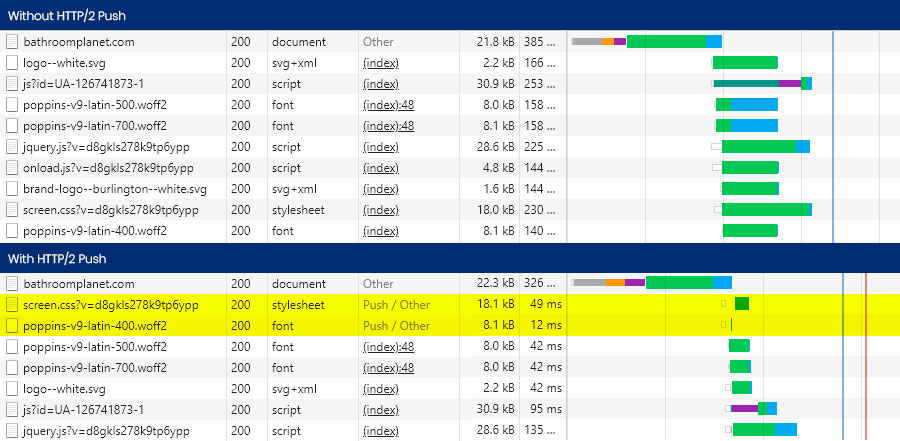
But even before we wrote a line of code, we expected to deliver a fast website through improved hardware setup. A new dedicated server, running the latest stable versions of any software required was just the first step. With updated software bringing in-built speed benefits, we also had HTTP/2 (including HTTP/2 Push) and Brotli compression enabled that would deliver tangible improvements to the website loading times.
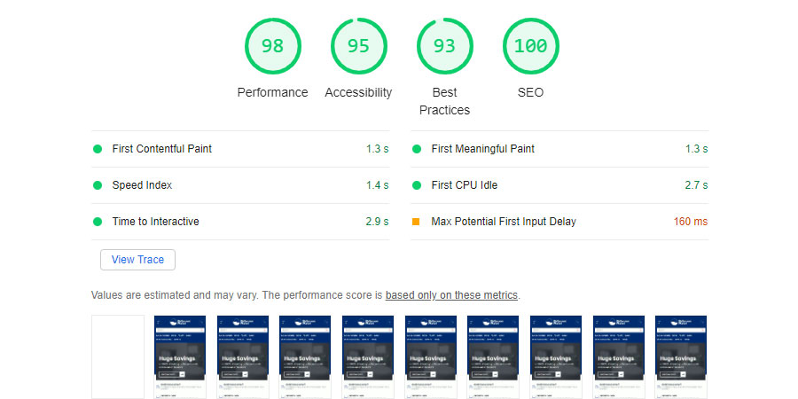
While Brotli compression delivers only small improvements over gzip any improvements are worth making if the cost of set up is low. With HTTP/2 assets will download faster than through HTTP/1.1 and by using HTTP/2 Push we can force certain files (CSS and fonts in this case) to be sent along with any request for HTML pages. The benefits are reductions in the time it takes for the page to render as these files don’t have to be delivered in a second request following a delay.
The improvements don’t just stop here, we’re still incorporating all the improvements we’ve progressively been making over the last few years to all our websites such as utilising WebP images, improved compression and caching techniques and both native and non-native lazy loading.
Our loading strategies are further optimised to ensure quick rendering and minimal reflow as different assets render on the page at different times along the render path.
Third Party Assets
We also paid particular attention to loading third party assets such as YouTube embeds and our Live Chat widget. In both cases simply including these on the page had an undesired impact on our speed scores, with time to interactive particularly impacted.
In both cases we implemented alternative solutions that would only inject any third-party assets only when the user requested them. Not only does this improve the speed of our website, it ensures that we’re only loading assets our users require and not draining any data allowances more than they might be able to afford.
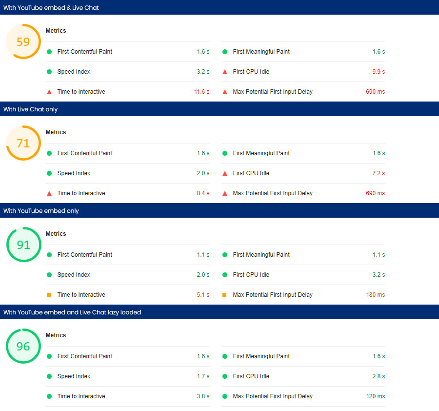
Though lazy loading these assets comes with some small downsides, such as the live chat window opening being slightly delayed, we believe the changes made benefit the greater number of users and so are worthwhile endeavours.
Conclusion
In rebuilding our core system, we are delivering a new e-Commerce solution that is more lightweight, modular and is built to last. It should be flexible enough to adapt to any changes or additions the client requires over the lifetime of the website and provide users with an improved experience.
Upon writing this case study the website has yet to be launched, and at publication will have only have launched in the last couple of days. Therefore, metrics on the success of the project as a whole aren’t available yet.
What we can say is that we’re happy to have delivered a website that we believe is well designed, well optimised and that should foster growth for our clients over the next few years. As time passes, we’ll be sure to be integrating further additions into the website that will help Bathroom Planet grow and compete with the industry leaders.
Share this case study
Like what you’ve read, then why not tell others about it... they might enjoy it too