Oeco Garden Rooms

Radical redesigns of websites are always a bit of a risk, especially if your customers already speak so highly of the existing website. Thankfully for us, we have clients we’ve worked with for many years that trust us when we advise them a big change is needed; one such client is Oeco Garden Rooms.
A long-running partnership
Bronco’s relationship with Stuart Hall, Managing Director of Oeco Garden Rooms, pre-dates the formation of either company. But before this becomes a history lesson, it’s enough to say that we’ve not only produced the two previous versions of Oeco but also multiple other websites for Stuart.
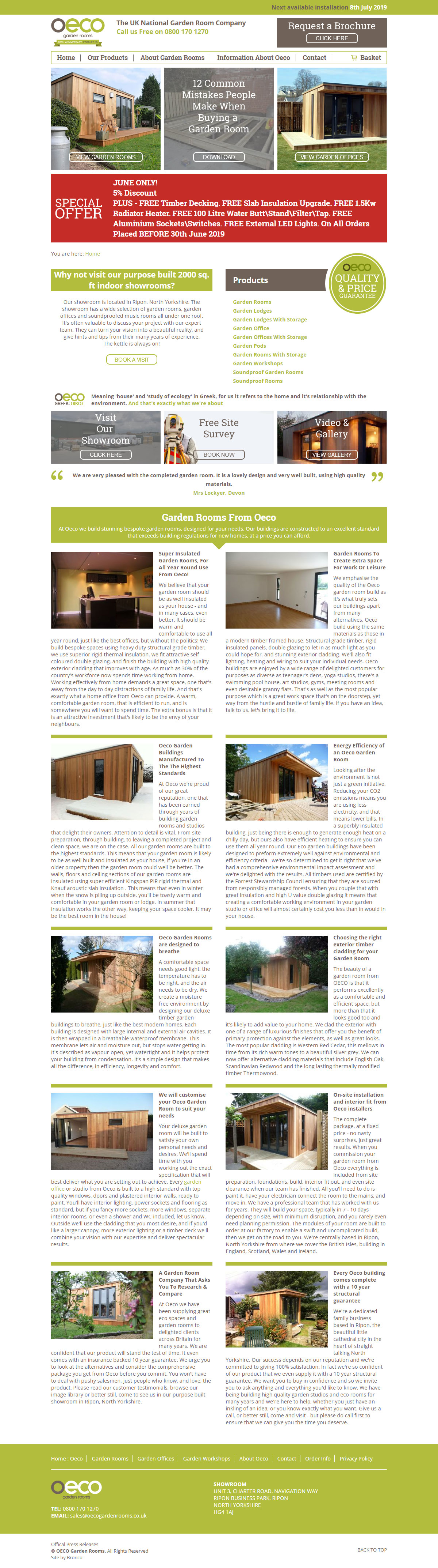
Refreshed in 2015 the previous Oeco website had undergone a multitude of changes and additions in the intervening years. As these were slotted in, the website had become a little repetitive, disorganised and didn’t always focus on the messages that we’d expect would actually sell the product to people.
Beyond this, collectively, we questioned the benefit to users of being able to purchase such high value items online. The number of online sales were low and infrequent, with conversions coming through other routes too. We considered that the website, as well as users, may actually benefit from the removal of this functionality, not to mention making the project more cost effective.
With some ideas about where improvements could be made we knew that a wider review would be beneficial and ultimately determined a new website that wasn’t beholden to the design or framework of the old one could lead to the greatest potential success.
Asking questions
As part of any review we’ll ask ourselves and sometimes the client a multitude of questions to determine why things are the way they are in the existing website. These are just a few such questions we posed…
- How easy is it for users to find the products, especially when the navigation does not display all available options?
- Is the special offer a requirement for the home page?
- Can the special offer be redesigned so the content is more easily understood, rather than as a long block of text, whilst still being client editable?
- Is the website projecting negative messaging on initial load?
- Are all the information pages required? Could these be removed or consolidated?
- Does the navigation require so many pages within the drop-downs?
- Could the content on the home and product pages be condensed or designed in a way to reduce their footprint?
- Could additional elements be added to the homepage to make it more visually dynamic and expose more meaningful messaging?
- What is the primary conversion? A product enquiry or brochure request?
- Does the website require a Content Management System?
- Can the various product options be condensed into fewer pages?
- Does the general look of the website reflect the quality and price of the products?
- How does the website stand up against increased competition?
Providing answers to these questions set the goals for what we’d try to achieve with the new website.
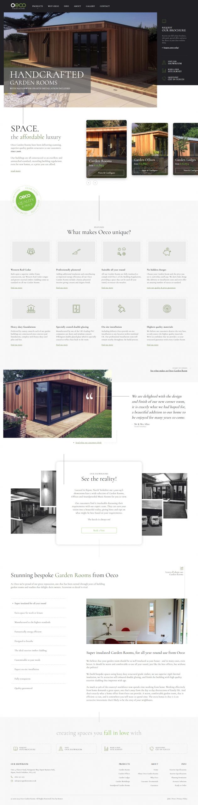
Oeco : 2019 Edition
As you can now see the website did undergo quite a radical redesign, nothing went untouched… not even the logo.
The Logo
Changing the logo was a bit of a risk, however the original seemed to clash with the rest of the design and how we wished to position the new website. By changing the font of ‘Garden Rooms’ we could harmonise the logo with the design but allow the original ‘Oeco’ to remain so that the website logo simply becomes a variant of the original rather than the instigator for the reproduction of all printed materials.
Colour Scheme & Fonts
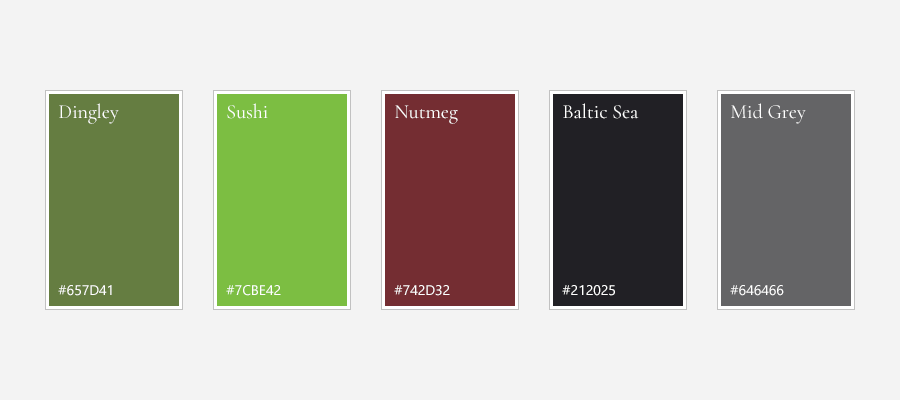
The old website used mostly greens and browns as the primary colour scheme with something close to an Earls Green as the primary colour of the website. We felt the site needed to switch things up to give it more of a premium feel, but for a website about garden rooms we weren’t about to abandon the green altogether. So we selected a darker green with a lighter variant that we could use for highlighting certain elements throughout the design, as well as introducing a deep purple for larger background colours and text.
We also updated the fonts on the website in order to use the serif font Cormorant as this would help reinforce the premium positioning we envisioned for the new website.
Rather than using two fonts as the old website had, this time we stuck just to the one. Partly this was as a way of reducing the number of assets required to render the page, thus keeping the website lightweight and fast, but also because utilising weight, colour, case and size we were able to differentiate the headings and body text as much as we required for this project.
Communicating more effectively
With a lot of information pages it was surprising how poorly the old website communicated the main selling points of Oeco as a company and also its products. These main points often seemed buried in long form content which not all users would read and would probably need to be highly engaged with the website to do so.
The new website needed to make this information clearer, quicker to find and in a form that made it easier to scan.
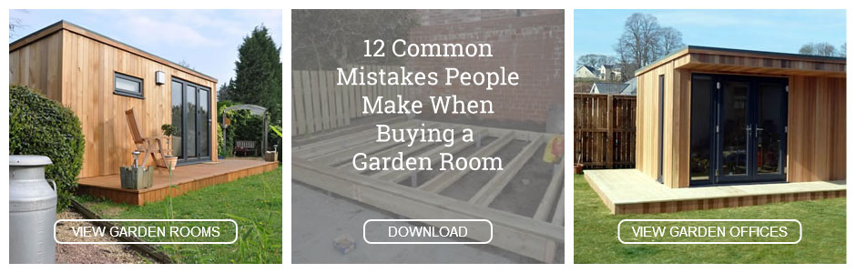
The old website had attempted to consolidate this information within a page titled ’12 common mistakes people make when buying a garden room’ with a prominent link placed on the homepage. But all this appeared to project a rather negative message in a highly visible location. So, one of our first tasks was to rewrite this page to give it a more positive spin. Rather than ’12 mistakes’ it’s now ’12 things to look for’. Not only that, but it’s now included as part of the main navigation under the title ‘Why Oeco’.
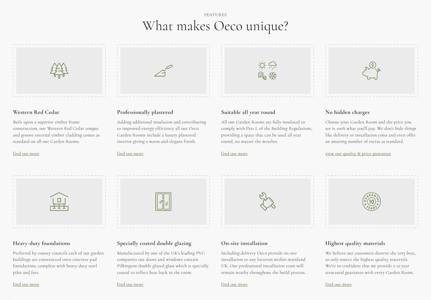
But this page was still a long read which not all users would have the time or inclination to bother with. So we needed to lift these main selling points out into relevant and prominent positions such as the home page and product pages. Under the headings ‘What makes Oeco unique’ and ‘Your Garden Room includes’ respectively we’re able to communicate these messages using smaller blocks of text, that scan more easily and that have a design that helps make them more visible to users and projects a more positive outlook.
Call to Actions
Within both the old and new website there are four non-product related contact forms. These are to request a brochure, book a free site survey, visit the showroom and a general contact form.
Initially we’d considered consolidating these various forms into a single page, but ultimately determined that while this may be beneficial for maintenance reasons the individual call to actions are necessary for the users, and unique pages offered the ability to tailor the content of these pages far more easily.
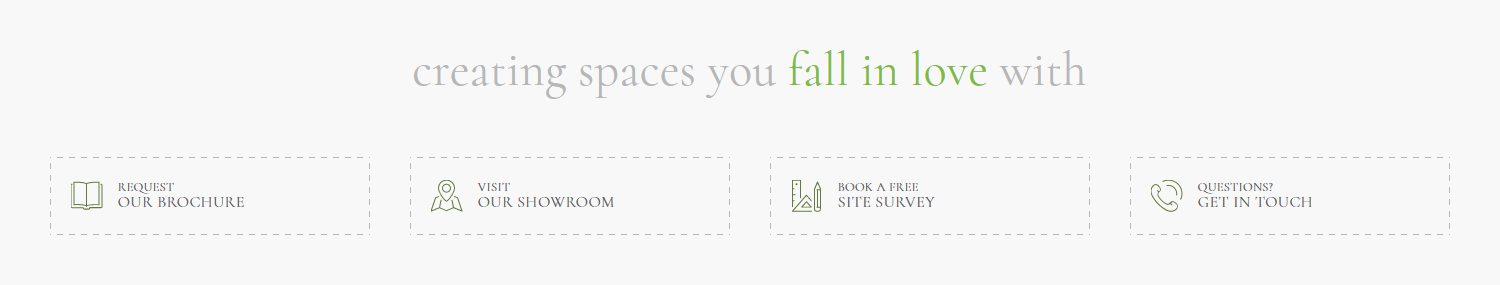
Instead we looked to create a closer association between these call to actions rather than have them spread separately across the website. So, with the exception of adding the ‘Request a brochure’ and ‘Contact Us’ links as secondary buttons towards the top of the product page in every other instance these four call to actions appear together. In doing this the user can easily see which option is best suited to their needs, as well as quickly observing the different actions available to users.
Product Configurator
On the Oeco website a standard Garden Room comes in five possible shapes, four possible styles, potentially seventy three sizes and each combination of these can be with or without a storage room.
In the old website the sizes were thankfully dealt with differently, but the combinations of shape, style and storage required a different page for each, resulting in 40 individual product pages for a single product type. Reducing this down to one page was something we set out to achieve in the new website, yet still wanted to show the various options available as well as provide a way for users to indicate what they wanted when enquiring about a product.
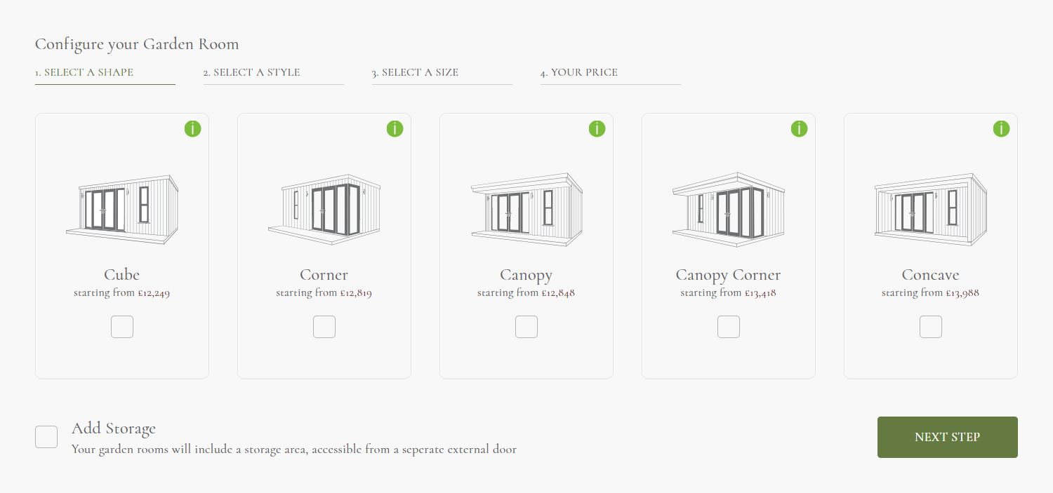
The solution we came up with was to create a product configurator that could take the user step by step through the different options as well as provide relevant information and accurate prices throughout. At the end the users could send an enquiry, view the optional extras or call the team.
Our intention was to reduce the amount of clicking around the client had to do, both by having to view multiple pages to see the different shapes and styles but also not having to select the sizes one by one to determine its effect on the price of the product.
Content Management System
As an E-commerce website the client had a lot of control over the content of the previous website. Not only the product pages but many of the text pages too.
With the sunset of the E-commerce functionality, and the removal of a number of information pages we decided that a Content Management System was no longer required for much of the website. The content of these pages simply does not change frequently enough to warrant it.
It’s an odd thing to recommend taking control away from the client, however without in-house web professionals it can be tough for small companies to maintain their website and keep it looking good, not unless the CMS is heavily restrictive but even then some clients have a way of doing the unexpected.
By removing a Content Management System for the pages we’re able to introduce more complex layouts, and reduce the amount of whitespace that existed throughout the repetitive layouts of the old website. Now, if changes are made, we have the ability to maintain the fidelity of the design and introduce new layouts when the content requires it.
Yet for Oeco a small Content Management System does remain to allow them the ability to edit site-wide sales, upgrade offers and the next available installation date which are all frequently updated or need to be updated at moment’s notice.
Fast, Fast, Fast
As has become customary in these case studies we have to compare how the new and old sites fare when it comes to loading times.
Without digging into individual metrics, overall the new website performs better than the last. Across the board, times are reduced by 0.5 to 1 seconds on a 3G connection. However the biggest improvement, I feel, is that through updated font loading strategies and self-hosted fonts the text on the website is now visible at the point the website starts rendering, rather than waiting for external Google fonts to load.
Also as you’ll see in the comparison below the new website has completed rendering before the old website has even started, though we did not run the test enough times to be sure this would be the case every time.
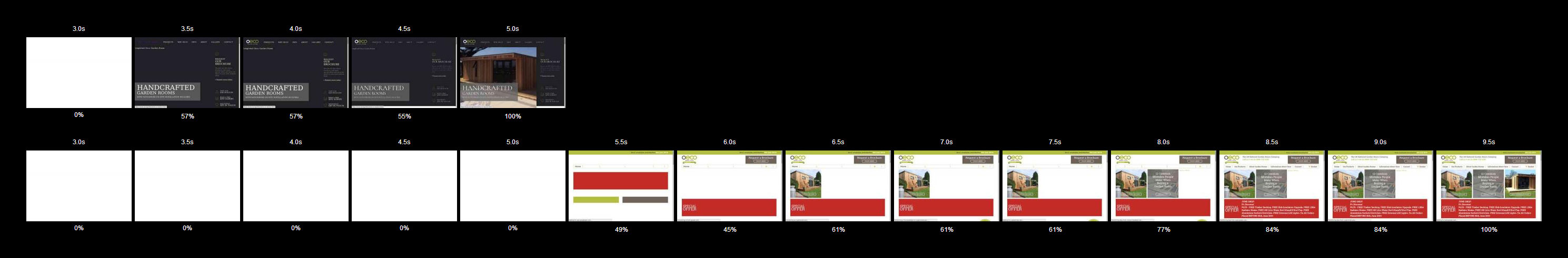
We even managed to pick up a few new tricks when investigating how to get our third party popup (yes, they annoy me too) more lightweight and less of a burden on our users. Beyond ensuring the imagery was sized correctly and it didn’t load on mobile devices we also stopped it loading additional fonts and instead used those already present in the website.
What about those customers that loved the old website?
When a client is receiving positive feedback from customers it’s tough to say that the website could be better. The truth is without more research you don’t know how much potential business you’re losing out on. For every one customer who loves the website you may lose nine who do not.
Unfortunately small businesses rarely have the budget to go out and find that information and so have to place their trust into the agency telling them that the website contains opportunities for improvement. Though some clients will have found what they needed in the old website we’re confident that many of the changes we made will benefit users.
We’ll admit not every change will suit all users, but over time the website will evolve based on the feedback we receive.
Conclusion
The new website is a radical change from its predecessor. It’s on an entirely new platform, with a whole new colour scheme and a more premium design. It’s been slimmed down with pages and functionality removed, whilst also made faster with a more visually complex design.
We’re pleased to deliver Stuart his third major version of the Oeco Garden Rooms website and feel that all the changes we’ve made will benefit the client and support the company’s continuing growth.
Time will tell how successful the website is in achieving this, but we’ll not be standing still. The website will change and we already have additional work on the website in the pipeline.
Share this case study
Like what you’ve read, then why not tell others about it... they might enjoy it too