Paul Roffman

- By Kean Richmond Web Designer
- Published
- Category Web & UX
All design work involves a certain amount of creativity, but there are certain projects where you have to temper that creativity to deliver something usable in line with user expectations. For example, you wouldn’t want new BBC News or Amazon websites that included visual flourishes that distracts the user from achieving their goals.
But there are also those projects where that kind of creativity can be unleashed, where it supports the subject matter of the website. One such instance of this is the new Paul Roffman website.
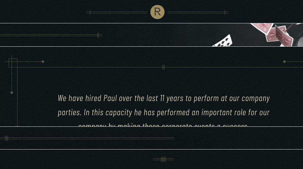
As a magician, mind-reader, actor and more you’d expect a website that might delight its users a little more than your usual cookie cutter templates. But as a corporate or private party magician rather than someone performing big stage shows his audience includes business types more concerned with finding the right information than animations of playing cards flying out of the screen. Hopefully Paul’s new website strikes a positive balance.
The starting point
Before we started on the project Paul’s website looked like this…
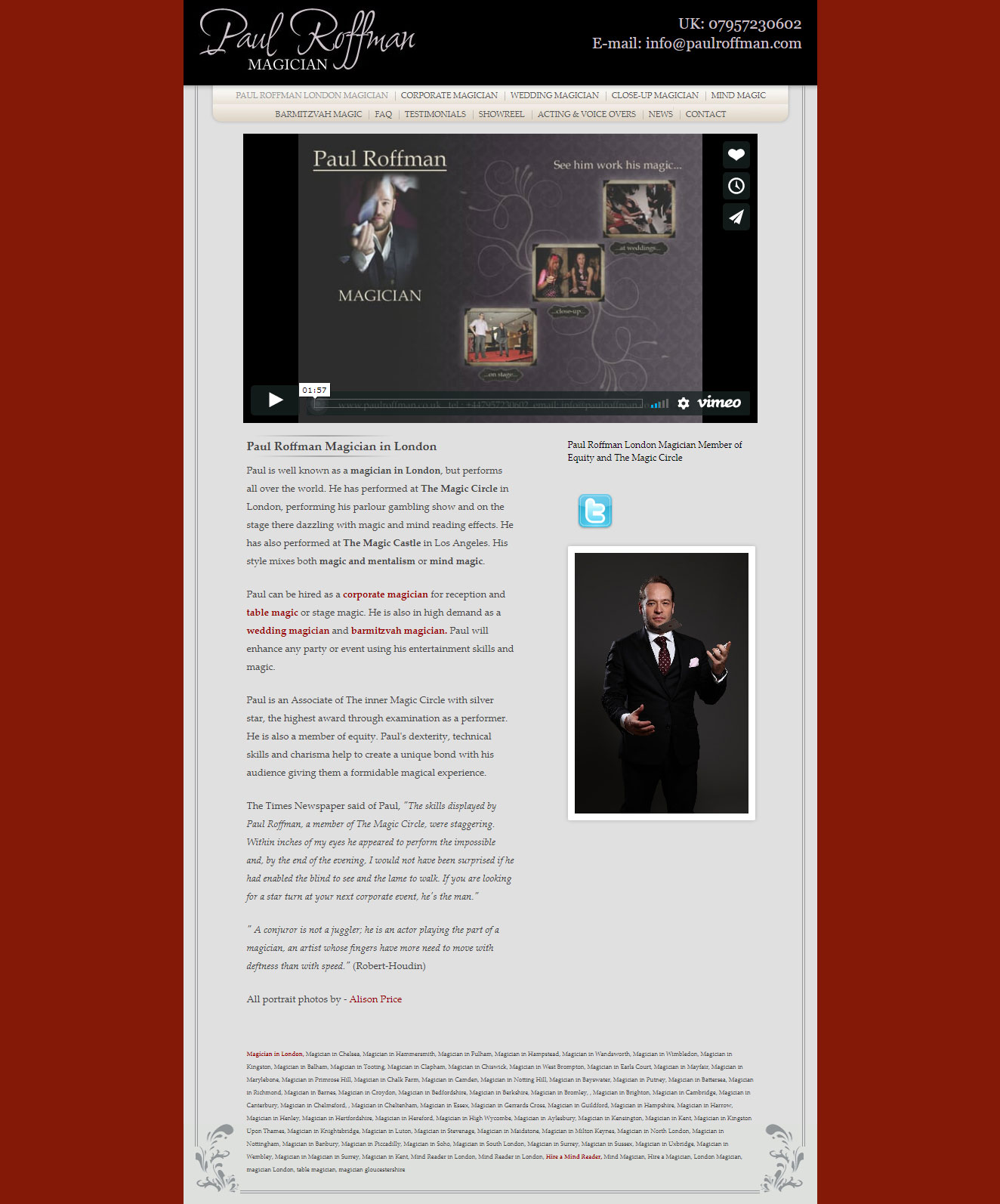
You might be able to tell that this website had been around some time. Built long before most of today’s best practices, it wasn’t Paul’s intention to leave it so long to redesign his website. He even got as far as having a new design created, but the project stalled and the old website remained.
It was through our long term client and resident Bee expert Jez Rose that Paul came to hear about Bronco. With us Paul embarked on creating a new website and logo, which by this article’s very existence reached its happy conclusion.
A tough logo
Logos are pretty tough to design. For larger businesses things get easier as the number of decision makers make feedback a little less subjective. But for a client like Paul where the logo is his name he’ll always want something he likes and feels suitably reflects how we wishes others to perceive him.
So with Paul it took a few iterations to get the logo right. With so many magicians using fairly obvious icongraphy in their logos we wanted to avoid anything too cliche. Paul also needed a logo that would work for him as an actor and voice-over artist as well as a magician.
Below are some of the various iterations we went through on the journey to Paul’s new logo.
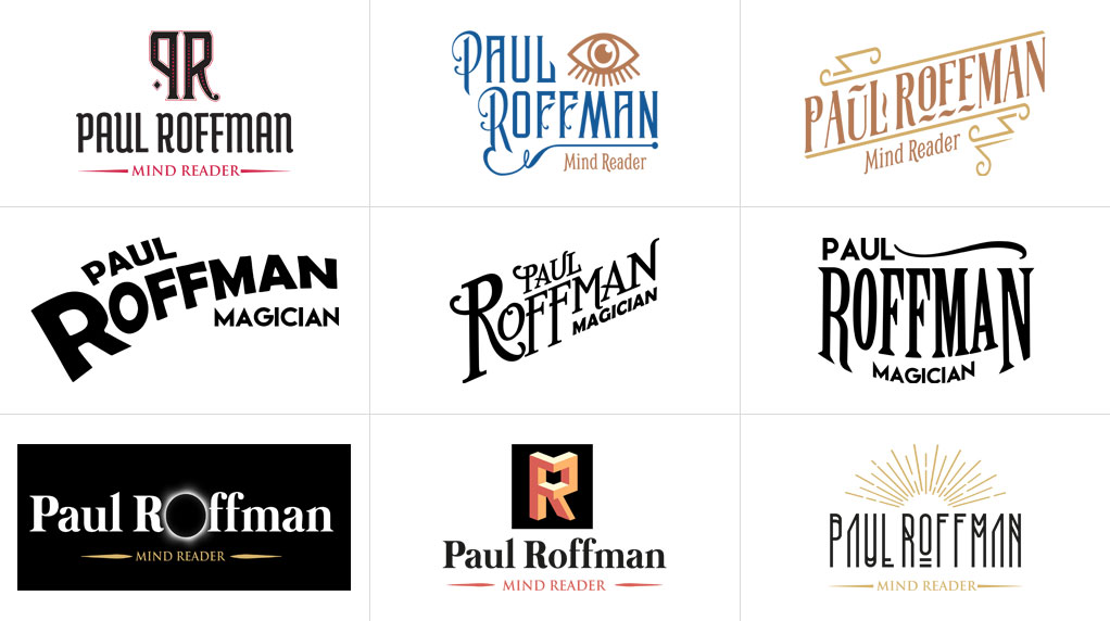
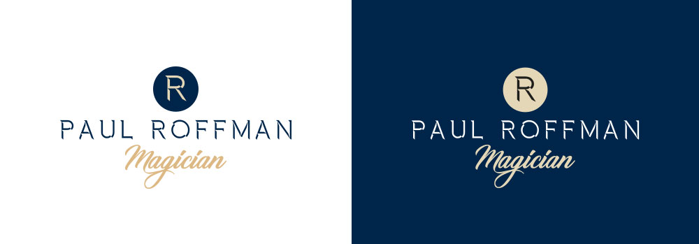
After we’d worked through some logos that didn’t work including being inspired by Art Deco and vintage magician posters, we eventually landed on this James Bond inspired logo that portrays a level of sophistication that Paul aims to achieve through his work.
An idea to hang your hat on
There’s always a spark of an idea where a design can grow from. For some time I’d been looking to find a project that would give me the opportunity to incorporate some double exposure images into the design. Though the logo veered away from this style for a while the final logo gave us the opportunity to try this out.
With Paul having a huge number of professionally taken photos of him alone and performing it made creating the effects we wanted so much easier. But designs do evolve as you work on them. What initially started as a lighter design became dark (our first in a long time) which also worked to mask the double exposure effect a little, but the image still looked great in the space.
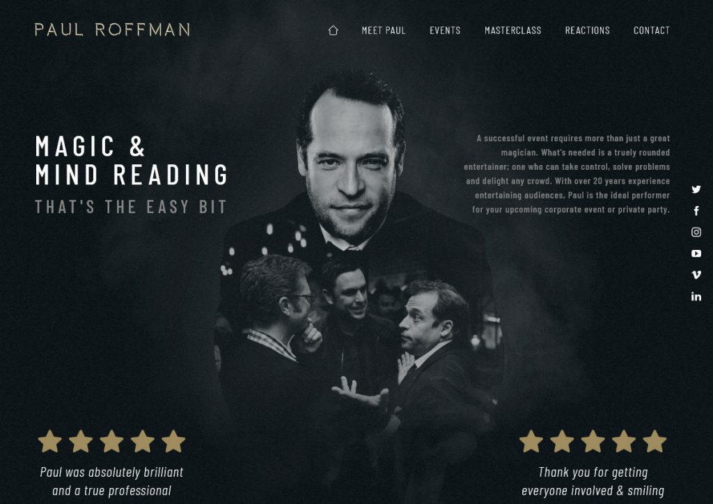
Though this proved a great starting point for the design we were still missing something that we could use more widely in the design that didn’t necessitate us creating lots of complex images throughout the site. It was through looking back at the project so far that the Art Deco influences came back into focus and proved the perfect visual flourish that would help bring the entire design together.
Not only would we use this style to differentiate the various sections in the pages but also added a little easter egg in numbering each through the page.
Another string
It’s normal for us to edit the content clients send us to make it work better in a design. Often it’s a simple case of splitting longer documents into smaller sections that can fall under specific headings that help users who often scan read longer pages.
But for Paul we went a step further in helping author much of the content from scratch. Different pages required different levels of input and each involved some back and forth between Paul and ourselves but eventually we created content that communicated the information Paul wanted and had the detail, or lack thereof, we felt was beneficial for the users.
While such a task would involve our team of content writers, the project evolved in such a way that the content was written by the designer as they had gained a good understanding of Paul, what he wants from the website and also could essentially apply what he would do with the design as he wrote.
You’d be unlikely to find this happening in large agencies where everyone has such specialised roles, but at a small agency like Bronco we all have a few strings to our bow.
Site speed, again
Left unchecked Paul’s website could have been really slow. We’ve got really large photographic PNGs that allow us to use CSS blend modes, complex layouts that increases the size of the CSS files as well as numerous high quality images dotted around the entire website.
Thankfully most of the techniques we employ around fallback JPGs, image optimisation and responsive imagery made sure that the website was well optimised. As always we try to make sure the mobile version is even lighter than the desktop version as we can use smaller images here and that’s good news when mobile connections are often the slowest. But the technique that probably saved us the most was in adopting lazy loading for all our gallery images.
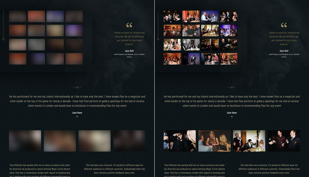
The technique we used would show a blurred version of the original that would only be a few bytes big, then once the image is scrolled into view the actual image would appear. We’d have fallbacks for non-JavaScript users too. While the solution doesn’t reduce the overall bytes downloaded if a user scrolls the entire page it does reduce it if users don’t scroll through all the images and does ensure that initial load is quicker and so become usable in less time than if we loaded the images normally.
The result is a homepage that comes in at ~1.21MB on initial load which is close to the 1MB goal we most often try to work to.
That’s the trick
While a fairly small website it’s one of the most visually complex designs we’ve created at Bronco, we’ve adopted a number of complex techniques to achieve the design and even added a few animations to delight the users . Yet we feel the information is still accessible and that the visual flourishes don’t get in the way of the user at any point.
But while we’re happy, what about the client…
I had the good fortune to work with Bronco, to have a brand new logo, business card and website designed for me. What a great partnership! They constantly challenged me to think about what I wanted my site to do and articulate my needs for my business. It was great having a team of people at my disposal. They listened and guided appropriately, understanding that they also needed to learn about my business to create the right design and functionality that was specific to me.
I would recommend them wholeheartedly to anyone who wants their design and website done properly without cutting corners. I look forward to an ongoing relationship. – Paul Roffman