Refreshing the Yotspot homepage to promote new sign-ups

- By Kean Richmond Web Designer
- Published
- Category Web & UX
Where to start.
Yotspot is one of the most complex websites we maintain at Bronco. We first built the website in 2010, redesigned it all in 2016 and have added, removed or altered a huge amount of functionality over the past decade; often finding even small changes can have a huge impact. So redesigning the homepage at the start of 2021 wasn’t going to be without it’s challenges.
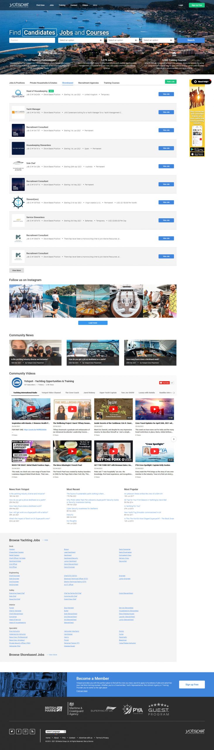
When the team at Yotspot wanted to add additional content to their homepage, we suggested that after 5 years a redesign might be warranted to better accommodate new content aimed at attracting new sign-ups into what was a page light on content. Previously the only static content present on the homepage was three short paragraphs providing an overview of the website. The page really lacked any information aimed at enticing prospective sign-ups to convert; a big omission in an increasingly competitive marketplace.
Why redesign?
Though new content could be added into the existing design, there was an opportunity to do much more by refreshing the entire page. Without a redesign there would be sections we’d be hesitant to alter, such as the banner space, yet it’s this area that underwent some of the biggest changes given it’s prominence in the page.
Other pages in the website would definitely benefit from a similar refresh, but scaling up the project to encompass the entire site was never considered by us or the client. While doing so would have potentially freed us to push more drastic changes, this wasn’t our goal and we were happy to work within constraints that meant any new design would have to be consistent with, though not identical, to the rest of the website.
In the past 5 years, there’s also been huge focus around the speed of the web, and with Yotspot especially impacted by this, a redesign is the kind of project that would facilitate improvements.
Fast or pretty?
It’s no secret that owning a Yacht takes a few pennies, pennies that put you in the path of many luxury brands. These brands often adopt particular design styles aimed at reflecting the value of their product or service and while Yotspot must attract a similar audience it must consider a number of other objectives which can conflict with appearing as a luxury brand.
Yotspot, as a service based around finding Yachting jobs and crew, must be accessible to an audience of seafarers located around the world on a variety of web connections which could be slow, inconsistent or have data caps. For these users a lightweight website is often more important than if looks shiny.
Creating a design that serves these two audiences is a balancing act.
Clearer messaging
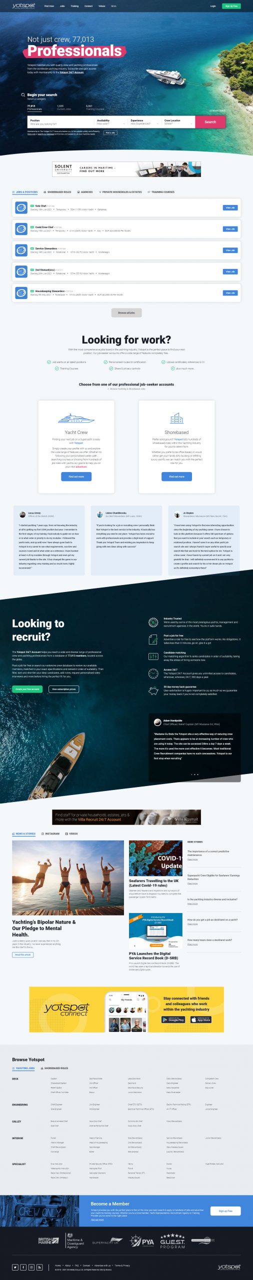
Alongside the additional content provided by the client, and expanded by us to highlight specific features and testimonials, we felt the new design offered an opportunity to make a bigger impact on new users on initial load.
The primary messaging in the old design was valuable in it’s directness, but was lacking emotion. In the new design we focused on this idea of ‘Adventures’, displaying the strapline ‘Not just jobs, Adventures’ within the primary banner space. For new crew signing up we determined this would be an emotive message to tempt deeper investigation into what Yotspot offered; whilst not alienating employers.
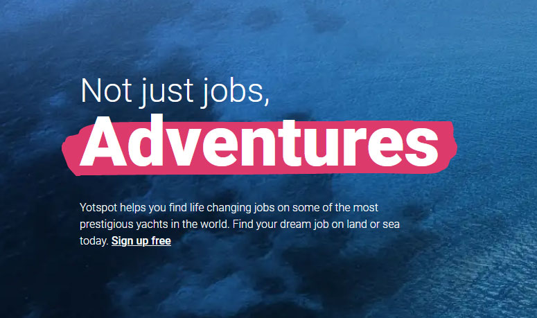
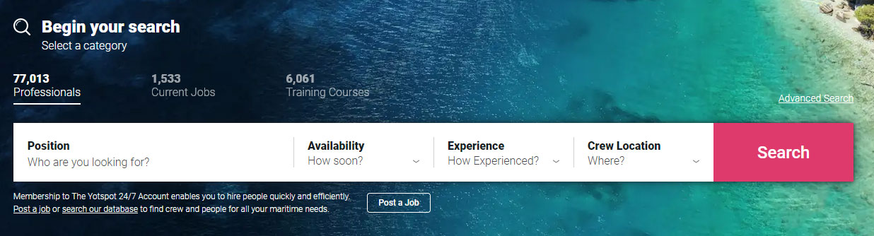
As the design evolved this messaging became less prominent. In attempting to satisfy all user types and focus on their primary revenue stream of employers, three versions of banner content were produced, with the ‘Adventure’ message visible only after user interaction or sign up as crew. In it’s place we display the number of crew accounts to convey the scale of the user-base available to prospective employers.
Evolving the design
As the rest of the website would remain unchanged revolutionising the homepage design in a way where it would no longer be consistent with the rest of the website just wouldn’t be approved. Common sections such as the header, navigation and footer all needed to remain the same as would the fonts and colours used.
Beyond this we’d have to retain a similar style. We couldn’t change to a more illustrative style, for example, as this would result in a homepage looking too far removed from the rest of the website. What we could change, without constraint, would be the layout of the page, the scale of elements and the amount of whitespace used. The result is a page that retains all the base styling that currently existed, but remixed to fulfill a new set of requirements.
Though we avoided changes to some of the core design elements we weren’t afraid to expand what was available by adding additional font weights and a new colour to our palette; pink. Used sparingly these provided more versatility in the design when we wanted certain elements to stand out more, especially in the case of using pink highlight specific elements in the banner.
Though the extra font weights added additional load to the page we knew that through modern font loading strategies and savings elsewhere we would still see a boost in performance.
Image Curation
Having worked with Yotspot for many years we knew that they were fond of certain parts of the existing design, one being the homepage banners and how they would display different imagery on refresh. Unlike most carousels that display different content, on Yotspot the image is all that would change; it’s purpose to show a wide cross section of the industry.
With up to 20 images to download across multiple visits, none which were optimised to use responsive image techniques, this meant many users would be downloading a lot of additional data that may have little impact, or worse really frustrate their experience of the website when on a sub-par connection.
The variety of imagery also created another issue in that the overlaid elements could disappear slightly or become illegible.
In the new homepage we felt it was critical to be able to replace the large set of images with a strong single image that would provide the ability to curate how this interacted with surrounding elements as well as allow users to benefit from browser caching on repeat visits.
Extensive lazyloading
While implementing lazyloading on imagery was a no-brainer, when reviewing the existing homepage there were two areas we found that had an excessive impact on the speed of the homepage; third-party widgets and hidden content.
Third-party widgets
With live chat, Youtube and Instagram feeds displayed on the page we found that collectively these were having a huge impact on a variety of speed metrics. Though we’d previously had success lazyloading chat widgets on other websites, without API access this couldn’t be lazyloaded on Yotspot without impacting its usability. Thankfully this loads fewer resources than the other widgets.
With Yotspot growing as a centre of knowledge the Youtube and Instagram are viewed as important methods of communication. So while we’d otherwise recommend removing these; this wasn’t an option. The compromise was that we would include these in a tabbed section where we could delay their loading until the point in which the user requests them. While attributes like defer and aysnc on external scripts do have benefits, in this case we wanted to avoid anything loading until the user actively chose to view them. In taking this approach we make the page as lightweight as possible for all users, only loading hidden or heavy elements once requested.
Hidden Content
Closer to home there are a few sections of the page where we’re loading content that may not be required by the user. We understand that some users will interact with the homepage only as a route to logging in or to utilise the search. By removing optional content being included on the page on the off-chance it’s made visible we can speed the loading of the page for all.
To achieve this in sections such as the search bar and job category tabs we created a reusable AJAX function that requests this content and appends this to the page on user request. The content is appended so it’s not requested multiple times on the same page view. The page also stores these choices so that on refresh or future pageview the users preferred view is maintained.
Success?
The new design has been live for a few months and we feel it’s achieved many of the goals that we set out at the beginning. Not only does the page now display more content aimed at attracting new users to sign up, but the page is far more lightweight and loads much quicker.
Excluding all third party assets the page weight on initial load is 350kb (700kb with external assets). The website also performs far better in a number of lab tests as well as showing positive uplifts in Google’s field data. A number of metrics are still a little off what we’d prefer, specifically Largest Contentful Paint, but a forthcoming server move will prove an opportunity to improve these scores further.
The result, we hope, is a homepage that will deliver continued growth in the years to come.