The 3 year itch

- By Kean Richmond Web Designer
- Published
- Category Web & UX
At one time redesigning our website was a yearly occurrence; constantly looking to upgrade and update to maintain pace with a fast-changing industry.
Yet our new website, launched over a week ago, is the second time we’ve waited over 3 years to push out an update. Maybe it’s a product of a maturing industry, maybe we’re simply more content with the designs we’ve produced or maybe we’re just too busy to invest the time in a rebuild of our own website?
Whatever the reason, in late 2019 we began to get that itch to redesign the website, not knowing at the time that we’d be launching it in the middle of such societal and economic turmoil.
Why now?
When it comes to redesigning a website, we’re conscious that doing so should represent more than a simple refresh of what it looks like; that the investment should be for more than a new lick of paint. Our problem was that we were still happy with much of the old website. The content still largely represented us and our services, and was presented in a form that we believed was easily consumed by prospective clients.
Yet, small elements of the design felt past their best and could benefit from being updated to reflect modern trends. There were also a few pain points in the existing website such as issues over featured images in the blog and lack of clear call to actions throughout where a redesign would provide the best method in addressing these.
A redesign also allows us to modernize the underlying code, which this time meant adopting CSS grid layouts more widely and ensuring we adhered to modern speed metrics, in part achieved by a new server move with HTTP/2 and Brotli compression enabled.
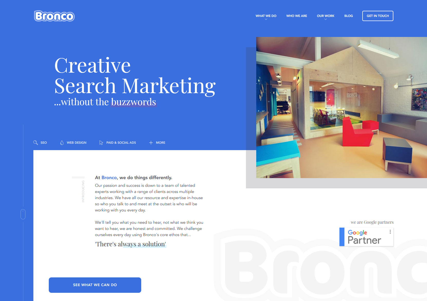
A new tagline
Over time the brash and self-congratulating tagline of ‘The Original Creative Digital Marketing Agency’ found on our previous website had begun to grate and with a new website it was time to rethink how we succinctly tell new people who we are and what we do.
Agencies often take different approaches to this type of messaging, but as the majority of the content found within our website reinforces a direct approach that’s borne of our Yorkshire sensibilities, we wanted to ensure we adopted something clear in such a prominent position. The result, was ‘Creative Search Marketing… without the buzzwords’.
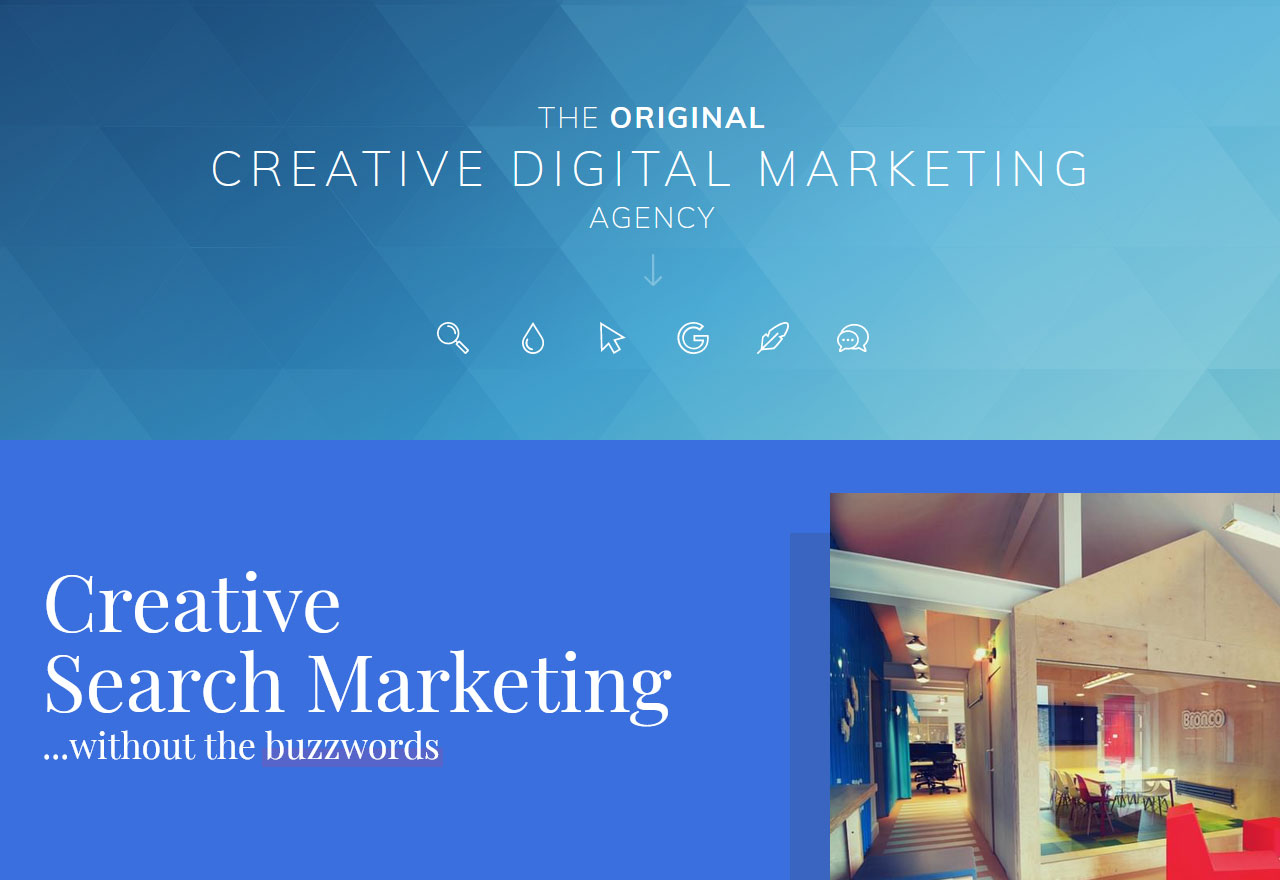
We feel this simply and effectively encapsulates the range of services we provide, whilst also giving an insight into the type of straight-talking agency we are with no marketing fluff to be seen.
A more dynamic website
Once we nailed down our primary messaging, we could begin working on the design. Undergoing a few iterations before settling on the version you can see today, the common thread between all of them was creating more dynamic and complex layouts.
Creating complex layouts is a subject we’ve made a lot of progression on at Bronco over recent years. Though there are instances that sticking to simpler layouts and particular conventions is necessary to ensure usability, on the homepage of a website there’s often more freedom to create something more dynamic through the use of complex layout systems.
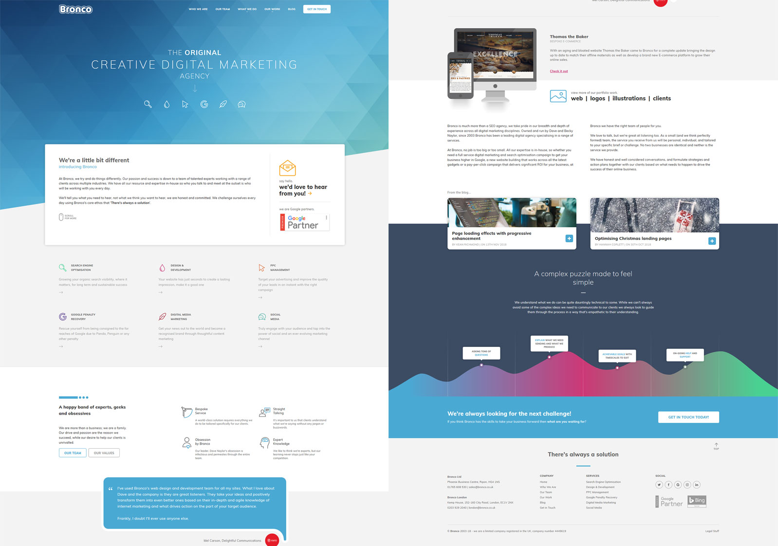
In our last website we tried to ‘bridge’ different sections by overlapping certain elements, but you’d still see a clear division between sections as you move down the page. Within the new design we feel we’ve achieved a design that creates less obvious separations between the different content groups and so promotes user scrolling.
The danger as you increase the complexity of the layout is that you create overly complex designs that lack the whitespace necessary for individual elements to get the focus they deserve. We hope we’ve stuck the right balance.
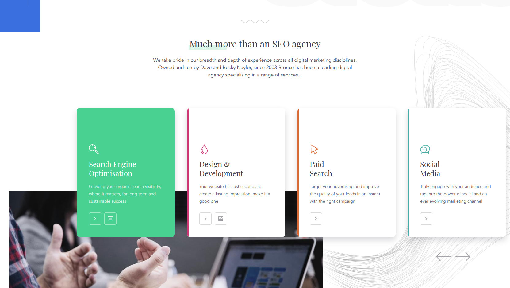
Subtle animation
Animation on the web is a tricky beast to get right as too much and a website can become a chore to navigate. At Bronco our approach has is less is more, and almost always use animation upon user interaction.
Most of our website’s now adopt a basic level of animation, be it simple transitions on buttons and links from their default to hover states or to open and close hidden menus. For our new website we looked where we could include more animation without taking it too far.
The new card-based design for our services listed on the homepage extends beyond the viewport and so for users to see all of them they must click the navigation arrows to bring them into view. Doing so will slide all the cards in the chosen direction as well as alter the colour scheme of the first item in order to highlight this.
We also wanted to bring in an element of animation for users on initial load. For this our homepage tagline now slides and fades into view utilising a method that ensures it’s still visible for non-JavaScript users. Unfortunately, at time of writing we’ve yet to implement a version of prefers-reduced-motion but have that scheduled to update.
In early designs we also planned to introduce video into the homepage design, however we weren’t able to agree on what content we would include in the video that accurately reflected the breadth of our services and as a potentially distracting element due to the addition of motion we felt it had to be perfect to warrant its inclusion.
Not featuring the featured images
The blog is one area of the website where others on the Bronco team have the ability to add their own content and, as we find with client websites, can be prone to utilise content management systems in ways you might not expect.
One such way is in the use of the featured image. With the old website this was present on the homepage, main blog archives and the post itself, often with different aspect ratios throughout. This isn’t so much a problem if the image used is a somewhat generic placeholder. Yet, at times, the team would wish to use this space to display an image with embedded text, and with the various aspect ratios used across the website it was difficult to ensure the text was always visible.
We wanted to find a solution that provided more control to the team and so, we removed the featured image from the individual article pages.
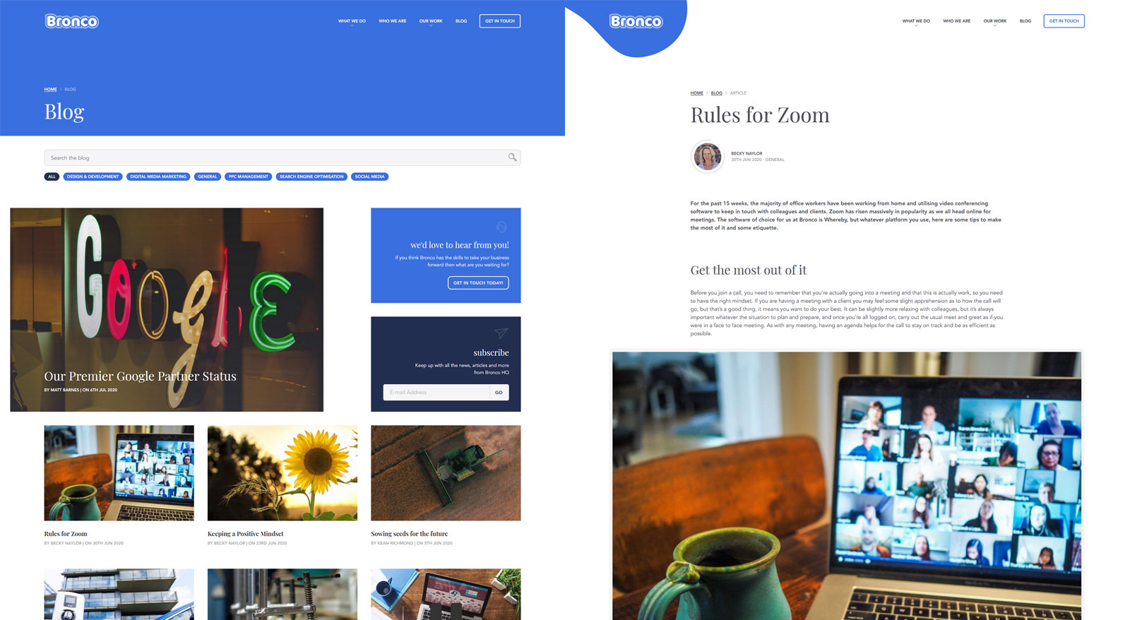
As the featured image held a prominent position on these pages there would always be a case for wanting to display something more intrinsic to the post like an image which might include text, while in other situations this was less critical and a generic image could be displayed. By removing the featured images from appearing by default above the article we separate these two use cases allowing the author to use a more generic image where it is appropriate to do so and then within the post has complete control over what images appear and where, if at all.
This coupled with finally upgrading WordPress to include the Gutenberg Block Editor the team now have more ability to customise the blog articles to suit their needs.
Super-Fast
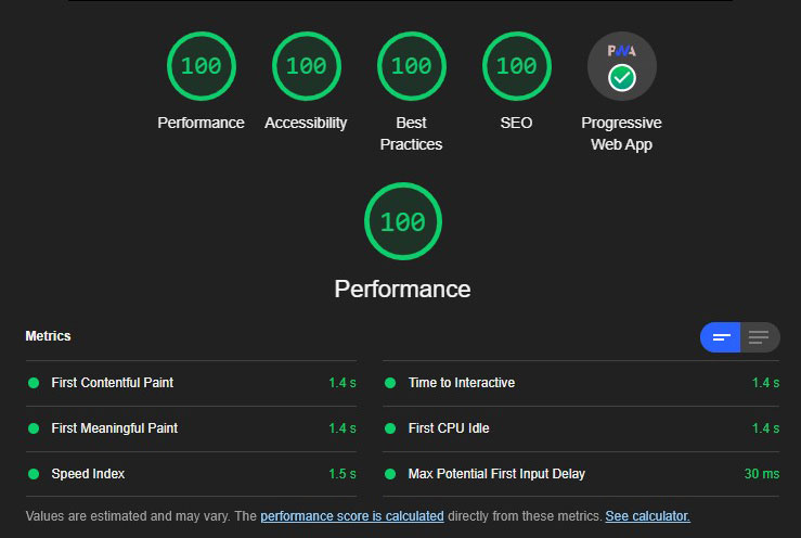
Happily, the new homepage for the Bronco website is super-fast, gaining 100 scores across the board on Lighthouse 5 and still 99 performance score on Lighthouse 6 which includes the new Core Web Vital metrics; something we had to address only weeks before launch.
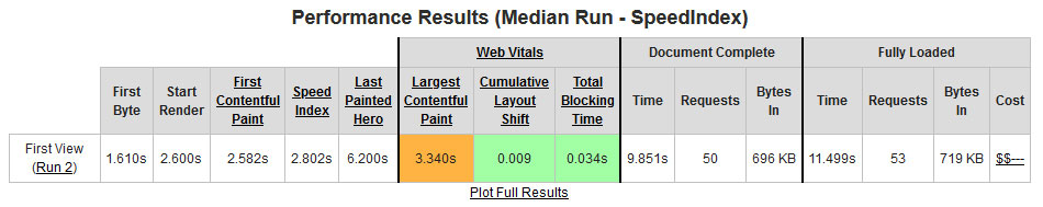
We’re aware these scores are benefiting from our geographical location in relation to the hosting server, but are also pleased with the metrics returned from other tools such as webpagetest measuring on a 3G connection from Washington, USA.
What next?
We already have a number of tweaks we’ve identified to improve the website further, but for now we’re happy that the website brings the design up to date and fixes some of those niggling issues that had begun to annoy.
As for its success; in a time of such upheaval a change of website isn’t going to suddenly generate an influx of new business, and thankfully we’ve coped better than some in these times. However, by launching as we start to see things easing back towards normality it’s a strong message to send that Bronco is still here, still working hard and is looking to help new and existing clients prosper through troubling times.